


You’ve seen it on the insta-stories and you knew it was coming. I was vocal about how I was never happy with my living room, but some of you needed more convincing that getting rid of the red Persian rug was the right thing to do. So today is the day that I show you the living room, styled out in a way that is closer to what I really want.
When we first shot this room in May of last year (almost a year ago) I really liked it, but as you know I was extremely conflicted about the amount of color and of how busy it felt.

This looks beautiful in the shot, don’t get me wrong, but on a day to day basis it was a jolt of color and pattern that my brain didn’t want. My brain needed less to process, visually. That rug was so kid-friendly and beautiful but I wanted more calm, more neutral tones, less boldness.

Like menopause, we all knew that the change would happen, yet some of you were upset regardless. I made it clear that I wanted more neutrals in my life and I wasn’t going to stop until I made that room more seamless (color-wise) in the house.
So I tested that theory during Halloween, which is when I bought the new rug.
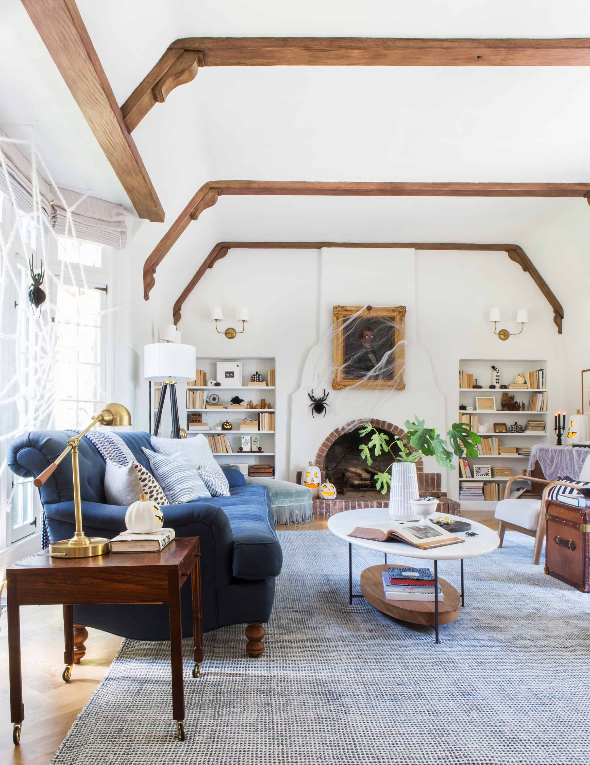
It INSTANTLY changed the vibe of the room and then by turning the books around it felt even more calm, even though there were spider webs and plastic bugs everywhere. Black, white, navy, gray and leather/wood is my jam. It’s what I’m comfortable looking around and being engulfed in, on a day to day basis.

But I didn’t know how to actually make that vibe as interesting as the red rug. This color palette is less adventuresome, less editorial, less pinnable. But it’s what I want. And as I said before, finding a 10′ x 14′ or 12′ x 15′ rug in blues and grays that was kid friendly, soft, but not one million dollars was almost impossible. Retailers need to make more 10’x14′ rugs, full stop.

For Christmas, I tried to do the same calm color palette but some of you thought it was boring. I didn’t. Living in it felt very full and beautiful, but admittedly it wasn’t over the top and some expectations weren’t met and that’s ok. I wasn’t offended at all, I knew that being happy living in it was more important than the reader reaction. When I styled it for the party I added a ton of darker copper and rust tones and it helped add another layer, but we didn’t shoot it again. Besides, I canceled the party because I had an emotional breakdown – MERRY CHRISTMAS! (see more about that breakdown here)
So then I thought, maybe they think it’s boring because it’s styled for Christmas so we’ll shoot it again and see what they think about a more everyday type of styling. Let me be clear – this is my favorite thing to do – tweak a space, shoot it and open it up for discussion. I’m not trying to ‘prove’ anything, it’s literally my favorite thing to do that is also good for traffic. WIN WIN. I had bought that new piece of art and I really wanted it to go a tad more modern, so why wouldn’t I show you?

I was out of town (the perfect time to shoot so your family isn’t disrupted) so Brady and Sara shot the living room. I told them to style and shoot it more for everyday – not a magazine. Don’t overdo it with the styling or props, I said and they listened.

They did a great job and I loved it. But there was so much feedback about the art – that it was jarring, that it took all the attention. And there were a couple comments that stung – that the room wasn’t ‘inspirational’. One of you even dropped the G word (generic) and while I don’t agree it did make me think. Sometimes it’s hard to analyze a space that you live in every day, so I stared at the photos and I said to myself – if you could do anything to this room, what would you do? I decided to make some changes. Maybe you were right. Maybe I was being more of a ‘mom’, and less of a ‘stylist’.

I thought how we lived was great (and I don’t negate that) but I asked myself if it could be better.
I realized it needed even more ‘punching up’ – That’s editorial-speak for – more ‘contrast’, ‘edge’ and perhaps more ‘lifestyle moments’. So we went to a few of our favorite stores in LA (Lawson Fenning and Consort) and borrowed and bought some extra beautiful pieces to style it out.

Juggling being a ‘designer’, ‘mom’ and ‘content creator’ is challenging but extremely rewarding when I actually let all those roles win equally. I’m not saying I did it here (there is always room for improvement), but the drive to merge the three has made me a better designer. It makes me consider the function, comfort and opportunity of the room first (mom), the beautiful furniture and fixtures second (designer), and the ability to tell that story via a photograph third (content creator).

I honestly LOVE IT. We kept all the same furniture but added edge and interest through the accessories and art. I resurrected that amazing painting (from the garage) above the fireplace which all of a sudden tied the room together. Plus it made me feel happy.
I eliminated all the orange, red and pink books so that the shelves were only full of blues, whites, grays, and blacks. If you are a novelist please consider the bookshelf color trend of the season before you publish. I’m joking … but only kinda. Here’s a secret, I never liked the spine of my book because it was too shiny gold – and therefore impossible to photograph. Every now and again I get a friend’s coffee table book and I’m like, ‘oh, girlfriend designed this spine to be photographed in shelfies and she did it right’. It’s along the same lines as designing for ‘likes’. You want to do something with integrity and authenticity, but also something with commercial/social success. HA. GOOD LUCK TO ALL OF US.
That’s all to say that we stored the penguin books and any others that we loved, and then donated any that we would never read again to the rummage sale.

Back to the changes – I decided to add some edge through some lighting. I borrowed that lamp from Lawson Fenning with every intention of not buying it. But man, it looks AMAZING in my living room. It brought something really bold and yet simple to the space. It created an energy that I knew I would miss. I also love that vase from Sheldon Ceramics – fill it full of anemones and call the priest because I’m getting married.

That art is from a local artist Kirill Bergart (the left two) and Lisa Golightly (top right). Man, I love that vignette now. You pushed me harder to make it better and I thank you.
The credenza is from Article and I love it, with the tray being from CB2 (but not longer available).
I’d like to interrupt this program for a lecture about trays.
Dear major retailers – we need more trays like this tray. It is wide without being too deep, thus fitting on multiple surfaces (keep them around 12-16″ to fit on the most). The wide-but-not-too-deep size is crucial to surface flexibility. Also, give the tray some sort of lip or exterior interest like what you see above. A straight up parsons tray does little for visual interest. This bevel makes it look expensive and custom. A beautiful handle takes it out of ‘basic – B’ world. I think this was $60 but it’s strangely valuable to me because of how great it looks in my house on multiple surfaces. Also, we have enough white, wood and gold trays out there and all three of those finishes have less flexibility because I often have white and wood surfaces. Having something with a pattern (marble or herringbone) or black makes it pop off the table (gold doesn’t look good on wood or vice versa, by the way). You want your finishes to contrast, so we need more trays in finishes that can pop off of wood, white or brass surfaces.

We kept the pillows mostly the same but added that darker merlot color (are we supposed to say ‘burgundy’ now? wine?). That pouf was bought just for the shoot and returned – only because our cats would use it for a scratching post. I kept thinking that we need something by the fireplace so we tried a few options, but once I saw this one in person I thought – it’s GREAT, but our cats will destroy it (it’s looped wool).
We moved the graphic painting to this side of the room and I LOVE it. It feels important but doesn’t totally loom over the room like it did when on the mantel.

If I were to redesign that sofa I would make the back a tiny bit lower and change the feet out to be castors (I thought we could switch them later, but they are actually built-in to the frame of the sofa). We still could but we’d have to cut off the legs and retrofit castors. I might do it someday but it’s not a high priority. Brian didn’t want castors because he thought it looked ‘try-hard’ but I regret not having beautiful vintage English style wood castors with brass wheels (you don’t place castors on all four, just the front two).
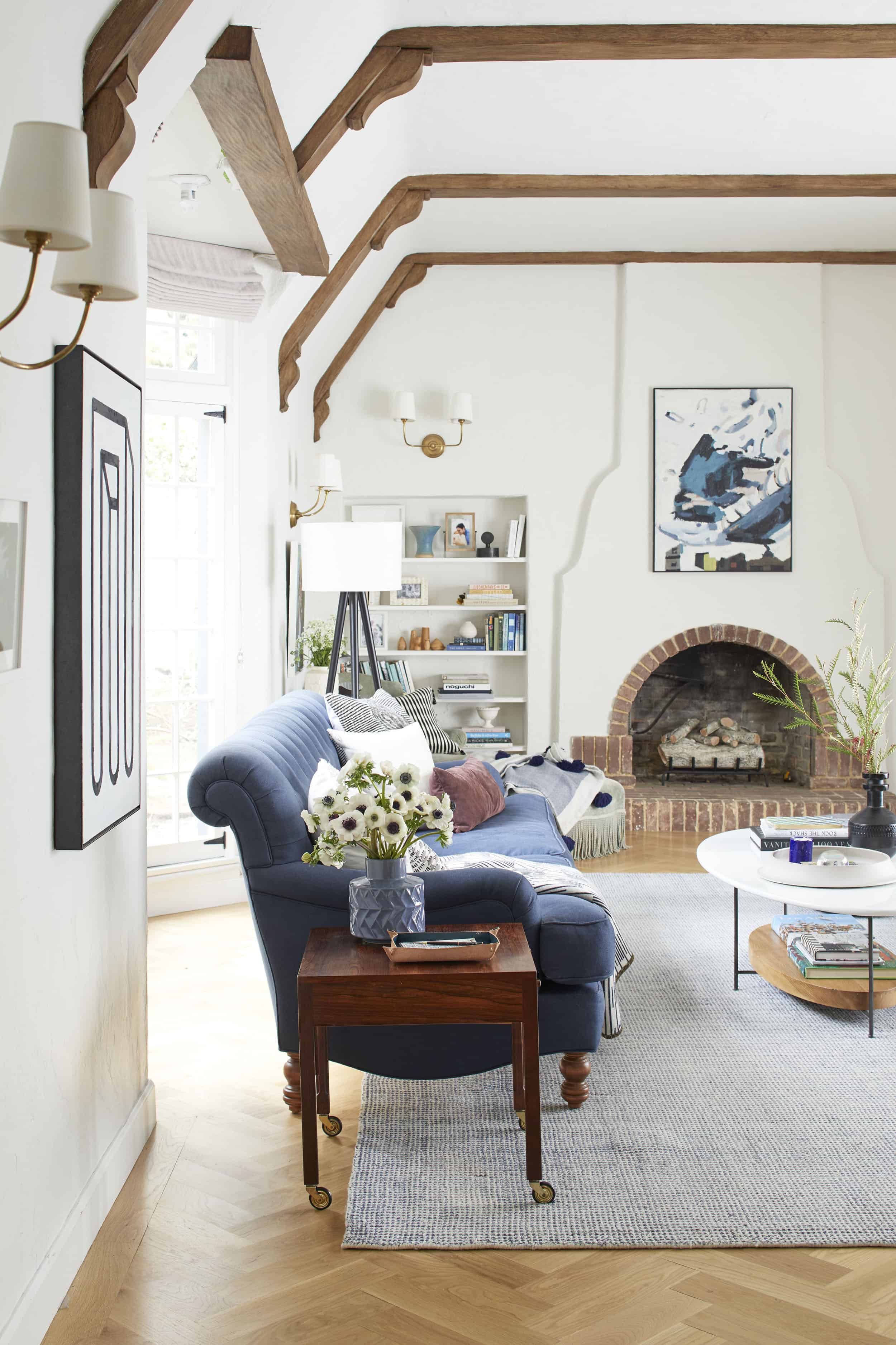
Man, I love that piece of art up on the fireplace. I tried a few mirrors and a couple other pieces of art but this really tied the room together and brought a jolt of happiness – plus I had it stored in my garage so it was free!
Also, of all my design decisions last year, I’d say the perfect decision was choosing those sconces. They are just so simple and classic.

That mid-century sewing table just keeps on giving. I’m not mad at anything in that shot. I still love that coffee table while wishing it were a foot longer. The kids play on it all the time and the white lacquer finish is super durable.


Over on the piano we put the schoolhouse lamp back but added a more sculptural one. People voted for no ‘double lamp’ on insta-story but it balances it out while not being identical. That lamp looks more like a sculpture (like a permanent flower arrangement because it has that pretty shape).

Don’t worry, we KNOW that we need a piano bench (Charlie started lessons last week!) but just haven’t found one yet, probably because we aren’t looking. ‘Piano bench’ isn’t #1 on our list of to-do’s right now so it might be a while. Our Paul McCobb chair is holding court there right now and it’s just so beautiful. Yes, I’m allowed to drop Paul’s name. He’s PAUL MC-EFFING MCCOB and all I wanted my entire adult life was to own something by a modern genius.
The vase on the gray cabinet is from Lawson Fenning and it’s $1200 so we just borrowed it for the shoot, but man – if I were a billionaire I would buy that beautiful hand-thrown vase – with a strangely dramatic top. It’s worth every single penny, if you have 120,000 extra pennies.
So that’s the update. I’m happy. I love it. Do I think I could love it more? Probably – if I could buy my dream furniture, but my dream sofa is $15k, my dream 12’x15′ rug is $140,000.00 and my dream chairs are $4500 each. I’m going to create a mood board with them all so you can see what I would do if money or kids were not an object, but for now I LOVE THIS ROOM. It’s really pleasing and calming to my eye. It’s family friendly (and our cats have stopped scratching because we bought them something else to scratch on) and it’s extremely inviting and warm. We hang the heck out of here with our kids and our friends.
Look how proud I am here. 🙂

That lady is PROUD.
If you like anything that we have above, here you go.

1. Painting | 2. Sofa | 3. Tripod Floor Lamp | 4. Arm Chair (similar) | 5. Rug | 6. Coffee Table | 7. Grey Textured Pillow | 8. Stripped Pillow | 9. Navy & Red Patterned Pillow | 10. Suede Lumbar Pillow | 11. White Shag Pillow | 12. Throw Blanket | 13. Large Black Vase | 14. Two-armed Sconce | 15. Mug | 16. Ceramic Tray | 17. Ceramic Bells | 18. Blue Vase | 19. Black Vase | 20. Lidded Marble Box (similar) | 21. Leather Tray | 22. Black Table Lamp | 23. Credenza | 24. Vintage Velvet Chaise Lounge | 25. Pouf | 26. Marble Based Lamp (similar) | 27. Wall Paint | 28. Herringbone Floor | 29. Sheepskin Rug | 30. Black Chair (similar) | 31. Table Lamp | 32. Modern Table Lamp | 33. Vintage Piano
The question becomes – do you like the changes? Do you think that it feels more young and modern and do you think that the ‘young and modern’ change is right in this space? Do you still miss the Persian rug?
As someone who genuinely loves to document, share and ask thousands of others their opinion about our home I’m opening it up to you. Weigh in, friends. I love the debate …
***Photos by Ryan Liebe
For more reveals from Emily’s Los Feliz Home: Powder Room | Jack and Jill Bathroom | Living Room Update | Charlie’s Big Boy Room | Master Bedroom | Master Bathroom | Living Room | Kitchen & Dining Room | Elliot’s Nursery | Backyard | Closets | Laundry Room | Elliot’s Nursery Update | Family Room Update | Kitchen


I love it so much! Love the new rug. I liked the painting above the mantle a lot but love it where it is now. And you look very cute on that picture.
It is very inspirational to me!
I love your blog. But I hate when people turn books around. Absolutely hate it. Sorry. Whenever I see books turned around, I get book rage. It’s like road rage, only with books. What is the point of having books on your shelves if you can’t see the titles and find the one you want.
P.S. I love the new rug.
Yes, yes, yes. Though, it does look like the updated version just includes color coordinated books, rather than books with their spines in.
Where did you see those books? In this post?
Ok, never mind. But why not? Maybe not everyone want to ‘share’ her reading preferences. 🙂
Lol. I get book rage, too. Also when books are arranged by color instead of subject or author. To me it is like asking a beloved but ugly person to turn their back or cover their face when photos are taken.
Yes, yes, I ranted about this (belatedly) on the last post, but she’s fixed this in the lastest iteration. So, yay!
The books turned around drives me crazy too, but I don’t get why people are irritated when books are arranged by color. Most people don’t arrange their books at all, never mind by subject or author, which doesn’t seem to bother anyone. Why is it more annoying that they are arranged by color than not at all?
That is a good freaking point! To go a step further, I love to read, and do so a ton, but mostly library/kindle or secondhand paperback books that I return, pass on or donate so, if I have any books on shelves AT ALL, they’re there for decoration! No hate!
I think that was done just for the Halloween decorations…
Hey guys, don’t worry I turned them back because I. too, think its totally weird to turn them around (of which I spoke about in the halloween post). it felt ok to do for halloween because it was spooky but no, I agree. Its weird for life to have your books turned around. we reduced the amount of color (which is also controversial) but kept them ‘spine out’. 🙂
I am so glad someone else commented on the book thing. I also get book rage (love that expression, btw!). I see the books have been flipped back spines out, but, yes, I am sad to see that some books got edited out because they were the wrong colour 🙁 You can tell so much about a person by the books they display! My books on display are “me” and I love them so much, I can’t imagine having to store one because it doesn’t fit the colour scheme. The rest of the room I love, though, especially the opposite end of the room from the fireplace! (love those ceramic bells but the link doesn’t seem to work)
Hi Emily, I loved all of the versions of this living room you have created so far. I do not think the issue has ever been your styling approach. It is this long shot that you have to, inevitably, take from the entrance of the room that instantly shows us “everything” to critique. I really do appreciate your transparency with your readers, but as we see everything in one point perspective, the room which has various stunning moments peppered throughout just turns into a linear collage. I have three reasons why I think you are not getting the love you deserve with this living room. 1. Your lovely recovered beams, which I believe are physically 3-4′ apart, seem like they are very close together in these shots and overwhelm any picture you take from that angle as they fill the top half of the picture with a lot of strong brown. 2. There is a recurrence of the conical lamp shade in every light fixture we see from this angle. The standing lamp, the black lamp over the credenza and your 4 light fixtures (total 8 conical shades) are overpowering that space at the back with the same geometrical shape.… Read more »
Yes, exactly this. To live in I imagine the room is lovely and comfortable and beautiful.. But as a full room shot, there are few “groupings” to help the eye travel – it’s more like the eye just jumps around from point to point. The beams, the hinges on the windows, and the sconces all have the same visual weight as your styling details, and therefore, for me, the photos of the room don’t give me that visual “ping” of a great photo. The red rug at least was also a busy piece, and richer in color, which balanced out the sconce/hinge/beam/wall detailing.
The coffee table midroom and equidistant chairs and sofa just compound the problem.
That said, this is a very good example then of how decorating (and dressing for that matter) for photos affects your livable life. The best way I’ve heard it described is that screens are lower resolution than real light – if we design for screens it’s often too high resolution for day to day.
I think both of you are spot on!
For me, this room tends to feel more attainable than aspirational – not a bad thing, but not the ooo, I need to Pinterest this. I think it’s because it feels like a energy releaser (ahhh, I’m home, calm) vs a delight giver, like your last living room (yayyy, I’m home!).
Most of the calming rooms That feel aspirational are spa bathrooms, quiet master bedrooms and Scandinavian neutrals. I just don’t see a lot of navy / true blue traditional calming spaces that hit the inspirational itch for me.
INTERESTING. I think this calls for more video and a better 3-d experience. thanks so much for this feedback. Its fascinating and eye-opening. xx
Agree! This comment is spot on – particularly as to numbers 2 and 3. I am a lover of bookshelves (including the current style of these!), but agree that they make the the room seem busy in the full room photos. I wonder whether spacing the shelves out a bit more (allowing for some larger styling pieces) and/or extending them higher would decrease some of the visual distraction.
Adding on to my last comment: To me, the height of the bookshelves don’t match the grand scale of the room’s other architectural elements (e.g., windows, beams, ceiling height), and the discrepancy makes them feel out of place no matter how beautifully they are styled.
This!! Those bookshelves have always looked a bit awkward to me within the room and I never really figured out why because they are styled beautifully. I think you need to get rid of them or make them taller or wider or something. They definitely don’t match the scale of the room or the beautiful architecture.
ooh. maybe you are right! why didn’t they take them higher?
Yeeeees!!! And yes to de sconces thing too!!!
YES! “I hope you do consider sleek library picture lights in brass over the bookshelves, if you ever decide to make any changes.” I feel like I’m seeing too many scones shades! They’re beautiful, but there are too many. Brass would be lovely.
And I see that someone else commented about the bookcases looking better if they were taller. I agree. I also think that they should be packed with books. No “white space” and no vases. Just chock full of books, of all different spine colors. That’s what bookcases are for, and it’d be classic and impressive.
Yes, I agree about this! I actually commented last time that it would be good to change the shape of the bookshelves so that they hug the contours of the fireplace, nearly to the top – making the most of a great architectural feature.
Books rather than lots of accessories would work better, and, I believe, would look soothing as a whole, even with multi-coloured spines; and there would probably not be any need for art on the fireplace.
The credenza, although beautiful, seems to block the right-hand bookshelf.
The coffee table feels much more harmonious with this rug than with the first one.
I am not sure about your choice of throws, nor about those stripy cushions… They seem to create busyness, rather than helping the sense of calm you are after…
Several lovely vignettes… And I love the chaise (although the painted console table may be one thing too many), as well as the Cherner chair, the piano, the Paul McCobb chair, and the vintage cupboard…!
Very challenging to present the way you actually live, Emily, up to the criticism of the public…!
thanks, mary. I can tell you know what you are talking about so i seriously appreciate the compliments and suggestions. xx
Love this suggestion about the bookcases. Because they’re built in and all the shelves are on the smaller side and uniform, a block of books on either side of the fireplace would look amazing.
YES. Fully agree with this comment. Its not the styling, but the proportions of the room combined with the perspective of the shot. For photos of this room to really “pop” I think you would have to remove 7/8s of all the furniture, art, accessories, etc. But I bet you always get tons of oohs and aahs when people enter the room in person for the first time!
Yes, agree! Normally I say you be you but since you are actually asking for our opinions and the debate I have to weigh in. There are some beautiful vignettes happening but as a whole it is way too much for the eye and I’m not even sure what the focal point is. I would love to see this room paired down as others have mentioned; bookcase full of just books, no art above fireplace, more simple one light sconces with no shades(though I agree those sconces are beautiful, I just don’t feel like they do anything for you in this room). I think less stuff would allow the beautiful beams and architecture of the room to really stand out. However, I absolutely adore that 9th photo down of the piano and sideboard shot. Something about those colors; wood tones, white, brass, gray, hints of blue that really speak to me. I appreciate all that you do and that you allow us to critique your space.
this is so interesting. in person I PROMISE you its not busy. its calm and happy. I can’t handle busy anymore. I like texture but and some color variation but thats about it. so the fact that it still seems busy is actually mind blowing. but maybe i’m playing to too many audiencs. There are so many of you who want it to look like a magazine and others who want the more minimal approach. I’m interested in both but for this house I like the inviting elements of the bookshelves (so many photos of my family). anyway, i love this debate. keep it up. xx
Yes to this >>> “sleek library picture lights in brass over the bookshelves, if you ever decide to make any changes.”
I actually came back to this comment days after reading it because it’s all I can think about when I see this room now! The sconces are just a lot… They’re great by themselves, but they add a lot of ‘busyness’ that it seems you are trying to avoid.
ha. this was my first choice for the shelves, but chickened out for some reason. I agree. picture lights here. i’ve always thought that 🙂
Love love love all the changes. The room feels fresh and happy. The new rug is SO good. As a mom to little kids, I totally feel you on the NEED to create more calming spaces that aren’t so busy. It’s taken me 6 years to finally feel content with my family room for that very reason. Love your work SO much! And I admire you as a mom, designer, and content creator. ♥️ Cheers to not letting the nay-sayers win and making it the best scene with you and your family. I love it all so much!!!
Emily, I really like your style and you are so inspiring. I don’t think pictures do your blue rug justice. It’s a great rug and I’m considering a similar one for our office but I was drawn to the warm colors in your first rug. I was so inspired by it that we bought a patterned 9 x 13 rug for our LR (smaller pattern and not wool) and yes, it’s a little busy but we love it and get lots of complements on it. I think your first rug added some soul to the space and that is what I miss in your room now. I like the changes you made with the art but I think the arm chairs would work better in your playroom or the mountain house. I like the basic style and bet they’re comfortable but I keep thinking that some chairs with a little more weight, maybe spool chairs, would look great. Seems to me that it’s easier to style someone else’s home than your own!
Love all the changes and do understand that for day to day you need calm rooms to balance out the color of children. But as good as you are at styling shelves and in up close photos they look great they are busy and I now think you should have taken them out and done some furniture on either side of the fireplace. In your last house you didn’t really have to look at your book shelf when you were in the living room. Love your work
I think the space looks wonderful, and what’s even better is that YOU’RE happy with it! I think it’s fun to have a room go through design “phases” – it’s part of the process. I wouldn’t be surprised if in another year it’s changed yet again. After our big reno, my mom’s friend (an interior designer) came over to give us some ideas on furniture placement (it’s an open-concept space, and I now know those can be tricky to design the furniture layout!). Well, the minute she walked in the door, she told me what would be best; we spent about an hour together talking about it. My husband came home and looked at her sketches, and we both unanimously negated it. Well, we lived in the space for about 4 months, with the layout we thought was best. After a few (well, quite a few – I was the post-reno hostess with the mostess) gatherings, I realized I didn’t like our layout because everyone ended up looking at a wall, away from the gorgeous kitchen; the designer’s layout kept it more open to the kitchen. And thus my journey of swaying my husband began (which, for the record took… Read more »
I think she should get the casters that are mostly inside the furniture leg. The leg is just routered out a bit and the caster is inserted in the void and attached. It’s an older style, so it would go with the classical style Emily wanted more of. But they only show a little, so maybe Brian wouldn’t mind. Idk?
I was thinking the same thing. Also lots of antiques have wood casters, which don’t have the same “pop” as brass casters. Brian might like wood casters better than brass casters.
I think it’s beautiful. I’ve loved all of the versions but I think this is the best. A couple things: that gorgeous chaise just always seems to get lost. Maybe it’s just the pictures because there is a lot going on. I feel like this room just needs a bit more furniture given it’s size. Maybe a bench upholstered in a fun fabric sit on the side closest to the fireplace? All of the fabric on the furniture is so neutral, it just all kind of blends in – even with the layering of blankets and pillows. Just some ideas… honestly it’s beautiful and I love your work!
I like this, but I still miss the Persian rug. I think it gave the room some much needed contrast. While I get (and support) the need for calming colors that work with the rest of your house, I’m craving some color in your spaces. Everything is pretty one note in your spaces in this house. On the one hand-this is your house- you should do you in your own house. On the other hand- I think you’ve missed the opportunity to take some risks with color/contrast. For example- your white windows are lovely, and they add to the serene vibe in your living room- but painting the mullions in your window a color (black, blue, gray) would be a way to add the contrast that you’re missing without the rug. It’d also be a way to showcase something different than the typical white on white on white that’s so common.
I disagree on painting the mullions a different color. Why draw the eye to boring mullions in a room that’s already architecturally interesting with the overhead beams and the fireplace? No, no, no.
I can understand your comment about wanting to show a little more of the architectural detail of the space but Emily did originally try painting the mullions black (and/or grey) and it was way too busy.
Girl, I LOVE it! That painting above the fireplace is perfect. I’m glad you kept the modern linear art in the room, and it looks better on the wall as opposed to over the fireplace. I’ve never liked the coffee table- it looks like a white boat sailing in a blue rug sea, but I’m glad your kiddos enjoy it. Sometimes I think you put too much importance on the opinions of your readers. Like, it’s YOUR house and we’re all lucky enough that you let us get to see it, but your preferences as an individual, wife, and mother should always win out over the concern that readers may or may not like how you’ve changed out the rug. I can’t even imagine how difficult in must be in your line of work to balance personal preferences and reader feedback, but I vote for you doing you first every time. Because you’re amazing and admirable and brighten everyone’s days just by being you. ,
This, this this!
I’ve never liked the coffee table either…i think it’s too small for the room and the wood tone, the legs, there’s something odd about it
Beautiful, Emily. I am definitely inspired.
I love it and love your style! I do think the built-ins looks busy and could use pairing down or even rethought completely. Maybe adding doors to the bottom half on each side for closed storage with cool vintage hinges and latches? Also, the selves in them look like an after thought, not original. Maybe they could be made beefier (still white) with period mouldings? I’d prefer less items on the shelves than filled to the brim. I love photos 17 & 19 in this post for the calmness they have. I wish the fireplace side of the room had some moments like that.
I agree about the shelves; they look good close up, but a little hectic when pulled back, and the fun chaise gets lost. Which I imagine is a tricky part about designing a large room with photography in mind— you want each individual vignette to look completely styled, but then when you pull back it can be tough for the eye to find a place to rest.
I know this house is an English Tudor and you’ve used that as a jumping off point for your design, but do you know if the fireplace was original to the house? It leans more Spanish to me, so I wondered if it might have been a later addition.
Thank you for sharing your home; it’s beautiful and definitely inspirational.
I like the changes and new accessories a lot except turning the books — Sorry, but this is the silliest trend ever. I understand it reduces the color from book covers but it also makes room feel styled, not lived-in.
As a book worshiper, I CANNOT wait for this trend to die.
Your living room is literal goals! Please come decorate my whole house ?
Brooke // http://www.brookeclarke.com
I love all the ways you styled this room! I can’t believe how people critique. Wouldn’t you love to see their homes? Good job, as always. Melaine
I’m happy you’re happy because that’s what matters. You are the one that lives there. Thanks for sharing your process. I just can’t get on board with the new living room version. The original version was so much more charming and fit the period of the house. It just made so much more sense versus someone who clearly loves mid-century but bought an almost 100 year old home. I think that works better in a victorian versus an english cottage. But again, that’s just my opinion and taste. I live in a 108 year old house and prefer natural, time worn, casual, original style in my home because I love it but it also looks the most effortless. I’ve said it before and I’ll say it again – that persian rug and the portrait above the fireplace MADE that house. I’ll gladly take the portrait and add it to the portrait wall in my kitchen 🙂
I think it’s a wonderful room, Emily, but then I love everything you do. I dream about having you style my living room! It’s a small thing, but that soft merlot pillow you added is lovely. I think I need something similar… getting the right pillow combo challenges me. I enjoy hearing your thought process as you show your designs. Every designer/blogger is thinking about how something will photograph …why not say it? Enjoy your beautiful room. 🙂
YES to the burgundy pillow. It’s warm and cool at the same time!?!? I actually would love a single tiny pop of mustard in there somewhere – like an easter egg hunt. It would barely show up in a photo, but in person you would do a little jig when you noticed it. Otherwise – this room is perfect to me!! (To be clear, I also liked all the other iterations but the first red rug – and I voted yes on two lamps on the piano!)
I love the updated look, light and airy. Love the rug and painting over the mantle. The space would feel more balanced to me if you had a matching sofa across from the other one. It feels heavy on one side with the dark color of the sofa and chaise then too light on the other side of the room with light colored chairs. Just a thought. Love your style and thank you for sharing your home with us….they’re my favorite posts!!!
I’ve never commented but I just had to say you NAILED THIS. I was silently sad at the loss of the Persian rug but adding some edge with these accessories and vignettes did it. I am won over. Neutral with edge = sighs of contentedness.
Oh the joy of moving things around! I love doing that! The new rug is definitely better for the room.
If it was my house, I would probably move the credenza that is blocking the shelves to some other place (maybe where the piano is?). That would, I think, make that right corner of the room look airy and less busy.
Also, I love the art, especially everything that’s above the credenza!
The new art over the fireplace is great—I love the colors and the composition. On the whole, though, I don’t see a huge difference between this version of the room and the most recent former version. I had to go back to the “everyday type of styling” post from Feb. 7 to compare, and it looked like a lamp and a vase that were both white were replaced with ones that are black. Without analyzing the photos super closely, I couldn’t tell much of a difference. To comment on what people are saying about styling photos and/or your house for likes and pins—from what I have observed, if you’re a designer or a blogger who has great style, you’re going to have people liking and pinning everything you do because they genuinely love your perspective and your interpretation of that style. It does feel forced to work that in reverse—to say, OK, I’m going to design this way because this is what attracts likes and pins. That seems like forcing yourself to conform to a mold instead of allowing your style (and your expression of it) to evolve organically. I appreciate that preferences change over time, and I fully understand… Read more »
“I used to think your previously colorful, quirky, mid-century-loving style would have shown up in your house whether or not there was a blog and a photoshoot involved. If you took away the blog and the photoshoots now, what would you really do with these spaces?”
This is an interesting question that has me wondering the same.
I think the room looks wonderful, and I love the changes. While the Persian rug was great, I agree it was too overwhelming/busy in this room. My favorite touches in the room now are the artwork over the fireplace (and the modern piece is great, too – and I like it better where you have it now!), the black vase on the gray cabinet (ugh, $1200! So sad!), the bells over the piano (have always loved those!), and the Lisa Golightly artwork – big heart eyes for that!!! I’m glad your mainly designing for yourself, even with the constant tweaking. Keep in mind you will never be able to please anyone, so please disregard anyone who says the room isn’t “inspirational.” Inspiration is a very personal thing. And I know that when I am pinning images for inspiration, it is less because I find something beautiful, and more because I would love to recreate some aspect of the image in my own house. Your house’s architecture, particularly in that room, is a very specific style. There are few elements that would work well in my house (a traditional New England colonial). So I probably wouldn’t pin much from your room,… Read more »
Ugh, you’re. I know this.
This is certainly the best version yet – the muted deeper color tones are awesome – the only pieces that make me cringe a teeny bit are the trunk turned vertical against the windows and the credenza up against the wall that blocks the view of the bookshelf. I’m sure both pieces are super useful so it’s hard to give up the space, but they seem so heavy, I can’t help but imagine the space every time with those gone and replaced with sleeker smaller pieces. Also – so many lampshades, wow! You have 11 lamps by the fireplace! Does it get super dark in there at night or something?! It just seems so visually weighted at the end of that room, and yet above the piano it’s super minimalistic. But! it does give off great chill / interesting vibes, it’s super challenging doing up your own space!
I’d love to see this room with different lighting, fewer two-light sconces with these shades, more groupings. But that’s because I am looking at a photo!
You make a good point about the credenza. Maybe a thinner (less deep) credenza, or a table placed there instead (so you could see through the bottom at least)… Alternatively, maybe one could rotate the credenza so that it’s actually in front of and blocking the lower half of the bookshelf? That would of course make the bottom half of the bookcase unusable, but I feel like part of it is sort of unusable now due to the current overlap. Or heck, even a drop-leaf wall-mounted folding table that could be down on normal days and raised up for entertaining and bar use? It’s hard to say because whatever goes there needs to be both functional and pin-worthy.
Yes, too many shades for me
I love this look best of all! I loved this room even with the Persian rug, but it just keeps getting better and better with every iteration that you do! Your coffee table is perfection and exactly what I have been looking for but unfortunately is not in the budget currently. Do you know of any dupes or coffee tables with a similar feel that happen to be a bit cheaper? I am currently in the process of moving into a new NYC (small) apartment with an open floor plan and would love a post about how to decorate a space like that without feeling too matchy-matchy. Since it is a small apartment you pretty much see the living room/kitchen/dining area all at once, so trying to make it look cohesive and styled yet thoughtfully put together and not from the same store is proving to be quite the challenge! Also, you asked recently about small space styling, I would also love a post of small space sofas. When I was shopping around, I was trying to find a small sofa (80 inches or under) that was a sectional and a sleeper sofa that I could test out in person… Read more »
On a similar track, I’d love to see how you’d decorate a modern PNW studio apartment, all from places like IKEA and Target, with a little Craigslist thrown in:).
I like that idea!
I actually really liked the Christmastime photo shoot / room styling. I also liked the Halloween one. With this room’s current iteration, I agree that what’s most important is that the family who actually lives here is happy (which is what I would’ve said about all previous iterations of it too). My eye loves the little pops of green (mug, Lisa Golightly artwork…). The only things I would do differently would be to make the bookshelves less busy (I know they’re challenging because the shelves are shallow, but the shelves seem like they’re suffering from too-many-small-things-itis), and to cut back on the sheer number of lights in this room or add more variety to the lighting. Assuming low-energy bulbs and only one bulb per shade, there are still eighteen bulbs in this room by my count, which to me seems like a lot of repetition / duplication to me. Maybe just some variation (adding some that cast light upwards, or some that feature bare bulbs, or some that have more of an arc, or some that have more of an ambient glow, or even some regular old candles) would help mix up the lighting situation. Not trying to fix something… Read more »
Love the changes! The graphic art on its own side wall is much better and the abstract above the fireplace provides the juxtaposition of modernity and antique that makes the room not only fresh, but suited to the 21st century and a young family. Can we talk bar carts/displays? I get the photo op they provide. But as a cocktail imbiber myself, I don’t get it from a pragmatic view. When we make cocktails, we need ice, water, a sink, tea towel, shaker, lemons/limes/olives/cherries/simple syrup/herbs from the fridge. So I have a spirits cupboard in my kitchen which is right next to all those things. I’m sure you add all of these things to your set-up when you have people over but why have it out all the time in between?
The painting over the fireplace is exactly what the room needed! It’s perfect! It was already pretty, but now it’s amazing. The painting that almost went over the fireplace is so much better in it’s new spot. I didn’t like it at all when I saw it over the fireplace, but I think it’s great where you have it now. This room is now worthy of being next to the stunning patio tile! Good job.
I completely agree with you re the two paintings! I also didn’t like the first modern painting when it was above the fireplace, but I really like it where it is now. Works much better there. And the new art above the fireplace looks terrific.
Love the credenza corner. That lamp is to die for! Two thumbs up for the garage art…loving it there.
Good for you Emily! This looks excellent! I’m not a fan of the art over the fireplace as much as the black and white and I think it could come down about four inches, but this is you, not me. Design for yourself and make yourself happy! We all love seeing your designs and you are very inspirational. Not just because it’s your design, but you seem like a super fun, cool person, and you’re everyone’s friend. Thank you. Love the new graphic pops. It’s a great balance!
Yes, I agree that the fireplace art looks a bit too high. I love it though!!
I am obsessed with that piece but I just want to reach it and move it down three inches. Glad I’m not the only whose eyes are playing tricks. Maybe it looks more appropriate in person?
Love that you are finding the balance between real life and style heaven, Emily. It’s fun to watch you experiment–it makes me braver in taking my own risks!
I like how your rooms evolve and seem to get better with (near-constant) tweaking. It’s fun to watch the progress/change.
Today’s post made me wonder if you’ve ever made a design decision and spent far too much money on something that didn’t turn our right. But it was so much money that you couldn’t change it, had to live with it. What did you do then?
I’m talking BIG decisions that didn’t turn out but you have to live with them because you sunk so much money into them that you can’t afford to change it. Like, maybe you refinished your floors over the entire house in a color that turns out to be hard to maintain and live with. Or you bought an enormous, very expensive rug that you thought would work out, but it doesn’t and you don’t have money to change it. Or you have the room with the 20-foot cathedral ceiling painted, and it looks awful after the sun goes down but you can’t afford all that scaffolding again.
What to do when you have to live with a mistake?
i love this room!
I love your updates. I love the art over the fireplace and I love the fireplace, but I think it would look better to leave the fireplace bare. It has a unique shape and the rectangular picture makes it look awkward and distracts from its beauty.
Yessss this! Please please 🙂 haha
I love the changes! I am loving these VERY-detailed posts. It is so interesting to read about your thought process and what you borrowed just for the shoot, etc. I totally agree with moving the black and white art to another part of the room – it looks great. Also, LOVE the rug – it feels like the absolute right ‘base’ for this room. I do have to say that I am not feeling the sewing table at all. I can appreciate the piece in the close-up image and can see the wood is beautiful and I do love the simplicity of the drawer and knobs. However, I think something more modern or ‘grounded’ (or softer?) here would be better. I am not exactly sure what it is, but just wanted to be honest that I am not feeling it. And the wheels on the legs are driving my OCD brain crazy. But that’s just me! Do you need to re-position this table a thousand times a day? I suppose my version of hell would be furniture on wheels that do not lock and I have to keep fixing their placement in a room. Anywhoo…I would also add a little… Read more »
I think it’s lovely. I basically did the same thing in my home – got it all loaded up and was suddenly overwhelmed with busy and now it’s all changing again. My family is suffering from whiplash. I would like to make a suggestion on the bookshelves – more books, less stuff. My opinion is that styled bookshelves are only nice for tight shots. When I stopped trying to feature items on my bookshelves and simply filled them with books, the room got much more peaceful. Even if the bindings add more color than you are looking for, it has the effect of feeling “right” and triggering your mind to accept that the books are an invitation to quiet and introspection. So, I have an 80% books, 20% accents on bookshelves. It makes a big difference.
Emily, we have totally opposite styles (the Persian rug and portrait painting is more my thing) BUT I visit your blog daily, and have done for quite some time, because I learn so much from you. Even though my tastes might not align, I appreciate seeing design from a fresh, well thought out perspective and I can incorporate certain details in our own home. I love that you share the process, the ups and downs, the mistakes and traumas as well as the successes. Thank you (and your team) for all your hard work!
LOVE the painting above the fireplace!
I really like the room update. The feeling of the art is way more you! However, I feel like you need a mantle. No matter what art you choose, it looks less pleasing to me floating and no having a horizontal surface. Just my opinion, but since you asked I thought I would let you know my thoughts.
I’ve always liked your living room with each style change. But holy smokes, this design gets a YAS QUEEN!!!
This living room is everything my soul needs. You’re killing it and I applaud you for taking reader comments (even the unnecessarily harsh ones) and using them to push yourself. Yas. Queen.
Beautiful! I was one of the folks who thought the modern art piece was jarring over the fireplace. I love its new location and it totally makes sense in there now, and also LOVE the new art over the fireplace. Also, just FYI, I NEVER thought it wasn’t inspirational just because I didn’t agree with a few pieces. I’m inspired by your quest for calm, and the designs you and your team churn out are always inspirational. You go glen coco!
Love the new rug and artwork over the fireplace! The only thing that’s throwing the room off for me is the lamp on the credenza. It looks beautiful when looking at the credenza head on but, in looking at it from the side the lamp is distracting in front of the bookshelves.
YAAASSS I love the changes. Bravo! I was one of the people who was a little jarred by that modern painting above your fireplace. It’s perfect in the other spot, while this new/old painting fits the mantel better. *clapping*
I also love the color-coded books. I’m a person who has all of her book spines turned around to quiet her space (which enrages some of your blog readers) but I keep my books for sentiment, not to reread. If I have time to read, I’m reading a new book. Therefore my books become props and it’s OK with me to spin them backward if I like it better! All that to say, my feeling is that your books are yours, and you can style them how you want.
First, I LOVE, LOVE your new house! It is beautiful! However, I think your personal decorating style is better suited to your former house – which you slayed! It was the perfect marriage and everything from colors to furniture looked like it belonged in that house. I just think your current home and your style are a little mismatched. I see a different style for your home – maybe more traditional with a lot of neutral? Warm creams, antique furniture and tall plants/tree (since you have the height). Please take my comments as kind criticism. It’s like your decor is Angelina and your house is Brad – both insanely beautiful – just maybe not together.
Honestly, it doesn’t look that much different, except for the art over the fireplace. LOVE!! Can you link it up?
While I appreciate a post about changes in your house, I am DYING to hear about what’s happening on the Portland house reno. When will we see that? I hope we will get to see some of the updates as they are happening and not just shots of the completed project!!
I love the sculptural, yet simplistic, addition of your Paul McCobb chair! My boyfriend is a McCobb collector.. like every single piece of furniture in his house is McCobb, so I had to send him this link and I said babe babe babe my favorite designer has an amazing McCobb chair!!!
I think its stunning. Both inspirational and aspiration. But here is my question….tv?? What happened with the projector?
Also random other question, what about the basement space in the house that got flooded around the time you moved in? Whatever happened there?
I love this version best, for sure! Beautiful!
The Persian rug was beautiful, but definitely busy. This design iteration is much more my style. The one thing I keep going back to though is the fireplace. I agree that this art is an improvement, however it still feels a little off to me. I can’t decide if resurfacing, painting, adding a mantle, etc would do the trick or not, but art here has never felt right.
Also, I would really love to see your “money/kids are not an object” mood board, please 🙂
Yes. Yes. Yes.
I say something along these lines in every comment — you really have a way with art. This room is my ideal; classic and beautiful furniture and surfaces with wonderful, personality filled art and objects. This looks like a lived-in & loved home. (For what it is worth I think every version of this room has hit this high-bar as well. This version just feels even more considered than the others.)
I think there’s too much furniture in it. Especially the credenza. It visually blocks the bookcases and I think removing that would do wonders, despite what a beautiful piece it is. I also think some of the visual busy-ness comes from the beams, maybe paint white? Your eyes don’t know where to land. Yes there is a fireplace focal point but there’s too much else going on. I’ve always been perplexed by this room and understood why it never felt fully right to you. I really think the issue is too much furniture.
As always its still totally beautiful. Just giving some input.
I agree! I keep saying remove the credenza!! It’s beautiful but not needed!! I also think the coffee table is too heavy/ the bottom looks like a cutting board. And if one or more items was edited from each table, it would be so much calmer feeling.
I agree…the coffee table just doesn’t seem a good fit for the room. But overall, I feel the new space is much less frantic looking…..more calm and zen.
I agree that it feels like there is too much furniture in this space. With that being said, I’m actually sad to hear that so many of your readers’ comments/opinions weigh on you so heavily. I’m happy to just sit back and watch the room grow/adjust/change with the needs of your family and life (and not to get more pins). You have mentioned in a few posts how this urge to generate traffic and pins contributes to the design process. I think that could be a very interesting, stand alone blog post! Thanks for always sharing and being so open (it’s definitely a lot more fun/interesting that way!).
Hmm. I like the credenza and the chaise precisely where they are. This is a big room and without those 2 pieces, the space would look bare. There is a nice symmetry, too, in how the chaise and the credenza are positioned to block a small portion of each bookcase.
And I also like the wood beams unpainted. The curves of the beams mirror the curves of the fireplace. Again symmetry calms things.
But different strokes/folks.