


Today is the first reveal day of my house and I’m excited, nervous, a little nauseous, but VERY happy. That was a lot to start a post with, I know. But I’ve been spending the majority of the week inside this house, staring at it, but not allowed to show any of it on social media. I’m SO relieved to finally be posting about it, and hopefully you’re all ready for at least 5 minutes of pure escapism. So come escape into my house (in a totally . . . non-creepy way).
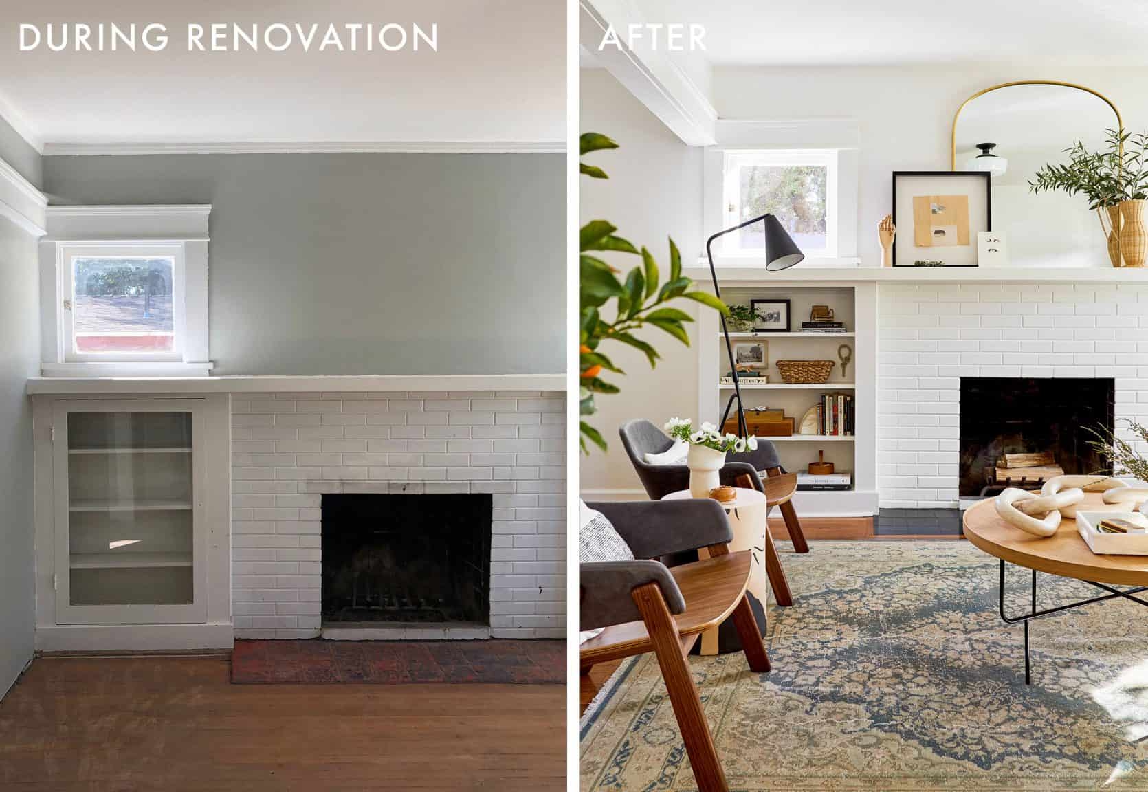
Here’s the quick recap – Back in November of 2018 my partner (sure, boyfriend), and I bought this 1921 Craftsman bungalow in north Pasadena for $550k. We spent the next 15 months renovating it, with the help of my family. My dad and brother did SO MUCH work on this house, and we could not have afforded to do it without all their free/cheap labor (stay tuned for the post where we reveal how much we’ve actually spent). Here’s what the living room and dining room looked like when we bought the house . . .

And while we renovated . . .

We got pretty far on our own, without any “professional” help (to be fair, my dad is pretty experienced). But when it came time to design this narrow, open floor plan MONSTER I had created, we needed a more experienced designer to get us across the finish line. In stepped Velinda Hellen, who, at the time, was part of our in-house EHD design team. And while I could drone on and on about her genius, I’ll just let her take it from here.
Let the living room and dining room reveal commence . . . .

Velinda here, ready to show off this house that isn’t mine 🙂 Emily brought me in on this project to save Sara and Macauley from the crushing design-paralysis they were pinned under during the major renovation of their very first home. I can’t tell you how excited I am to FINALLY be walking you through the reveal of the design you’ve been following since day one (now five months ago). My, how we’ve all grown.
You haven’t been following? Despicable. Today’s post will be like skipping to “Harry Potter and the Deathly Hallows” before ever knowing how Harry gets his wand. No clue what I’m talking about? Despicable!! (Sara would like to note that this one paragraph has solidified their friendship forever).
Let me help you out. Jump back to this post to peek at the dilapidation that once was. Next, we mapped out what this long, awkward box could be, decided on some furniture, picked tile for the fireplace, and dove into the dirty details of how many coins this “working with a designer thing” would have cost them.
All caught up? Great. Welcome back to Sara and Mac’s craftsman cottage.

Look, it’s us! If you’ll recall, our power couple (Sara & Mac, not me & Sara) was drawn to textural detail and a stark lack of color for their living & dining space. They wanted something “fresh, traditional, curated, inviting, and sharp.” But they had no idea how to unite the open floor plan living and dining room.
If you couldn’t already guess, designing with another person – a partner/spouse/roommate – can be extremely challenging. Just because you love that person doesn’t mean you love their stuff or their style. Working a designer was like having a design mediator for Mac and I. It was her job to make sure we were BOTH happy. But I do have to say, I think I won most of the time . . . . – Sara
After knocking down an existing wall that separated the two spaces, Sara found herself completely stumped on how to handle the resulting shape of the rooms. They were long, narrow and weren’t aligned quite evenly. So she made it Emily’s problem to solve . . . who then made it my problem.
Favorite new hobby: Making all of my problems also Velinda’s problems. – Sara

Now that we’re looking at these stunning photos instead of my sketched out ideas, let’s take notice of a few things that really helped to define the spaces. First, the vintage rugs (from Esmaili Rugs), which we’re all obsessed with, can be given the most credit for creating “areas” within this long, narrow space and anchoring each design as a whole. It’s what rugs do! And despite being different colors these two work together because they are similar in style (and share some common tones).

Front Door | Sofa | White Fur Pillow | Grey Pillow | Black & White Throw | Black & White Pillow | Gray Lumbar | Magazine Rack | Brass Wall Sconce | Window Treatment | Rug (Vintage) | Coffee Table | Large Wood Chain |Marble Tray | Ceramic Vase
Now the rug isn’t centered to the room, due to the front door and walkway. Which, I hope, is a forgivable sin. In all other ways, the rug still abides by adequate rules of scale and positioning to the furniture, but it keeps the front door space clear. Which allows that space behind the front door to become a real entry area.

So, let’s talk about this “entry.” The front door Sara & Mac used to have wasn’t right for the space, and felt a bit 90s. Instead, we replaced it with a solid hardwood door from Simpson Doors in a much more traditional and timeless design. Hoping to let in extra light but not creeping eyes, the placement of the door lite was at a perfect height (no, this isn’t misspelled, it means the little windows at the top of the door). We wanted to keep that “timeless” theme going in the hardware, and went for vintage-inspired pieces from House of Antique Hardware.
Keep your permanent features more traditional and timeless, but then go crazy with trends in your accessories. A front door isn't easy to replace and you'll want it to last for a long time without looking dated. But you can switch out a pleated lampshade with the click of an Etsy purchase.


Entry Console | Leather Hardware | Wall Hooks | Rock Vase | Lamp Base | Pleated Lamp Shade
Like many smaller, craftsman bungalows, a formal entry was nowhere in the original design. But to reduce the inevitable clutter that comes from not having a place to “land” upon entering, I wanted to create an entry area for Mac & Sara. Even if it would have to be a minimal one. A standard entry console would have been too big, and taken huge chunks out of their new front door every time Sara threw it open (has anyone seen Sara come into a room? She’s usually carrying her computer bag, purse, camera bag, tripod bag, and, like 2-3 grocery bags? I mean, she needs a WIDE berth).

Well, guess who just happened to offer a perfect narrow-space storage solution? Ikea. But, of course, that wasn’t going to look “bespoke” enough for Sara *hard eye roll*. So instead she sourced these cute leather pulls from Etsy, and pulled off the easiest Ikea hack around – the old fashion knob switcharoo. But the hacks didn’t stop there. That lamp is actually from Target. Well, the base is at least. Sara had gut-reaction purchased that “knife-pleat” lampshade from an Etsy seller in Denmark (no doubt after a day of granmillenial brainwashing in the office), but had no ideas for what to use it on. We threw it on this long-legged lamp, and voila, the chicest Frakenstine’s Monster you’ve ever seen.
Listen, when you see something that RIPS at your heartstrings, sometimes you need to give in. I didn’t know where that lampshade was going to go, expect I knew it was going to go IN MY HOUSE, SOMEWHERE. Obviously, having a design plan and vision in place before buying random stuff for you house will help you stay in budget and make it easier to create a cohesive look, but having a collected feel comes from sometimes buying that set of vintage french puppets on impulse, even if they don’t have a place in your home yet (they’re going in our Bedroom, Mac). – Sara

Fireplace Hearth Tile | Mirror | Mantle Art |Wicker Vase | Stone Book End | Floor Lamp
Following the flow of the space, we’ve landed in the main part of the living room, which now feels so much bigger and brighter thanks to that sexy mirror (from Rejuvenation). Combined with one of Sara’s favorite pieces of MaryAnn Puls’ art, and a few sculptural touches that Sara already had in her collection, the mantel becomes the room’s focal point. The mirror helps bounce light around the room, and just happens to be conveniently placed right across from the entry, so it’s the perfect place to glance for last looks before walking out the door for the day.

Lounge Chairs| Female Form Table | Slouching Vase | Accent Lumbar Pillows
And now for your first peek at how this whole “open floor plan” thing came together. Behold, the flow of a properly designed space. So what was the biggest challenge with this floor plan and how did we address it? We wanted the space to feel open as a whole, but for the living room and dining room to feel like their own areas. At the same time, we wanted them to flow into one another both visually and functionally. So when you’re in the space your eye bounces from sofa, to mantel, to dining room table, and finally to the dining room’s heaviest piece (and the crown jewel that Sara wanted to build the room around to begin with), the bar cabinet. We know you want details on that piece but SLOW DOWN, we’re not there yet.
Here's the trick for shared spaces: You can functionally divide the rooms and even visually separate them (i.e. with rugs), but balancing color, finishes (in this design: brass, wood, and black elements), and visual weight is the best way to create a seamless flow.
Speaking of flow… You may recall we debated between using chairs or a daybed to provide seating between the living and dining rooms. But these low lounge chairs from BluDot became the perfect solution (and definitely check-off Mac’s desire for “sharp”). Chairs being the more comfortable solution in general (given they have a back, and a daybed would not have), these are low enough that they don’t visually block off the room.
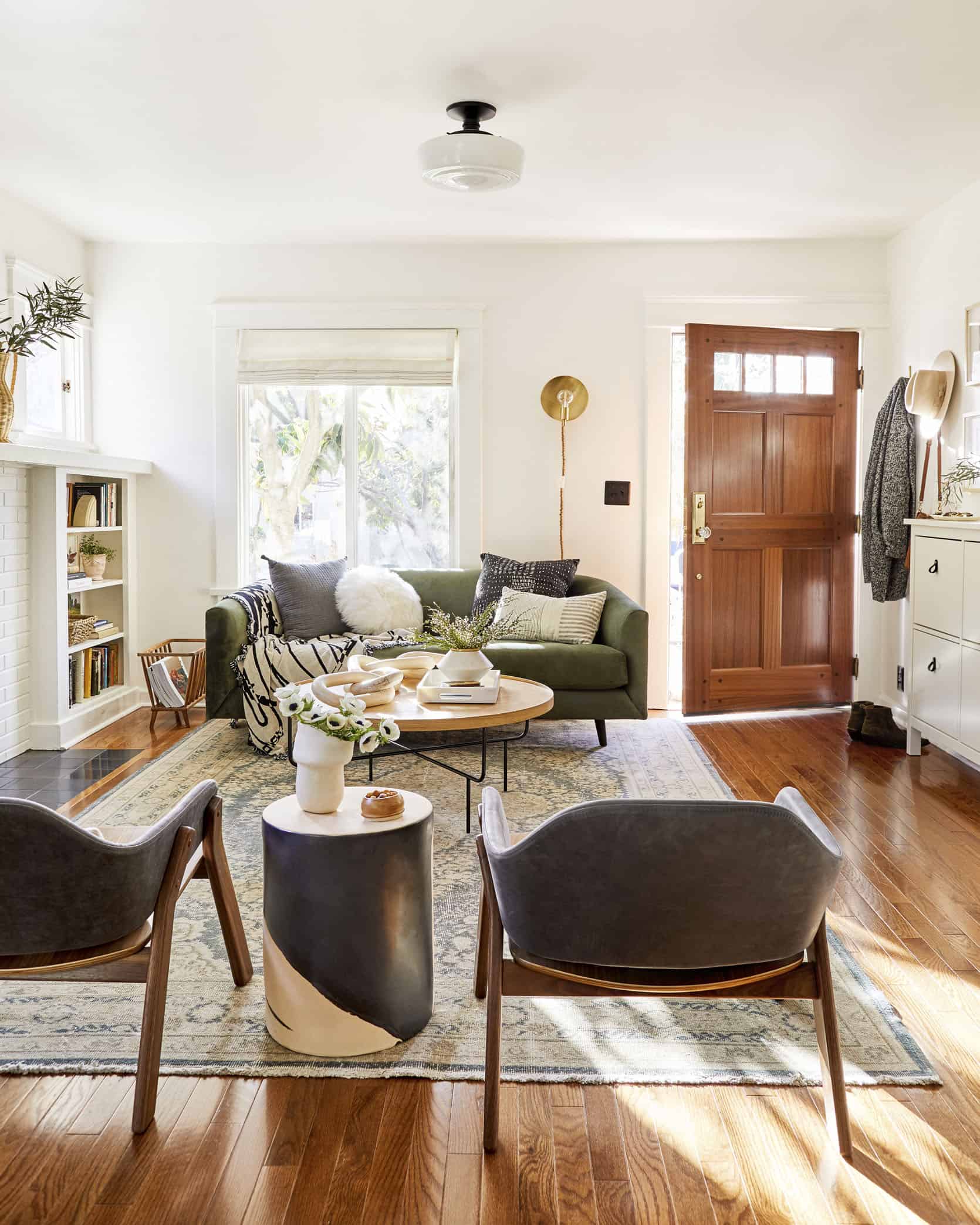
If the opportunity ever presents, I plan to steal their sofa and coffee table. The sofa maybe have been the hardest piece to find because it needed to be narrow, but we didn’t want it to feel like a love seat. When we finally found this sofa (from Clad Home), we knew we couldn’t go back. The shape itself sold us, but the beautiful basil green color really sent it over the top. Combined with the coffee table’s subtle, linear legs (and a rounded shape that helps the room’s flow even more), we can pretty much check off all the design boxes Sara & Mac had: Fresh, traditional, curated, inviting, and sharp.
Sofa’s are one of those things that can be worth going to try out in person, due to their cost and the longevity you want them to have. We had this one custom made (meaning it was already designed, but we selected a size from three options, and picked filling, fabric, and leg wood). Clad Home just happens to have their brick and mortar down the street from our office, so I popped in to test out the different fillings and see the fabric colors in person. But most sofa companies will be willing to send you swatches of the fabrics if you’re ordering online. – Sara

So let’s talk details. How lovely did the Bedrosian tile solution turn out to be? Sleek and modern, but with a classic touch of tile. A slab-effect without actually being slab, pleasing both clients (and the designer).
Another detail that was an incredibly special touch is the seeded glass Sara’s dad used in the mini casement windows to replace the old, clear glass. It basically makes the world outside looks like an oil painting, while also providing privacy. They also replaced the original, rusted hardware with almost identical hand-finished, brass hardware. It’s the small details like these that really help preserve the character of the home.


Wicker Vase | White Fur Pillow |Ceramic Knots | Wicker Baskets
But like any design, the clients themselves are the real “heart” of any space (nahhhh, vintage pieces are the heart. But client details seem to help). Sara and Mac have collected so many pieces of art from friends, family, and flea markets. And Sara is a hobby ceramicist (what doesn’t she do?!), so when it came to styling, they really stepped up with the goods. That, combined with old family photos and piles of polaroids, really show off the people behind it all.
Having all the shelves filled with things that really feel like “us” was super important to me, but I also wanted the shelves to be beautiful. I got a little too carried away with the “beautiful” aspect, and when Mac saw them his first response was “they’re very . . . neutral.” Not exactly the excited response I was looking for, and YEA I was bummed at first. But then I started mixing in more of “us” and realized he was right. In all honesty, these rooms still really represent more of “me.” How could they not? I was the one getting to spend more time shopping and styling, and in a way this house is a part of my portfolio. After the shoot Mac said “I can’t wait to put out more of our stuff,” to which I thought “. . . all my stuff is already out . . .” SO, yes, we’re still working on bringing in more of Mac’s style and STUFF into these rooms. There are a few pieces of his that I made sure to include, like the graphic throw on the couch from one of his favorite design stores. But, this is just a reminder to anyone feeling like they’re struggling to co-design with a partner – it’s a journey, not a one day install. – Sara


Before we leave the living room, there are two more things I want to call out. First up, that wood chain (from Bloomist) on the coffee table. If you are looking for a sculptural statement this is it. It’s not terribly expensive, and it’s probably the #1 thing Sara has been getting compliments on whenever someone comes over. While styling, we wanted to hang this on every wall and lay it on every surface, but we figured you guys might notice. Secondly, one last hack, which is all Sara. That sconce behind the sofa (from Target) is a plug-in, so to make the visible cord more custom & attractive, my very-clever client wrapped it with twine using an old friendship bracelet skill! It was my twine though, so I’d ultimately like the credit.

And now we can follow where our eyes have already fluidly and seamlessly led us – The dining room. Shall we start with a very important piece? The bar cart, obviously. Holder of alcohol, beacon of joy.

Bar Cart (similar)| Framed Tarot Cards
It’s exceptionally hard to go wrong with a hit of brass in a room, and it’s the bright pop of warmth that this corner needed. Above it, Mac selected his favorite Tarot cards from a very attractive deck, which he then mounted onto a piece of matte board and framed in an Ikea frame. Cool art doesn’t have to be expensive.

Dining Table | Dining Chairs (Vintage) | Dining Bench | Ceramic Beads | Rug (Vintage) |Ceiling Fixture | White Bowl | Black Accent Table | Window Treatment
And on the topic of art, long-time readers may recognize the two pieces on the left from Mac and Sara’s former apartment. These pieces survived the fire, coming through with only slightly-charred streaks (which they decided not to cut out, so it would serve as a reminder of how lucky they are). That lovely portrait is a piece Sara stole after we used it while shooting for the book last year. Yes, I’m telling on her… Emily Henderson, did you hear that?

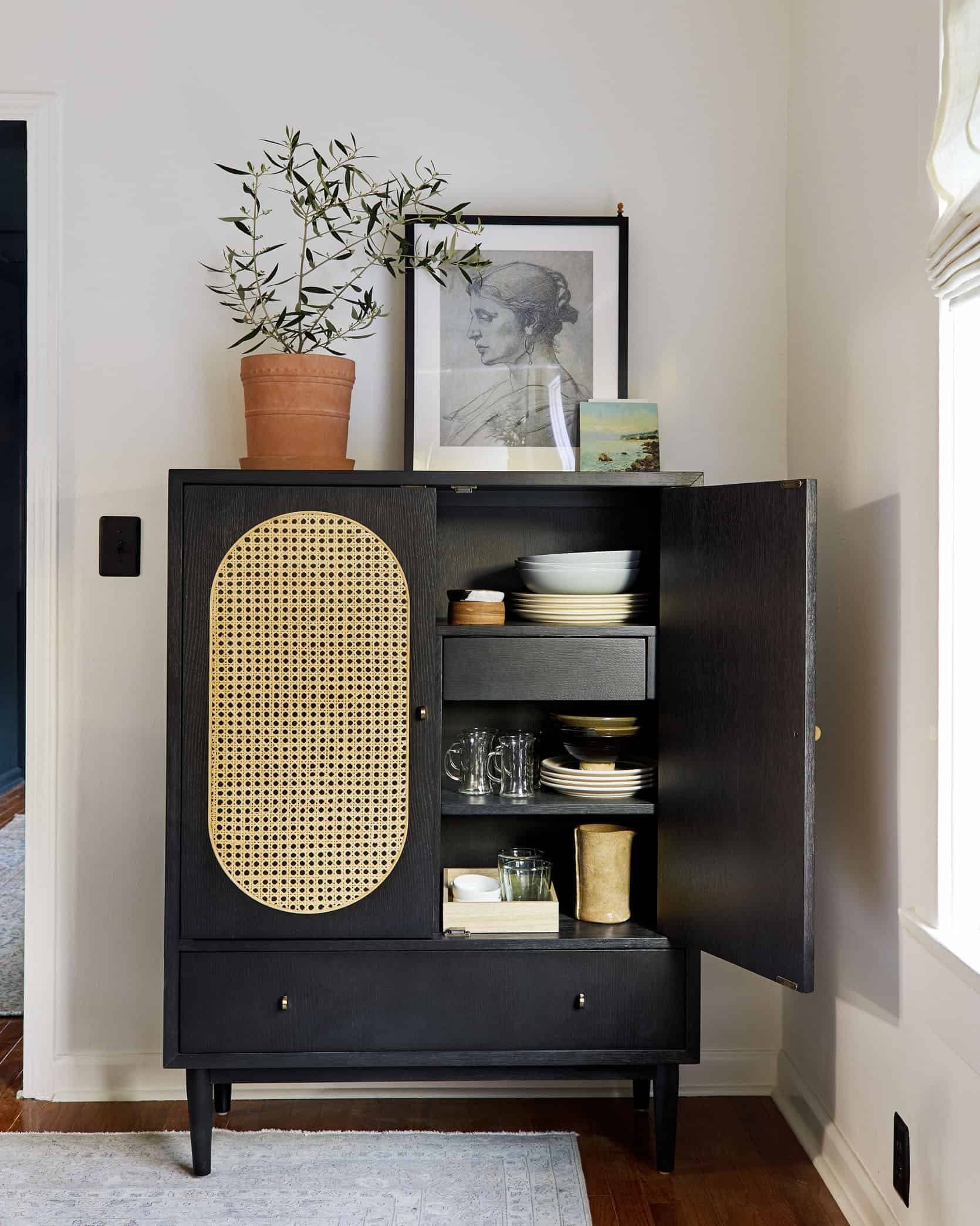
Bar Cabinet | Terracota Pot | Female Portrait | Marble Art Stand
The two pieces that Sara came into the design with were the pendant and a desire for that specific bar cabinet. I was on board for both – the pendant brought a hit of modern that I knew Mac would appreciate, and a bar cabinet is a brilliant piece of furniture that I wish more people would utilize. The storage people, THE STORAGE.
That bar cabinet was the one piece I KNEW I wanted to have in our dining room. I saw it while over at Brady’s apartment one day, and couldn’t get it out of my head since. The cane details were ultra-cool and warm, the brass handles against the black wood were modern, and the storage was unbeatable – I really don’t like our kitchen right now, so having someplace pretty to store our dishware has made me a much happier person. The piece anchors that corner of the room, and helped us decide on the direction for the rest of the pieces. Because it was so modern, but neutral, Velinda picked other pieces that were warmer, more traditional, and vintage to help the space feel balanced. – Sara
One big dining room conundrum the couple had was how to position their dining table, and how big they could go with it. It’s normally just the two of them, but they also wanted to be able to host up to 8 people for serious game nights. The dining table we ended up choosing is 72″ long – which gives them enough space for gaming whether it’s just the two of them, or them plus 6 of their best friends, all while feeling perfectly scaled to the room. I can personally attest after rousing rounds of “Secret Hitler” at out last EHD game night that this table fits eight!
Their dining room is actually quite large by “small home standards,” so we had the clearance to center the table. Which is totally fine to do, despite blocking the door to the TV room (reveal coming tomorrow).
As long as you have a few feet (36” to get technical for you nerds) between the table and nearby wall, object, entry, etc., you are good to go.

But for you non-measurement nerds, let’s talk about this table (from Lulu & Georgia). I LOVE the tone of it and the detail of the legs. There’s no bulk, yet it’s not overly-minimal. It’s warm, but not too saturated for an aiming-to-be neutral space. But being a “new,” purchasable piece, I hoped to pair it with something “old.” And these simplistically-stellar vintage chairs from Amsterdam Modern (which were actually one of the last pieces to fall into place) were perfect. They even have vintage plaques marking the original makers from decades ago.

Details, Friends, details! To divide the “chair, chair, chair, chair, chair” profile that could have dominated the living room and dining room seating arrangement, a bench was implemented. But not just any bench; One with lots of natural texture AND a back. I’m adding this to my list of things to steal. Texture, tone and “curated” pops of black make for a non-bland, and still mostly colorless room.

I’m sure your eye has once again gotten ahead of us. Is that a peek of color beyond? STOP, DON’T LOOK, THAT’S FOR TOMORROW. Never have I vibed with a client’s desires the way I have with this moody, “grandpa’s-smoker-jacket-meets-man-cave-meets-stop-gender-stereotyping” TV room. Pack your cigars, refill your whiskey, we’re diving-in tomorrow.

But before we go dark tomorrow, let me call out that light! And I don’t mean the classically-inspired flush-mount in the living room, though it’s one of my go-tos. I mean natural light. If you’re working with a small (or in this case, narrow) space, don’t forget the sun is your number one source when it comes to “lighting design.” Don’t block it (unless you truly need to). The linen window treatments, from Decorview, throughout the living and dining space let in soft filtered light, even when they’re pulled down for privacy reasons.
They also choose to paint the rooms a warm, soft white (Greek Villa by Sherwin Williams), which really just lets the light bounce around over and over in the prettiest way. If you’re unsure what to do with a room, painting it white is usually a good starting point. Live with it for a bit and then decide. That’s what Sara & Mac did, as Sara had plans to eventually choose a color to paint at least one of these rooms. But they ended up loving how creamy the neutral white (not BRIGHT nor cool white) felt in the space.
Here’s the moment you’ve been waiting for – All the juicy before and afters.


That’s it for now, fellow Ravenclaws (since you all now get the reference, because you read the entire Harry Potter series before you came back and read this post). Meet back here tomorrow, because Sara is going to walk you through that TV room. Don’t forget your favorite scotch and book – we’re about to get in the mood-y. Now I’m going to throw it back to Sara for a few quick words.

THANK YOU VELINDA, you magical, magical human. Before you go, I’d love to roll some credits and send some BIG thank you’s out into the world. First and foremost, a HUGE thank you to Emily Henderson herself for supporting this project and making it a reality. My job here has afforded me endless privileges and opportunities. Secondly, to Velinda for working with us on this project. It’s turned out beautiful, and we’re so happy (Velinda is a freelance designer now, and always excited to work on something new. And for those of you ready to tackle a design project, but not human contact, she offers e-designs!). Thirdly to all the vendors who partnered with us, and who helped us fill our home with so many beautiful pieces that we will take such good care of forever (can’t make any promises about the cats though). And finally, to my family, who did all the hard work, put their sweat and blood into this house, and really helped us turn it into a home. Macauley, you sweet, patient man. You are the best.
OK, that’s it for today. Like Velinda said, come back tomorrow to get cozy in our dark and moody TV room.
But before we get into all of the beautiful products, here is a fun video we recorded a few weeks ago. ENJOY!
[drawattention ID=”228649″]
1. Window Treatment | 2. Ceiling Fixture |3. Brass Wall Sconce | 4. Sofa Fabric Swatch in Belvedere Basil | 5. Front Door | 6. Sofa | 7. Black & White Pillow | 8. Gray Lumbar | 9. White Fur Pillow | 10. Grey Pillow | 11. Black & White Throw | 12. Marble Tray | 13. Rug (similar) | 14. Coffee Table | 15. Ceramic Vase | 16. Large Wood Chain | 17. Wall Hooks | 18. Pleated Lamp Shade | 19. Lamp Base | 20. Rock Vase | 21. Entry Console | 22. Floor Lamp | 23. Lounge Chairs | 24. Accent Lumbar Pillows | 25. Slouching Vase | 26. Female Form Table |27. Mirror | 28. Mantle Art | 29. Wicker Vase | 30. Magazine Rack | 31. Stone Book End | 32. Wicker Baskets
[drawattention ID=”228723″]
1. Yellow Abstract Art |2. White & Black Abstract Art | 3. Terracota Pot | 4. Female Portrait | 5. Marble Art Stand | 6. White Bowl | 7. Ceiling Fixture | 8. Bar Cabinet | 9. Black Accent Table | 10. Ceramic Beads | 11. Framed Tarot Cards | 12. Dining Bench | 13. Rug (similar) | 14. Bar Cart | 15. Dining Table | 16. Dining Chairs (similar)
Catch up on all of Sara’s Makeover Takeover: Sara Buys A House Part I: Six Tips For First Time Home Buyers | The Designing Begins: A Floor Plan Design Agony | The Designing Continues: Time To Pick Furniture | The Final Design Plan | A Fireplace Design Agony | Sara’s Moody TV Room Plan | How Much It Really Costs To Work With A Designer: The Final Tally Of Sara’s Project
Design by Velinda Hellen for EHD
Photos by Sara Ligorria-Tramp


This is absolutely stunning. Looks like a real home that shows the personality of the owners. Just the right balance of modern and vintage. Well done.
Thank you so much Karen xx
Sara, This is so well done. As someone who is also constantly trying to balance the right style with my own partner (sure, boyfriend), I know it can be hard to strike the right note. You have definitely given me inspiration!
GAH thank you
Oh, you guys. It’s beautiful. *wipes away tear*. I had high hopes for this and it did not disappoint!
OH man, thank you so much, that’s what I needed to hear
The narrow plank wood flooring choice surprised me. I just ripped it up in my house and replacing with a wider plank. It just seemed dated vs what I see in more recent interiors. Overall very attractive interior that they will enjoy.
I think it probably depends on size of room. I like it here. Similar to age of the home, I would guess. I’m no pro, though
Hey JB, feeling dated is actually what we were going for, haha. 2 1/4″ solid oak flooring was often the traditional choice for craftsman homes built in the early 1900s (we were actually able to confirm it as the original flooring because we found it as the final layer when we tore up the flooring, but it was sadly too damaged to refinish). We wanted to restore the houses permanent features to be as historically accurate as possible, to help preserve the character of the house.
love that you kept the narrow plank. it fits the style of the home. and aren’t you guys always saying to keep the permanents of the house in line with the age of the home? it’s perfect.
Hopefully you have a newer house, JB. Wide plank would not be age-appropriate in an old craftsman or tudor. I have the originally narrow plank in my 1923 craftsman and I think Sara chose a gorgeous dupe when the original couldn’t be worked with.
OMG, I totally disagree. I love the the narrow strips and am SO HAPPY they chose to remain true to the style of the house instead of shoe-horning in a trendy thing that will look dated in five years.
I love the flooring! I also have an older house and it’s so nice to see design that I love and am inspired by for my home that will suit my beautiful 70+ year old flooring
Absolutely beautiful ❤️
Thank you!
Dear Sara, we bought a house 10 months ago and it also needed ( and still does) a lot of work. We also did most of the initial renovation on our own with my parents help. This was a lot of work an sacrifices but it was totally worth it. We live in the house only couple months but I feel like we were here ages. And every corner ( of lower level so far) have a story from renovation time Congratulations for you for great job done!
P.S. can you please let me know what is the name of your window treatment – I clicked on the link but still cannot find this exact model on the website. I appreciate it. Thank you for sharing!
Agnes, thank you so much for that sweet comment xx It’s so nice to hear from others who are also renovating. As for the window treatments, we didn’t order them online. You can schedule an appointment for someone from Decorview to come to your home, measure your windows, and help you pick what would work best!
Absolutely agree, this is wonderful. It looks like a beautiful, comfortable, well-loved home and so much better in the reveal than in the design layouts, (which I enjoy) that can’t show all the details and personality. It’s so nice to focus on a post that feels “normal,” cheerful and a little break from everything going on in the world.
That’s what we were hoping for xx
This is a gorgeous space! These are my absolute favorite posts. Seeing a real person’s home, their story, their choices…this is the EHD feature I’m always most excited to see. Great job…can’t wait to see the rest!
Thank you Lori!
Very nice, informative piece, thank you! Very comfortable, yet trendy home. A heart warmer for me because it is very similar to our son and his family’s craftsman home in the San Francisco/Bay Area which we would normally be visiting from the East Coast right about now. We are from Northern California but moved across country three years ago. We’ve had a new home built in which the finishing touches are being completed in the next three weeks. Next up is the painting crew, custom kitchen ordering and install, and hardwood flooring install. With the world turned upside down, not sure what will be happening now. Because we live in a remote area and we can all distance from each other and still get painting done, I think that project is still a go. (I believe Sherwin Williams is doing curbside pickup so we are good there.) Waiting to find out this morning on status of the kitchen design service. Two questions, if you don’t mind. My husband is very keen on the house being a continuous white throughout. I’ve also been looking at Sherwin William’s Greek Villa white paint color. However, my kitchen cabinetry will be the exact same… Read more »
I truly hope your home build gets finished!!! These are crazy times. I’m going to let either Velinda or Julie answer your design questions 😉
I audibly gasped when I saw the first photo on Instagram. I love absolutely everything about this and would like to move in today please thanks very much.
Well done well done!
Come on over!
WOW. I’ve been waiting for this reveal and it was SO good. I just spent a ridiculous amount of timing looking at every single detail. 🙂
THANK YOU!!!
LOVE IT! I know you provided the sources for almost EVERYTHING. But just one more? the pot holding the kumquat tree?
We got that at the nursery where we bought the tree!
Such a beautiful space! And such an impressive progression from before to after. Wow. Curious as to why the glass doors were removed from the bookcases flanking the fireplace?
Just a stylistic choice. We removed them to paint, but I liked how open it felt without the doors, and I liked the idea of not having to worry about furniture clearance anytime I wanted to get into the shelves (which is often because we store things we actually use in them like books, cards, and matches).
Stunning!! Also do you happen to have deets on Sarah’s purse hanging in the entry? Looks like the one I may be after… thank you!
Is it from Madewell? 🙂 If so, yes. It’s my favorite purse, when it breaks I’ll buy another. I also have the bigger size for my computer.
Just lovely! Wonderful job!
Thank you xx
Thank you EHD team. Thank you. This is the first time in days I got lost in something beautiful without thinking of the madness around us in the world. This was a feast for the eyes, I could honestly pin every image. These images give me hope for some reason? A reminder that even in these crazy uncertain times we can still dream, and plan and design. I love all of it. And if some dear person could tell me what color stain was done on the flooring that would be lovely.
Ahhhhh thank you Mel. That’s really what we were hoping for with posting today. As for the stain, we bought pre-finished, but the color is “gunstock.”
Looks fabulous and can’t wait to see the tv room.
The female form table is very cool. Though my children would giggle at that until they’re 20.
My husband wouldn’t stand that wooden chain on the coffee table for one second. Ha! Looks good in pictures though
I like the rugs and how the smaller space feels pretty large!
Mac and your husband would be friends, haha. But as long as I keep getting compliments on it, it’s staying.
Really beautiful place. I love seeing small scale interiors like this (given that this is what most of us have if we live in or near large cities, where space is a commodity). I, too, want to know the particular name of the window treatment.
Not sure I like that wood chain as much as the EHD team does. I am a firm believer in saving space on my coffee table for my feet, and it would drive me nuts to have to keep moving that chain. 😉
Haha, it’s 100% a preference. The window treatments are custom roman shades!
can i ask what size rug is in the living room and what is the width of the couch? i’m trying to buy a new rug and am trying to decide between a smaller rug or one that will literally cover the entire living room like carpet.
I’ve been so excited to see the reveal of this room! It looks beautiful. I think I would have defaulted into chair, chair, chair, chair… so thanks for pointing out that bench. It really does make a difference! And now I want to get a bar cabinet for my dining nook!great job all!
Thank you so much!
Love a good dining bench! Find one with a back… far more comfortable!
It’s so beautiful!! ??
Thank you so much!
It’s so beautiful!! ?
Such a well-written, fun read. The finished rooms are spectacular!
Thanks Suz xx
Ditto!
Oooh … I’ve been hanging out for this reveal and it was worth the wait! I’ve had a crazy day today and I just had to check in here (okay, I’m addicted, I’ll admit it!) before bed. It’s now after midnight here in Western Aussieland, so I guess it’s already Friday! Ha! The first thing that made me audibly gasp was that front door. Perfect choice! I was so comforted by all the little personal details that show this is someone’s home, not just a house, as well as purrrfect kitty! It is certainly curated and speaks volumes for Velinda’s guidance. The dining bench is genius. We live in an Aussie version of a Craftsman, only when we restored our “Old Lady”, we couldn’t knock out walls, because most houses on the west coast are brick. The only room we renovated was the bathroom … seriously, there was no toilet in the house, only the old “dunny” as we Aussies call them, in the back yard! Noooo way was I creeping outside in the dark! I’ve been looking forward to replacing the “new” 1950s kitchen with a functional one, but Coronavirus has screeched that to a halt, so I’ll be… Read more »
Thanks, Rusty! Loved reading your feedback.
Fabtastic. I LOVE THIS. Great job!!! Giving me some inspiration to get off the couch.
Finally! I’ve been coming back all week for this when it was teased last week. Love everything about it, especially the mix of new + vintage and across the price spectrum, which makes it beautiful without feeling out of reach. Nicely done, and best wishes to Sara and Mac in their new space.
Thanks so much, Erin!
Thank you!
Love the personality of the space. It feels layered and considered– which is tough in such a short time (though I bet it feels like forever living through the renovations!!). If you haven’t already, you have to print out that photo of you, Mac, and your cat. So frame-worthy.
I completely agree!
FOR. EVER.
Just want to say, haven’t even read this yet, when I typed in the website and saw that this was today’s post on the home page I was like YEEEEES!!!! 😀 I hope you are also enjoying your Downton tv room during this quarantine time.
love to you all
Hahaha, thank you!
It’s gorgeous, of course. I just came here to say that I will REALLY miss Velinda’s writing voice on this blog. Such a delight.
Awww, thanks, Caitlin. I’ll be popping in. Appreciate your thoughtful response!
It ‘s very beautiful! Thanks for sharing.
Thanks for reading!
Yeah, Ravenclaw! Whoop, whoop! Also the space looks amazing. Nicely done.
Two points for Ravenclaw!
3 points for Ravenclaw!
YYYYYYEEEESSSSS!!!
MY HOUSE. MY POINTS. *Gryffindor eyes narrow*
I’ve been looking forward to this reveal! The space looks fantastic, so well designed 🙂
Thank you!
WOW great work!!!
LOVE this so much! The bar cabinet, the diy cord with the sconce, the woman’s figure side table, that dining room pendant…. I am dying. Velinda, Sara, so stunning! <3
They are TRULY the dream team
Gah, thank you so much xx
Don’t mind me! I’ll just be over here pinning every…single…image. It’s stunning, team!
So flattering, Kelcey. Thank you!!
Yes! Thank you!
Congratulations! I agree with all the wonderful comments. So well done. Really fun, light-filled, creative, and personal. Enjoy! Please consider a plant/tree caddy, or some pot feet, under your orange tree. Your gorgeous floor will thank you.
Consider it considered (seriously)
Thanks for such a fun and beautiful distraction today. It felt great to get absorbed in something fun! I noticed you chose black outlet and light switch covers, instead of white. I’d love to hear your stylistic thought process about choosing to go dark and have them pop, rather than go white and have them blend in. Such a beautiful space, thanks again for sharing!
It was something we had done in our last apartment to bring a touch of modern, and we just really liked it!
I’ve been so excited to see this, and it’s gorgeous! Velinda and Sara, you guys knocked it out of the park. (And the door was well worth the splurge.)
they totally killed it!! thanks for the love, Jen!
Curious: I have always called IRL shops brick and mortar (not motor). Is this a regional thing since Cali is so car-centric?
Hahahahahhahahahah, no. It’s a typo.
GORGEOUS!
Love all of it, beautiful work, beautiful home.
Thank you!
Velinda did an outstanding job on this! Brava!
She really did!
Oh my goodness, this turned out beautifully! I would want to work from home all the time in a space like this. BRAVA, Velinda!
xxxxx Thank you!
You all (together) did a magnificent job! I love it all! Obviously a lot of thought and consideration went into it- and you pulled it together so successfully. I’ve been reading along so I know how much effort went into getting to this result. And, from what I can see as I peek- tomorrow will also be a very exciting reveal. I really like seeing the dark moodiness looking from the bright and cheerful LR/DR.
Thanks, Roberta. Can’t wait to show you tomorrow’s reveal!
Oh my gosh–so beautiful!! I looked at the site this morning and saw what today’s post was but decided to save it for later when I could have time to really go through all these lovely details. What a fantastic space!! We have a long, narrow room too, and I’m sure I’ll be pushing around furniture soon in response to this layout inspiration. 🙂 Wonderful work, team!
Lastly, I thought someone had been watching “Princess Bride” with the “despicable” reference. Guess that’s just me. 🙂
Okay, my fifteen-year-old really does know it all. “It’s ‘inconceivable’ Mom!”
AAAAHAHAHAH. Definitely laughing now. (and this is why I don’t have kids ;))
I love this space! You made amazing choices in the decor selections for your home. I’ve been waiting for this reveal and as someone who lives in “shelter in place’ San Francisco the timing today was perfect.
I went a little houseplant crazy last year, and have a question / comment on the plant growing the corner of your living room. I think it is real judging from the soil line on the pot, but if not then never mind the following comment. I know you get a lot of natural light, but since the plant appears to be growing fruit (?) is it getting enough light? I know plants like that probably need a lot of direct sunlight. If it needs more light to thrive, I’ve heard about a product that is highly recommended. It is the aspect light from Soltech solutions. I personally don’t have one but have heard great things. I’d image the white one would unobtrusively give the plant the light it needs.
Yes, it’s real. And right now, I’ve moved it outside to get the air and sunlight it needs (we’ve placed a little stool with a smaller indoor plant on it in the space for the time being). But it’ll come back in for bigger parties, because it’s such a pretty friend.
Sara! Lucky you, so stunning, Velinda, wow, such a great design! I absolutely love it.
Thanks so much for your kind words!
Wow, looks absolutely amazing, love what you have done with the place. Looks so bright and inspirational x
Thank you!
Great post, love what you have done with the place, so inspirational x
Incredible post! Also love that just about everything was linked, and many of them very affordable!
So glad you liked it!
Dear Sara, I was wondering where u got the wood planter that u have sitting on the shelf by the fireplace. I passed one up that looked allot like it at home goods. I absolutely love your style and thought your renovations were beautiful!!!!
Ahhh I can’t figure out which wood planter you mean!