


Welcome to the Portland formal dining room reveal. It’s big, bright and can be seen from most of the rooms on the main floor. Although I say this for just about every room reveal that we’ve done (if you’re just joining us after being a little MIA, you might have missed the big living room, entryway, office, kitchen and master bedroom and bathroom reveals so far), I really love this room. It is so bright, happy and is somewhere that I would love having family dinners (or generally just hanging out in).
When we were shooting all of the content up at the house, I found myself here a lot, whether writing, planning or just chatting. It’s an inviting room with amazing light, and one that makes me happy. There are so many elements that I love and although the room feels sophisticated and formal (like a true formal dining room), it is still casual enough that it doesn’t feel stuffy.
So how did we do it? Today, we’re breaking down all the key elements that we brought into this room to help it feel upscale and sophisticated while still keeping it interesting and casual…and how you can do the same in your own home.

Wallpaper:
Let’s start with that insanely beautiful wallpaper from Rebecca Atwood. It is the Mixed Stripe in Blue-Slate. When we were designing this room, we toyed around with quite a few different patterns for the wall but landed on this one and I am so glad that we did. Because this room is directly off the living room and can be seen from the front door as well as the family room and kitchen, it needed to have something that was interesting on the walls but did not scream “look at me.” An Oscar-winning supporting role but not a leading lady with an overly dramatic death scene. Impactful but not over the top. You get it.
So to give the walls some interest, we brought in a bold paper done in a quiet color. If we had done the same wallpaper in a more dramatic colorway, it would have read busy, which wasn’t what we were going for here. The pattern helps to move the eye around the room, while the tonal blueish-gray color doesn’t compete with all that beautiful woodwork from Metrie on the bottom half of the walls.

Mixing Wood Tones:
Take a look at the picture below and you’ll see that there are a lot of different wood tones in this room and yet it all seems to work well together. The table is a dark raw edge wood, the chairs are a stained ebony wood, the Thos. Moser credenza is a walnut color and the side chairs in the corner of the room are a blonde wood, oh and don’t forget the flooring below. People often get scared when mixing wood tones but our rule is as long as they fit within the same tonal family, and have a similar finish (aka none that are crazy shiny next to one that is super rustic) they can work together in the room. For example, if you were to mix cherry wood with a honey oak with a warm walnut, then things might start looking chaotic and random but when you mix woods of varying color within the same tonal family, they all complement each other rather than work against each other. Here, all our woods are on the warmer side of the spectrum and the black wood on the chairs still works because of the black in the window frames. The different wood tones help to bring interest and energy to the room and also give it the warmth that we wanted with the walls and ceiling being mostly white and gray.

Organic vs Refined:
While we are on the subject of wood, let’s take a moment to talk about the two big wood pieces in the room. This credenza (from Thos. Moser) on the back wall is a piece that we all loved so much that we wanted it to really have an important spot in the home. We originally had it planned to go in the entry on the hallway wall that leads to the family room, but, as we love to do, we played around with it in a few different areas and ended up loving how perfectly it worked in the dining room. The craftsmanship, detail and design of this piece is pretty incredible (as is the same for all Thos. Moser pieces—we used more in the living room and master bedroom). The height of it worked perfectly in the room (one of our dining room design rules is that your credenza/buffet should be the same height as your table, but ideally higher, so…check), and set against the wall paneling flanked by two Rejuvenation sconces gave us a perfect focal point between the windows from Milgard. I seriously think that of all the pieces in the house that I would want to steal it would be that credenza. It’s stunning.


For the staging, we styled the credenza with a few more wood pieces (again to play with the mixing of woods in the rest of the room) as well as the beautiful black vase made by Bobbie Specker (of which I bought :)). More of her work is available through Mantel which is a local PDX store that Brady and the crew sourced so many beautiful pieces from for the shoot (we also wrote about it in our Portland design-lovers guide post here). I was unfortunately out of town when they visited the store but I ended up buying so much of it to take home with me to LA (including this vase) that I still consider it a major win. Above the credenza, we knew we wanted a piece of art but it needed to be something that was tonal as to not compete with the wallpaper and also not too formal or serious. These two pieces from MaryAnn Puls were the perfect pair—they are still available for purchase through her website if you are interested in them. I bought a lot of her work, but not these because I had to stop somewhere, so go for it.
This is a picture that I will never get sick of looking at. We had to have four people help us move out the dining table in order to get this straight on shot but it was worth it.

To contrast with the refined nature of the credenza, we brought in this massive live edge table from City Home which gave us our “raw” element. When I say massive, I mean it. The table is almost 4-feet wide and over 8-feet long but we still could have gone bigger in the space if we wanted to. I love the way that it brings the outdoors in with its live edge—it is Portland after all, just look out the windows, while still feeling refined enough to work in a formal dining room. The base of the table is black iron which helped everything in the room feel a bit more graphic and edgy. If it had been a brass or wood base then the room could have read too formal but the modern base helps to modernize the rest of the room. I also love how much it speaks to the beautiful windows and doors from Milgard in this picture. The black in the room really helps give the room that graphic and modern punch it needs to feel “cool” but still sophisticated.

To edge it up a bit more, we brought in the black chairs rather than use a brown wood tone. With the wood floors, the wood table and the wood credenza, we wanted a chair that would pop and also felt modern in the room. These chairs from Room and Board were the perfect option. They have a slight mid-century bent to them but work perfectly with some of the traditional elements that are happening elsewhere in the room.
Let’s talk for a moment about cushion vs. no cushion in a dining room. I will always be a fan of having a cushion on a dining room chair because well, cushions are comfy and comfy chairs make for good, long dinner parties (which is only a good thing if you actually like the people you’re dining with). But on the other hand, they also may not be the most practical with kids that could smear peanut butter and jam all over. The textured gray fabric on these is the perfect solution to get the cushion while having a fabric that can help to hide stains and use. The gray also ties in the slate blue from the wallpaper to bring in that middle tone between black and white. Oh, and if you are wondering about the comfort of these chairs, I give them 15 very comfortable stars. I was (and am) very tempted to get a set of these for our home in LA as they come in a handful of color and fabric options and are extremely comfortable and practical. They are shaped perfectly for your back and ergonomic.

We love to mix and match styles and the same goes for types of wood over here. Having a combo of both refined and organic woods in the space allows the room to feel more collected and also not too rustic (raw) or polished (refined).
Simple Yet Impactful Styling Moments:
Now let’s take a moment to talk about what is happening on top of the table. We get this question all the time: “How do you style your formal dining table when it is not set for a dinner?” While there are a lot of different ways to do this that could work for this space, we wanted the room to feel both high end but special so we chose to go the route of an object—a vase—and then repeated it over and over in various shapes and sizes down the center of the table.
Hot tip: I use this rule in design, decorating and styling all the time. “Repeat multiples of something to create a large impact,” in this case, the sculptural vases and vessels.


Had we used different colors or styles, it could have looked thrifted or too collected, but because we stuck to one material and similar shapes, it feels instead like an intentional collection and gives you a big impact with a small amount of work/fuss. Would I recommend this setup if you had kids in the house? Probably not due to the fact that their little hands could knock one of those down like pins in a bowling alley, but since we were styling the home to stage and sell, we wanted to give the table a special moment. It also gave us a chance to highlight the gorgeous work of Bobbie Specker (who also made the vase on the credenza that I took back to LA with me).

The black vessel ties in with the vases on the table, and the candlesticks (by Bosque Design via Mantel) and bowl (by Elise McLauchlan via Mantel) introduce new shapes but in wood tones already present in the room.
In the corners of the room, we had extra space so we styled them out with side chairs from Structube that are insanely affordable (under $250 each I believe) and bring in a new silhouette. Plus, the wood arms bring in another wood tone and the neutral gray fabric speaks to the dining chairs and wallpaper. Do you see a theme going on here of introducing new elements but keeping things tonally within the same family to create interest while still helping it feel upscale?

Statement Lighting:
We have a big post we are working on about how to pull together a lighting plan for the entire home and trust me it is a lot to think about so we really want to dissect it for you in a post but let’s for a moment talk about how we did it in the dining room and why it works. In this room, we went with all brass hardware for the lighting. We could have mixed brass with another metal and it could have worked (like we did in the kitchen with the hardware and fixtures) but this was a formal dining room and therefore we wanted to keep it feeling high-end and refined. Let’s start with the large chandelier over the table.
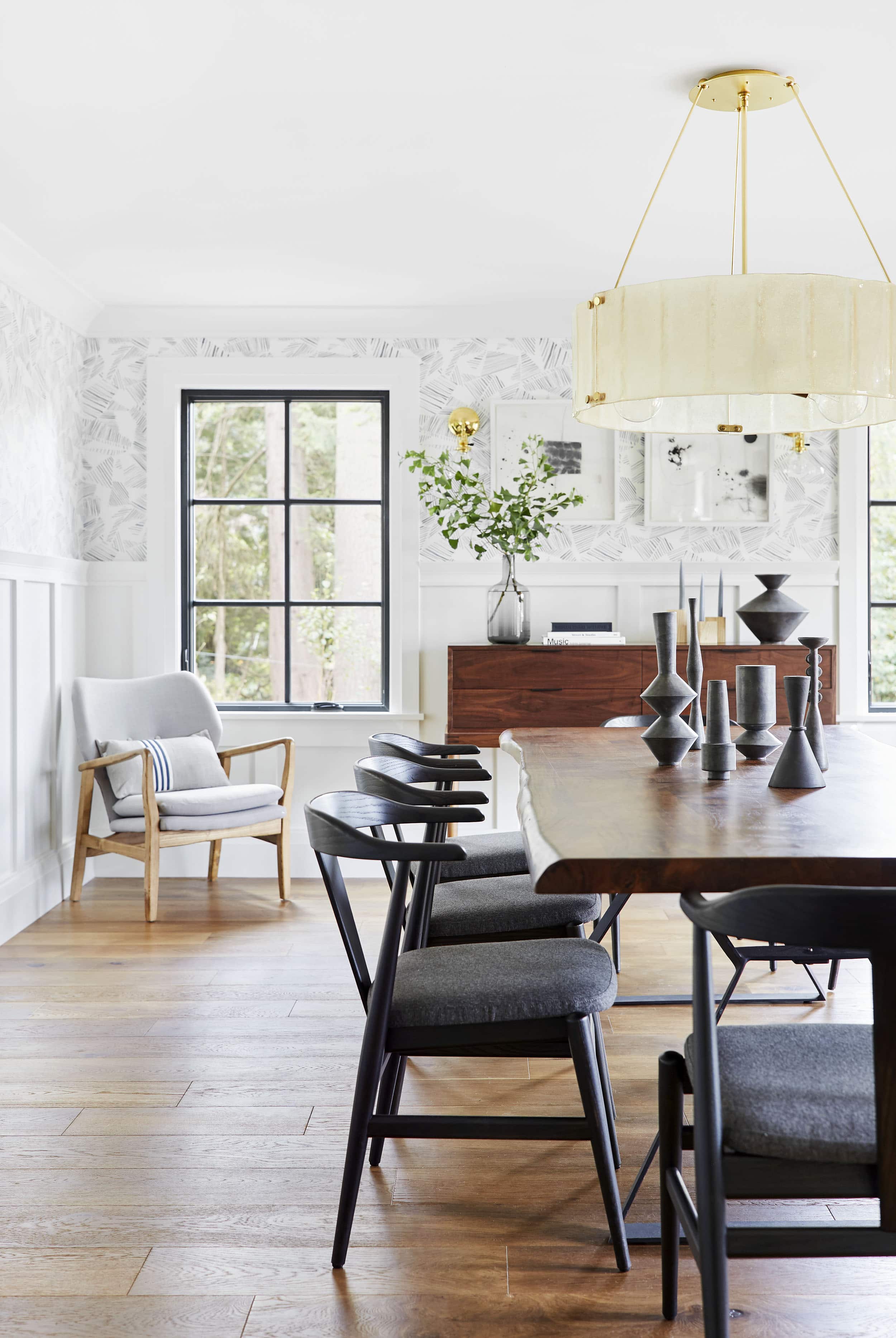
The chandelier (as well as all the lighting) is from Rejuvenation and this piece is what we call a total statement piece. It really commands the room but in a soft and subtle way. Because we have the wallpaper, the woodwork and all the lines happening on the windows and doors, we wanted a chandelier that read more like one large visual mass than a piece with a lot of different arms or details. The warmer tones in the glass help to balance out the warmth that is happening on the floor and the brass reads refined and elegant. The glass shade gives off a nice diffused light and really lights up the room in a special way. Behind the chandelier, we added two sconces to frame out that wall and create a focal wall for the dining room. If you stand at the end of this room and look straight down, you see the chandelier framed by these two brass sconces and it really invites you into the room. It says “Please, come to my dinner party—it will be lovely, comfortable, well lit and very enjoyable…and there will be soup.”


The sconces have a slight “classic schoolhouse” lean to them which ties into the PDX vibe and lighting in the rest of the home but the clear glass and the polished brass finish elevate it and help it from feeling too utilitarian.
On the opposite side of the room in our dry bar niches, we hung the Small Ignis pendant (from Rejuvenation) above each. The glass shade ties in with the glass shade on the sconces and the polished brass again ties in with the finishes on the sconces. Now that is an area that I want to shake up a cocktail in.

Creating Special Custom Moments:
Speaking of cocktails, let’s talk about these dry bars. When we designed the room, we had two little niches in the dining room which became the perfect area to add some built-in cabinetry and create a spot that would work as a bar and to hold platters and other “entertaining” tabletop items. We used the same cabinetry profile from the kitchen (by Crestwood Inc.) on the doors here as well as the same hardware finish. This was done so that when you look into the kitchen from the dining room, you don’t see two different styles of cabinetry. They speak to each other while still feeling unique. The Elroy brass hardware (from Rejuvenation) visually reads as similar to the kitchen but is slightly different, while the brass finish ties into the chandelier.
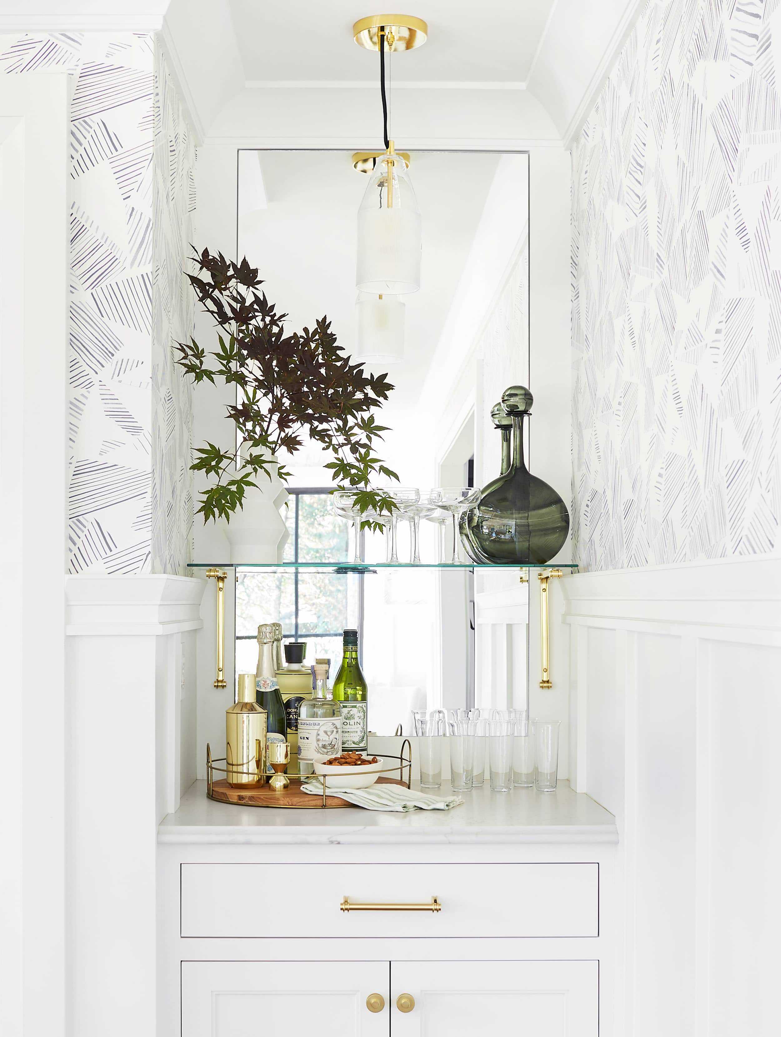
We styled it out as a help yourself cocktail bar and boy do I want to help myself to some almonds and a cold G&T at that little niche.
To bounce the light from the opposite side of the room, we also added these mirrors to the back of the dry bar. It gives such a beautiful reflection when you are standing in that corner of the room and also helps to expand the corner and make it feel larger.

On the countertops, we used the Ella Matte from Cambria which is a material that is not only extremely stain resistant and user-/family-friendly but in this little niche looks like a natural stone. We used the same material in the mudroom (reveal is coming soon) but it works perfectly in these little niches and also will prevent your guests from staining your countertops when they come back for their 3rd/4th glass of red wine. (I also used their product on my counters in the kitchen of the mountain house).

Incorporate Elements From Other Rooms to Tie It All Together:
Although this room is located in the back of the house, it can be seen as soon as you walk through the front door as it opens up into the living room, kitchen and family room. Basically, just about every room on the main floor. So although we wanted it to feel special and unique, we needed to bring in elements from the other rooms to help tie it all together and not feel like you were in a totally different house as soon as you walked into this room.

We spoke about bringing in the same cabinet profile from the kitchen which ties it together with that room but we also wanted to pull elements out from the dining room into the other rooms. This was done in the family room which you see in the distance here where we pulled a tone from the wallpaper into this sofa (from Lulu and Georgia). The tones, although slightly different, speak to each other and help the rooms feel unified. You’ll also notice the hits of black in the dining chairs that are echoed in the barstools in the kitchen as well as the art on the family room wall. When you have rooms like this that open into each other, you really want to make sure that you work unifying elements into each room so that it speaks together even though they aren’t the same room. That might be a good topic for a blog post (unifying adjacent rooms with design and how to do it?) Is that something that you guys would be interested in?

From this angle, you can also see how we used the black accents in both the living and dining room and the brushed brass (in the living room lamp) is the same brushed brass that is in the dining room chandelier. They speak with one another and help both of the rooms to compliment each other in a subtle yet impactful way.
So there you have it. The dining room reveal. We wanted to create something that was special, unique and interesting while still feeling sophisticated and high end, and I think we did it with this room. As always, we put together a get the look with all the items in the room, and let us know if you have any questions on any specifics.
[drawattention ID=”176543″]
1. French Doors by Milgard | 2. Door Handles by Milgard | 3. Black Vessels by Bobbie Specker via Mantel | 4. Dining Table by City Home | 5. Chandelier by Rejuvenation | 6. Dining Chair by Room & Board | 7. Wallpaper by Rebecca Atwood | 8. Abstract Art by MaryAnn Puls | 9. Smoke Glass Vase | 10. Sideboard by Thos. Moser | 11. Wooden Bowl by Elise McLauchlan via Mantel | 12. Black Vessel by Bobbie Specker via Mantel | 13. Candlesticks by Bosque Design | 14. Wall Sconce by Rejuvenation | 15. Windows by Milgard | 16. Striped Pillow by Jillian Rene Decor | 17. Armchair by Structube | 18. Blue and White Pillow | 19. Pendant Light by Rejuvenation | 20. Brass Ice Bucket | 21. Wooden Tray by Schoolhouse | 22. Textured Pitcher | 23. Decanter | 24. Glass Pitcher | 25. White Vase | 26. Champagne Coup | 27. Green Bottle by Gary Bodker via Mantel | 28. Green and White Dish Towel | 29. Brass Shaker | 30. Gray Glass | 31. White Ceramic Bowl by Rejuvenation | 32. Champagne Flute | 33. Round Wood and Wire Tray | 34. Brass Jigger | 35. Ella Marble from Cambria | 36. Wood Flooring by Hallmark Floors | 37. Pure White by Sherwin-Williams | 38. Crown Moulding by Metrie | 39. Door and Window Casing by Metrie | 40. Architrave by Metrie | 41. Baseboard by Metrie | 42. Shelf Brackets by Rejuvenation | 43. Cabinet Knob by Rejuvenation | 44. 6″ Drawer Pull by Rejuvenation
Outfit details: Printed Blazer and Pants by Wildfang | Shoes (similar) | Blue Blazer by Wildfang
***Photography by Sara Tramp for EHD
***Design and styling by Emily Henderson and Brady Tolbert (and team). The wonderful JP Macy of Sierra Custom Homes was the General Contractor, and Annie Usher was the architect.
For more room reveals, inspiration, how-tos and shopping roundups, head to our BRAND NEW Rooms page.
For more Portland Project Room Reveals: Living Room | Staircase | Office | Master Bedroom | Master Bathroom | Kitchen | Powder Bathroom | Guest Bathroom | Hall Bathroom | Laundry Room | Guest Bedrooms | Media Room | Family Room | Playroom


It might just be my phone being glitchy, but I’ve noticed recently it’s difficult to pin images from your posts. The Pinterest icon has disappeared, so was wondering if that was a choice and not just an app glitch. Thanks.
I’ve been having the same problem too! I just tend to screen shot the images I like. It would be great to be able to seamlessly pin from here though!
I would definitely be interested in a blog post about how to unify adjacent rooms with design! It’s hard to wrap my mind around designing for more open spaces but with different areas having different functions so you want to distinguish them but not too much either.
Me too!
Oh yes, me too, forgot to say that in my comment!
Yes! Please do a post on unifying different rooms in a home… this is currently my biggest challenge in our house!
Yes please on unifying rooms. So many designs are open floor plans so to have distinction and cohesion is so challenging!
Me too! I have one big family, dining/formal, and entry/office 🙂
Me too!
Beautiful. But tonal really confuses me. That is one of those color concepts I just don’t get.
Each new room revealed from this project becomes my favorite. I’d gladly linger for hours at this table. You and your team knocked this whole house out of the park! Keep up the great work EHD team!
My Favorite part is the St George spirits gin! Mmmm
Beautiful dining room! Not sure I understand chairs in corners though. Do you imagine they’ll ever be used? Any idea for other “corner fillers”? I seem to always use plants. (Boring. ??)
Master class in formal but approachable design. I can envision sitting at this table with friends/family for hours. Bravo!
Question – didn’t see any mention for window coverings. During the evening, windows can look like black boxes and not in a good way. How would you solve for that?
What a beautifully done room – particularly impressed by the cohesion you’ve created within the rooms without simply copying elements. It’s hard to make this sort of open space flow and still come off as elegant and unique!
Meanwhile, I am having mountain house withdrawals over here – probably all that stuff you’ve been imagining is actually being installed right now, and that’s not the stuff of pretty pictures, but man I want to see what’s progressing! Looking forward to the next update 🙂
Can you also reveal where your amazing suit is from!?
All the outfit details are linked up in the bottom of the post but it is all from Wildfang. xx Brady
Absolutely stunning! This is one of my favorite designs! Love the modern mid century style.
That credenza gives me heart palpitations. It is WAY outside of my budget, but if I ever win the lottery, I’m coming for it.
Also: “That might be a good topic for a blog post (unifying adjacent rooms with design and how to do it?) Is that something that you guys would be interested in?” Yes please! I think I have done an OK job on it, but I know my house could really use some improvement.
Really beautiful. I am obsessed with that chandelier and the way the chairs tie in with the windows.
Beautiful dining room! But sorry to say, not loving that chandelier at all for this room.
I love it, but why no window treatments? Even though the house is set back from the road and may not be visible to other homes, I’m a total scaredy-cat about someone being able to see in at night when I can’t see them (I’ve been at home when someone tried to break in before, so I’m admittedly paranoid about this kind of stuff). What would you suggest if the new owner wanted recommendations? Same Roman shades as the living room?
Is it weird that I wish you had sold your LA house and mountain house and move here instead? I feel like this is the most perfect Emily house ever and you would be near your family.
Is the Willamette chandelier you used over the dining table the 24” size or the 32”?
Thanks!
It is the 32″ size!
xx Brady
Great post. Beautiful dining room. The only thing that doesn’t work for me are the chairs in the corners. Yes they fill the corners but to what purpose? Someone says they always use plants, but suggests they are boring. I agree wholeheartedly that those corners need a tall plant or another decorative element, which would in no way be boring! As beautiful as all the elements are and how lovely they work together, the room seems kind of flat to me, which in my opinion would be rectified by some sculptural greenery.
So gorgeous. I love the bold wallpaper and that Moser credenza is so stunning. The only thing that I wish was different is the black dining chairs. I think there is so much modern happening in here already (and different colors of wood) that an upholstered chair in a grey tone (like the color of the seat) would have been quieter and more cohesive. That being said, I wouldn’t decline an invite to dinner here! Excellent work.
Love! Everything about this room! And I just gotta say, how many outfits did you bring to Portland? ?
Pro tip: I have previously purchased one of those gray chairs (#17) at Home Goods for only $150!
Absolutely beautiful…especially love the wallpaper!
Did you talk about a big rug for under the table with your design team…or stray from the idea because of food spilling, etc.
Love this room and I must say love love love what you are wearing!
Super beautiful. Love the wallpaper and those dining chairs. The only thing I see is the right art print above the buffet needs to be shifted up a smidge and to the left.
I’ve been eyeing that wallpaper for months now. I love how it turned out in your room and I think it’s just about perfecto! I am always working on finding that fresh mix which is between too subtle and your “scream at me” comment. It’s not a very easy place to find but you manage it a LOT! (I think we might have different budgets, though!). Very nice room. 100.
Hi Em, Just gonna say it, I am “totally in LOVE ” with this dining room! I’ve been admiring and studying each carefully chosen piece of furniture and accessory as well as their placements and grouping…genius! I adore the Thos. Moser credenza, it sets the stage for the entire room. The Room and Board dining chairs…I cannot think of a more perfect chair to put up at that gorgeous live edge dining room table. Just yesterday, I ordered some fabulous Rebecca Atwood wallpaper for our “kitchen entry”, (coincidence or oddly random?) the paper you chose for this room is stellar and I’ve not yet raved about the vases, lighting, etc. You know what I love the most about this room? It is signature Emily Henderson. Your incredible ability to mix and match every appointment in a room, creating a seamless, comfortable, inviting space shines brilliantly in this dining room. Thank you, what a treat!
🙂 Not to detract from all of this fabulousness, but you look amazing and fun (I think looking fun is important!) in the printed blazer and pants at the top of this post.
Beautiful house! Did it sell?
Beautiful room and this entire house has been so beautifully done! I was wondering about the room layout – how/why did you decide to put the sitting area in between the kitchen and dining room? It seems like the dining room and sitting room could be interchangable when they are all open to each other in a row like that and I think most people would usually put the dining room closer to the kitchen? Just curious if there were structural factors or something else that went into that decision. Maybe you can talk about this in the sitting room reveal?! Thanks
Another stunner! This room feels inviting but also original. The sideboard is beyond but so minimal. I love the black chairs and it all comes together so well, with that extra touch of glam that’s especially fitting in a formal dining room. Again the art and sculptural pieces really bring it!
Love: chandelier, sconces, WALLPAPER, artwork, windows, French door, dining chairs!!
I wish there was a bit more color in this room though, and maybe more soft textures— I’m missing a colored seat cushion that maybe blends the kitchen green and the living room blue, window treatments or a rug. I just feel like this room would be really echo-y.
I’m not a huge fan of the vases on the table, I think some living element like flowers would have been nice, and I can’t say that I love the chairs in the corner.
BUT, the bar niches are absolutely stunning, and I loved your comments about the coherency running through the house.
Keep on keeping on, EHD. Love your work.
Love the room and I knew those were Bobbie Specker vessels as soon as I saw them. I discovered her shop after a Forest Park hike one Saturday morning when I was living in Portland. I bought over a dozen of her pieces and used them in my own home and my staging business. Beautiful work and such a lovely woman.
This room makes my heart skip a beat. Perfect!!
This has been a wonderful project to see trickling out bit by bit. Photography is particularly amazing. Great work
I *LOVE* this room. You’re making me want to move back to Portland and get a bungalow to re-do (I know your house is far from “bungalow”).
Please tell me why your Rejuvination chandelier looks amazing and the one they have when I follow the light looks…not amazing, almost cheap. I want a round light for our dining room, we have a similar sized table, and I can’t stand seeing lightbulbs. The Edison bulb craze is really making it hard for me. Yours looks like opaque glass and on their website it looks much more clear.
Agree with those saying the corner chairs would have been better replaced with plants. Also I really hate the dining table styling… I know it’s a matter of personal taste but those black pointy things just seem so bleak. Even if you weren’t styling the table for a dinner setting, perhaps a centre floral arrangement with gorgeous native flowers would have softened it a bit.
Otherwise, a lovely room. The lighting in particular is gorgeous, and the two little niches are delightful. The credenza gives me a modernised French Provincial vibe with its long spindly legs – perhaps because of the paneling behind it? The EHD design and attention to detail is as usual impeccable.
Definitely case study in approachable #elegance. I’ve been intrigued by that wallpaper & appreciate how it brings life into the room. I agree was another poster that sculptural plants in the corners would also feel great.
Emily, now we’re waiting with baited breath for that post on designing for adjacent rooms!
This is so beautiful! I’ve been working on a lighting plan for my new house and have been wondering if sconces and a chandelier would be sufficient for our teeny dining room, so this gives me hope. Our other complications are that the ceiling is wood (kind of a grey-ish stain) and there is a structural beam right down the middle of the room. Oof!
“That might be a good topic for a blog post (unifying adjacent rooms with design and how to do it?) Is that something that you guys would be interested in?”
How about just unifying design in general? I want to buy a place that has separate, distinct rooms with doors, because that is functionally good for my family. I have pretty clear ideas on colors and materials I want to use in each room, but haven’t figured out the central hallway or how to make it clear that you’re still in the same house, even though each room has its own color and character.
I’m with you!
I like the quiet neutral pallet. It lets the dining room recede from consciousness when it isn’t being used, and can support nearly any color/style of place setting, etc. I love the way dining rooms can take on a whole new feel based on the centerpiece and dishes used.
Please do a post about how to unify adjacent rooms with design! I live in a flat with an open kitchen to the living/diningroom, where the bedroom is also visible. I would be especially interested in how and where to hang art when it is visible from everywhere.
On the contrary to some people I like the side chairs in the corners. I think they could be functional at dinner parties not to sit but to put handbags or sweaters on them.
Yes please to the unifying adjacent rooms with design and how to do it post!!! Gorgeous room.
I have been loving all the Portland reveals- the amount of thought and design that went into that house, it’s incredible.
And SIDENOTE: The styling on Emily herselfis top notch as well. Loving all the looks you’re wearing in these! I just bought that Wildfang suit because it is so fantastic, so thanks for the hot tip!
Love the dry bars!
The room is actually too bright for me. But it’s in Portland, so it’s probably o.k. I’m so used to the SoCal sun frying my eyeballs that really bright rooms make me want to hide away like a vampire. 🙂
The chandelier is gorgeous. Simple, but not boring. And I really REALLY like the brackets supporting the shelves in the dry bar area.
P.S. I’m not always in favor of rooms “matching” even when they’re as open to each other as they are here. Sometimes a room in a completely different color or statement wallpaper can invite you in as opposed to going with a design that blends in with all the others. Or maybe I am just a fan of juxtaposing different elements!
This is really awesome… actually, I’m not a fan of wallpaper, but I love it in this dining room. But my fav piece is the chandelier… beautiful! Thanks for sharing this amazing project.
XO
Anna From Italy
https://society6.com/sierraf31?curator=sierraf31
“Loved your article about the trends used in architecture companies in Gurgaon. It was a very informative read!”