


IT’S MOUNTAIN HOUSE REVEAL WEEK!!!!!!!! In case you’ve missed the countdown to it on social media (we are treating it like “shark week,” for obvious reasons(??)), we are revealing the entire house (almost), area by area, day by day this week. The house is featured in House Beautiful and on newsstands tomorrow! Please go buy it where there is an exclusive story I wrote for it as well as photos of the master bed and bath, which we can’t reveal for a couple of weeks here (magazines get what’s called “exclusivity” to give readers something unique to see in print instead of seeing everything online). But back to the reveals…
Today, we are featuring the living room and entry. She is a BIG post, but full of beautiful images and lots of words by me.
But let’s back up a bit. This week marks the two year anniversary that we closed on this house, which gives you some perspective on how long it takes to plan (5 months), design, renovate (1 year), decorate, style, shoot (4 months) and publish (2 months) a house. And I have so much help. We went 2-3 times over budget (I still can’t bring myself to calculate) and it took twice as long as we predicted, but “renovation amnesia” is a real thing, and can be forgotten because our family (and friends) are IN LOVE with this home. It has this very special positive, calming energy and feels so easy to live here.
Here are the facts if you’re just joining us: it’s a 3,200 square foot house, an hour and a half outside of LA in Lake Arrowhead. It was built in the 1960s with additions and some renovations done in the ’90s and 2000s. We documented the entire process here, and yes even let you choose many of the design elements or room plans via this I Design, You Decide contest. I have learned more this year about design than all years combined. We changed E.V.E.R.Y.T.H.I.N.G. in this house, to really create a dream house full of comfort, light and calmness for my family. And I have to make sure that you understand that I didn’t or couldn’t have done this by myself. I had an incredible design team who helped me make every decision; thank you Julie Rose, Velinda Hellen and Grace De Asis (and our contractor Jeff Malcolm).
Let’s take a peek at what it looked like before to remind you where we came from and why.
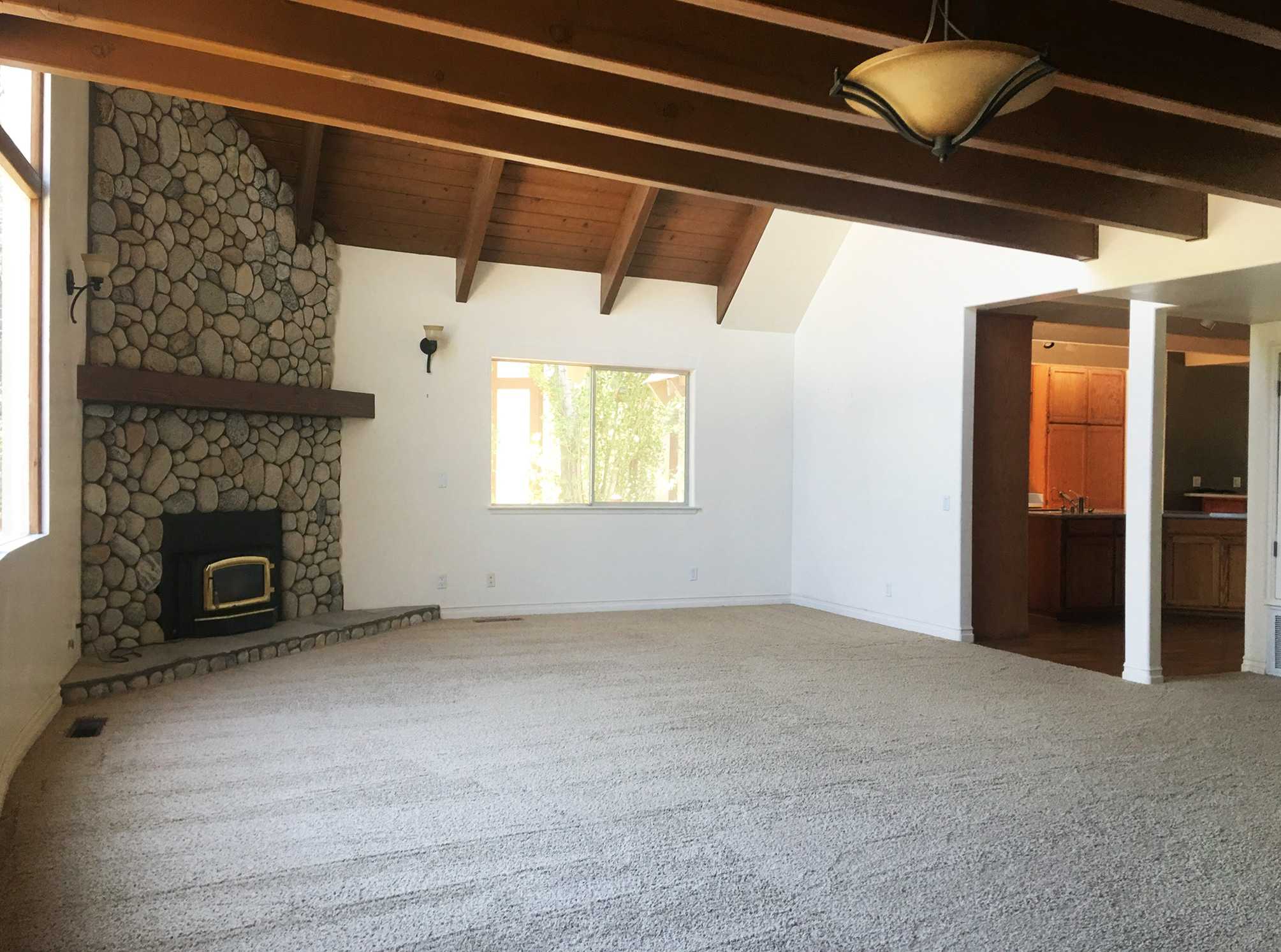

The living room was always great. The light was amazing and it felt really open and calm. The house has a GREAT layout so we didn’t end up doing too much structural.
We opened up this room to the kitchen, but otherwise, it was just changing all the finishes, though when you are talking fireplace, ceiling, smooth coating walls, flooring, railings, stairs, doors and windows, the finishes were a lot. We even took off all the window and door moldings and of course replaced all the lighting.
As a reminder, the style that we were going for was warm minimalism, modern mountain, in a rustic yet refined Scandinavian chalet vibe…but family-friendly obviously. We wanted LESS stuff, less contrast, and a LOT of comfort and calm.

Here she is, the living room where we spend so many happy hours as a family.
Let me walk you through the process and more importantly the intentions that we had while designing the house. This house is so cohesive, happy and yet full of comfort without sacrificing too much style. Here is why:
We minimized the number of finishes throughout.
This feels really cohesive, calm and is really easy for your eye to understand. There isn’t a lot of high contrast or patterns or colors, with mostly that beautiful beech wood (all from Ross Alan Reclaimed Lumber in LA), white/light gray and hits of black. I can’t stress this enough: our #1 goal was for it to feel calm here, therefore we chose less contrasting finishes and colors which means less busy-ness. A good example of this is choosing stools (this are from Article) that actually blended into the wood island, which is something that I wouldn’t do in every house but is perfect here. Also, the window frames (we sourced from Marvin) match the wood on the floors/ceiling, again hoping that your eye rests instead of bounces. The sofa and rug are the same tones which keep it really seamless and so calm (although there are some days I wish I had done the sofa in a green or blue). But by bringing in hits of black everywhere it grounds it and adds some excitement.

We maximized the light, focusing on the nature outside.
Natural light is your #1 design element. We made the windows the focus (all white oak contemporary from Marvin) and chose finishes that bounce the light around, and yet are quiet enough that the green trees outside become part of the design. We also added skylights from Velux wherever possible. The light in this room is amazing all day every day, even when it’s cloudy.

We splurged on doors and windows.
Years ago, I asked an architect what he would spend his money on in a house renovation, and he said “doors and windows” and now I understand why. In our LA home, we made sure that those elements were original or mimicked the original and it makes a difference, it does…so we did the same with this one. You can’t tell that much in this room because there is only one door, but all the doors are the beautiful reclaimed wood, made by Ross Alan. They are solid and feel so high quality.
As mentioned, we worked with Marvin on all the windows, choosing their white oak contemporary frames and boy are they stunning. The huge A-frame windows were in bad shape and redoing them wasn’t an easy feat (stay tuned for a full post about the how and why we chose our new windows) but the new ones are nothing short of stunning. We chose to have the new door to the garage (which wasn’t there before) as a simple white flat panel, so it “went away” but now I regret not having that be in the wood as well (see below).
We focused on the architecture.
Again, the wood, windows, and open space and light are really the feature of this house, so why clutter it up with a ton of stuff to distract from it?

We went SIMPLE.
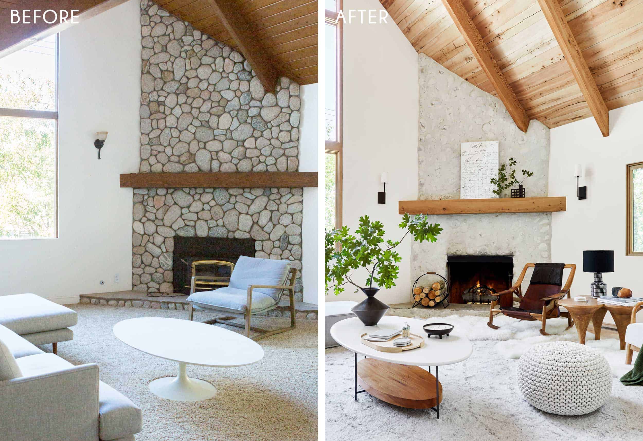
We chose the most minimal version of everything. For example, the fireplace—by schmearing over it with plaster (German schmear—see this post for the hows/whys), you still get the stone look, but way less busy and with less contrast. And the stair railing—it’s still black iron, but we designed it to be so simple and sleek with no decorative detailing except the wood on top which matches our wood on the floor. Every single choice went through the lens of “could this be simpler?” We didn’t even use moldings around doors and just a tiny quarter round on the floor to even it out. This mostly works in a midcentury or contemporary house.
We mixed high, low, vintage, new, big-box or one-of-a-kind throughout the house.
This ensured that our house looked personal, collected, unique and had a lot of soul. I LOVE that vintage side table with the three legs and while it’s kinda oversized and we thought there was no way it would work in the space, it really does. There is a ton of Target’s new fall collection mixed throughout the house (not available just yet, I got some early releases for the shoot, but everything will be on sale August 25) like textiles, bedding, lighting and accessories, and a few splurgy vintage pieces (mostly chairs because I love a statement chair) that I got either at local stores (Pop Up Home, Midcentury LA) or online via Chairish and 1stdibs. The leather strapping rocking chair was my 40th birthday present.

We prioritized comfort and livability.
Every piece of furniture is kid-friendly, with any lighter upholstered pieces (like the sofa) being in Crypton fabric, and the light rug is a performance rug (meant to be easy to clean) from Ben Soleimani. Nothing is precious and there are not a lot of accessories (even pillows!) for them to move around which I then have to put back. Sometimes, I look at that coffee table (ours from LA we got from Lulu and Georgia years ago) and think why didn’t I put some books on the bottom shelf?? I do think it would have looked better, but we don’t NEED books there and likely the kids would just take them off and throw them around the house. The wood log holder (again from Target’s new fall collection coming soon) with porcelain logs is decorative as the fireplace is gas so I suppose I contradicted myself there (but it’s sooo good).

We stayed neutral.
All the major pieces are neutral because I wanted calmness and flexibility. I really loved how we had a neutral sofa and rug in here prior to the renovation so we stuck with that, but there are days when I wish I had done the sofa in a darker green or blue. I literally go back and forth on it daily, some days LOVING that everything is tonal and calm. The good thing is that with this color palette I can easily add more color and pattern and change it with the seasons (which I will).

The sofa is pretty darn incredible and even looks great from the back—it’s a vintage piece that I found on Chairish, bought through Gallery L7 in LA and had reupholstered in family-friendly Crypton (in their Calico Maxwell fabric in Pewter). The curve in the corner really makes it special.

Sitting in that corner, above, is so dreamy and cozy. We felt that it was a sofa that didn’t want a lot of pillows, because the back is so ergonomic, tapering back. I could have styled it with more pillows and maybe it would have looked better, but I was trying to keep it as livable and true to the minimal aesthetic as possible. But of course, NOW I want more pillows. 🙂
We chose simple, or really special lighting throughout—some more splurgy and some affordable, like the sconces in the living room, which were $130. The round light going up the stairs, from Allied Maker, was chosen because it didn’t compete with the other thin and linear sconces, and was a nice solid, round shape behind the stair railings. The detailing in person makes it feel really special and handmade.
Speaking of, we carried elements that were “thin, black and linear” throughout the house. Note the black railing (installed by 3D Stairs & Wood Works), the black standing lamp, the island pendant, the coffee table legs, etc.

Almost all the textiles in this house are from Target’s new fall line (again, not available until August 25), because I personally think that pillows and blankets are a GREAT place to save. For you eagle eyes, you will notice that the room is styled differently in a lot of the shots, that’s because House Beautiful asked for options, as well some shots looked better with certain things styled a certain way. The black tubular chair you see in the living room ended up in the loft and a vintage Cherner chair sits there now instead.

The entry is so simple, just a bench (that we sourced from Ethnicraft) and some art that my kids made with pressed flowers from the forest behind our house labeled “spring 2019.”

I love love love the pressed flowers as art so much and the kids point them out to everyone who walks into the house. It was so easy—we just pressed them inside books, then after a month pulled them out, and we framed them in a cool minimal way that didn’t feel so crafty and we think looks really elevated. We put them on pretty thick watercolor paper (that has a lot of texture) by using super glue and framed them in readymade IKEA frames.
The wall that that is up against is new. We closed up an open area under the stairs, creating a hall closet, which looked like this before:

We wanted to create a closet to actually use the space, which also simplified the architecture in a good way. The stairs were very thoughtfully designed by my team (thanks Velinda for all your problem solving there and hard work!) and frankly, they are stunning. The railing goes directly into the wood, not a plate which is a detail that we love but is more expensive to accomplish. We used hollow iron rods (I believe because they are less expensive) with thicker solid rods every few feet for code.

The last rod was supposed to be a thicker support rod and yes needs to be switched out because if a child swings on it, it wobbles and will surely break at some point. But let me divert your attention to that light switch. We went with Forbes and Lomax wherever it was really obviously visible, and while they are a splurge, boy are they a treat and everyone loves them.
BEFORE AND AFTERS:
We love a side by side to see where we came from and where we are at now:


HOW WE FEEL ABOUT LIVING IN IT AFTER 2 MONTHS:

It’s been a couple of months living here off and on (and me staring at the room) since we finished the project…how am I feeling about it? We thought for each room we’d go through the livability of it because while you make these decisions that you think you won’t regret, guess what, there are always some things you would tweak or even find that you end up using a room entirely differently than you intended. So here goes for the living room:
Generally, this room gets a TON of use and we love it. Right now, I’m missing some color, namely blue in here, so I’ve added a blue throw instead of the green one and a few other pillows, which is an easy fix. I might move the art (a lithograph by Cy Twombly) next to the stairs where it feels a bit empty and put more blue above the fireplace. Who knows?

The sofa, which I love aesthetically is a challenge as it’s modular and it slides EVERYWHERE and the back cushions fall off easily. The kids treat it like big building blocks for a fort, which was adorable at first but means I’m literally rebuilding the room every day that they do that. It didn’t slide around before when it had the original upholstery (a thick terrycloth), so I’m currently playing with the idea of putting felt or some sort of anti-slip material on the bottom of the top cushions to keep them in place, and maybe even wrapping rug pads over the feet or attaching the bottom cushions to each other with velcro. It’s driving me NUTS.
I do kinda want to switch the rug in here with the rug in the guest room or the family room (coming up later this week). When the room is perfectly styled, I like that the rug and sofa are tonal and kinda run into each other, but other times I’m wondering if I could have made a more colorful choice. So many ways to skin a cat. We didn’t find that sectional until 10 days before the shoot so we had to make the decision on fabric in like 1-2 days to get it upholstered in time. The idea of going darker was so scary to me because we were so used to the lighter sofa in here, but I’m tempted to get darker slipcovers made (a dark blue or green) and see how that feels. Would that ground the living room more or make it feel busier? Probably both.
Also the rug is high pile and while it is a performance rug, i had no idea how much foot traffic would be on the space from the kitchen to the front door so it just gets trampled. The guest room rug is a low pile, but neutral and the guest room gets less foot traffic. This one is really cozy, though… .
Lastly, if you are sitting in that sweet spot of the sofa, you can’t reach your coffee/drink so we need a table either on the left of the sofa or behind it. We have something for now but still shopping…
But generally, this room is SO comfortable, warm, inviting and easy to keep styled as we live with way fewer accessories, and yet it doesn’t feel bare. The architecture, light, windows, fireplace and wood are the real features and the furniture is all so comfortable and kid-friendly. No real regrets, just some tweaks – THANK GOODNESS.

Thanks for making it through the whole post. It’s a lot of info and I could have even said more, so please, if you have any questions, leave them in the comments and I’ll answer them. And don’t forget to go out and get the issue of the magazine tomorrow!! Again, there is a whole story in there that I wrote, different than what you read here. Come back tomorrow for the downstairs guest bed and bath.
Again, I wanted to give a great big thank you to my incredible design team who made this house a possibility: Julie Rose, Velinda Hellen and Grace De Asis. Photos are by our own Sara Ligorria-Tramp, styled by me with help from Emily Bowser, Erik Staalberg and Veronica Crawford. Our contractor was Jeff Malcolm and our architect (that we used at the beginning of the project) was John Lyles.
Here are all the resources.
Living Room Resources
Finishes:
Beechwood Mantel by Ross Alan Reclaimed Lumber | Beechwood Ceiling by Ross Alan Reclaimed Lumber | White Oak Contemporary Windows by Marvin | Beechwood Flooring by Ross Alan Reclaimed Lumber | White Cliff Matte Countertop via Cambria | Pure White by Sherwin-Williams
Furniture:
Vintage Sofa from Gallery L7 via Chairish | W. Andersag Teak & Leather Rocking Chair via 1stdibs | Esther Chair via Target | Thomas Bina Olivia Coffee Table by Lulu & Georgia | Esse Canyon Tan Counter Stool by Article | Vintage Mango Wood Tripod Side Table Wood from Habitat Gallery via Chairish
Art & Decor:
Performance Elda Rug via Ben Soleimani | Lana Ivory Sheepskin by Article | Art Over Peninsula by Arielle Zamora | Farmhouse Pitcher by Sheldon Ceramics | Black Vase by Ben Medansky | Farmhouse Jewelry Box by Sheldon Ceramics | Leather Wrapped Rock by Made Solid | Chain 2: Tara 4 by MQuan | Opening Tray by Skagerak | ZigZag Vase by Bobbie Specker via Mantel | Apothecary Matches by Lawson Fenning | Ridge Coasters by LGS Studio via Lawson Fenning | Peterson Real Fyre Birch Log Set via Woodland Direct | Once viii by Jane Denton | Quilted Velvet Lumbar Pillow via Target | Firewood Holder via Target (coming soon) | Green Throw via Target (coming soon) | White Knit Pouf via Target (coming soon) | Quilted Throw via Target (coming soon) | Pillow via Target (coming soon)
Lighting:
Stark Minimalist Sconce via Shades of Light | Table Lamp via CB2 (no longer available) | Black Floor Lamp (vintage)
Staircase & Entry Resources
Finishes:
Wall Mounts by Alpine Metal Design via Etsy (no longer available) | Beechwood Handrails by 3D Stairs & Wood Works | Balusters by 3D Stairs & Wood Works | Stair Tread by Ross Alan Reclaimed Lumber
Furniture:
Oak Spindle Bench via Ethnicraft
Art & Decor:
Lighting:
Concentric 10″ Sconces by Allied Maker | LYNEA Lamp
Check out the rest of The Mountain House reveals here: The Kitchen | The Kitchen Organization | The Kitchen Appliances | The Powder Bath | The Kids’ Room | The Downstairs Guest Suite | The Loft | The Hall Bath | The Upstairs Guest Bath | The Dining Room | The Family Room


So so great! Congrats Emily and team!
Job well done! The wood tones matching throughout the space is breathtaking and easy on the eyes. I love that couch, hopefully some Velcro can fix the movement for you because it’s great.
I also love the vertical black railings.
The schmear was a great success!
The drapey blanket moving around the room makes me crazy but I get why you do it for different shots.
Lovely room, you guys! Take a bow
Just use white Velcro Industrial Strength Sticky Back, 2” wide. I used it to hold concrete sculptures and lamps on tables my kids and husband kept knocking over. Life changing!
Ha. it actually kinda annoys me, too (the blanket moving around) and I didn’t realize that we did it so much until i saw the photos. Here’s why – house Beautiful wanted some photos that were different than what we were going to run so we kinda had to shoot it twice – and they have some that we don’t and vice versa. And then the shot of the back of the sofa, I COULD NOT get that green quilt to style (mostly because its a bed quilt – but i love the color) so i gave up and used the easy to style throw. But anyway, why the mantel is different is for the same reason – to give them some different shots than us.
I totally get it! Pics came out great!
Gorgeous and perfect, it’s triumph
THANK YOU. xx
Congratulations, Emily! This is stunning! About the updates, that’s what I like about your blog. I loved seeing the different iterations of the living room in LA. It’s so fun!
thank you!!
So beautiful! Could you share the budget for the room, especially the windows? Thank you!
I’m speechless, this turned out so beautiful! You all did an awesome job, now enjoy and be proud of the result!
The moment we’ve all been waiting for! And you did not disappoint! The room seems like the perfect canvas for you to play around with for years to come. It reminds me a bit of your previous home, and I’ve been missing those modern vibes since you moved into your tudor. Well done team!
Beautiful! Kudos to you and your team. Love how the fireplace turned out. Most importantly it seems like an amazing retreat for you and your family.
thank you! i’ve bee missing those modern vibes, too. xx
Really beautiful and looks absolutely comfortable. Did you do anything more with the fireplace after the initial schmear? Curious if it looks more amazing because the room is finished or if it was further refinished.
nope! We schmeared it once – wait, I think he had to come back for touch ups but it was like 8 months ago so I don’t remember 🙂 Thank you!
I was thinking the same thing. It looks like the schmear is lighter. I know you were thinking g of maybe going lighter? Did you end up painting it lighter?
Love the way it came out! My favorite part of this room is the stairs, sooo much better than the “before” area. Maybe consider not drinking/eating in this space instead of adding a table? I started only drinking/eating in my dining room recently and it has made my life a lot easier and simpler (less mess, more relaxing – I’m fully in the moment drinking my tea at the table, then I’m fully in the moment reading on my couch (or watching Big Brother when my kids are asleep TBH)).
Those stairs and railing? Best!
It’s beautiful and cozy – but doesn’t seem full of personality. Will you weird it up per OG Emily? I miss your unique finds and styling.
Hmm. i see what you mean, but I think its just more neutral and quiet – which was so necessary for the purpose of this house. But check this out – the sectional is a weird 70’s modular, the rocking chair is a vintage masterpiece, the two side tables are vintage and one of a kind,, the standing lamp is vintage and the lithograph is totally unique. I think they are all just quiet and neutral. But I can see how it doesn’t feel weird. I’ve thought about bringing in some vintage plaid pillows or something like that.
I think if I walked into this room, I would let out a big sigh and say “Ahhhhh.” There’s no noise in this room. Contentment all the way. I love the wood tones. Love the idea of the stools blending into the wood instead of contrast. You can tell this house was a labor of love. I’m already visualizing Christmas in this room.
it is SO CALM. it just gives us so much mental and physical space. And i can’t wait for christmas here, too. 😉
Yes, I immediately envisioned a Christmas tree near those glorious windows!
That fireplace is a triumph. Such a lovely space
Love everything about this post! German smear is my favorite, love the couch and seeing how the changes in the wood ceiling/windows made such a difference. Great job! Love the blog, my favorites are the design posts like these.
It looks amazing! Love the fireplace!! BTW- if you & your family love it, that’s all that matters 🙂 BUT, I love it too!
Absolutely beautiful.
Emily- this room is amazing! You did such a wonderful job! I wish I had all the money in the world so you could come and redo my house in houston! Wonderful wonderful wonderful job!!
This is even better than I expected! Everything looks so cohesive.
One question — is that stump/live wood side table the one you got at the flea market? I didn’t see it in the sources.
Keep it neutral. Resist the urge for color. This room looks like all your wish pictures from way back when — just beautiful
Oh goodness. I saw that first picture and it made me take an audible breath. It’s so peaceful and comfortable looking. Lovely!
Emily, it looks fantastic. I love the pared back pillows/accessories. So restrained. I’m using the same color palette for my nursery – gray sofa, black metal crib, neutral rug, wood side tables/accents. Last minute, I ordered a blue upholstered rocking chair and am feeling quite validated ? For fun, I used the Schumacher deconstructed stripe wallpaper (white), and rainbow colored art and textiles. Love having a neutral palette that can be flexible (we don’t know gender.) Hopefully, the rest of the mountain house continues to validate my recent splurges!
Calm and beautiful. Wow. Congrats! xx
OMG Gorgeous, gorgeous, gorgeous! The pictures of the room are seriously beautiful and the space feels so calming. I think you nailed it and I cannot wait to see the rest of the house!
Underwhelming. Soulless.
Yeah it’s not coming together for me too. Not a fan of the chair on right or the boxy sectional. Doesn’t fit well with the kitchen.
That’s a bit harsh—especially given that the content here is provided to you for free and nobody forces you to look at it if you don’t like it. Honest feedback is valuable but only when it is delivered with some civility.
I very much like the design and can appreciate all the hard work that went into it!! Nice job!
if this is soulless, then i don’t want to have a soul.
Wow- such a stunner! I’ve missed a lot of the progress posts so I’m sure you discussed this previously, but did you reclad the whole ceiling/floor above? It looks different from the before shots so I’m guessing you did. I’m sure that was an expensive choice that wasn’t made lightly, but WOW it elevates the space into true “magazine 2019” worthy space! I could legitimately comment about every design decision in here with heart eyes! But that couch is AMAZING. It would look terrible in my house but in this room it works soo well! I like it much better than the Article sofa with legs. I say go for it on velcro and some dark slip covers.. but I only say that because it isn’t my money 🙂
thank you! and you know what – I don’t know if i’ve really talked about the ceiling yet (although i do tomorrow in the loft reveal post because you see it so much more). But here’s what we did – we left the rafters and just sanded them down and yes reclad all the horizontal tongue and groove with the same wood as the flooring – reclaimed beech from ross allen reclaimed. It wasn’t cheap (labor on high ceilings takes a lot of time), but it saved our marriage as I couldn’t live with the dark orange stained wood and wanted to paint it white and brian was VEHEMENTLY against painting it white. like he would have run for president on that platform. We both wanted wood, and i’m SO Glad we did it.
The ceiling is absolutely gorgeous! Emily, I’ve been following your blog and I thought you had walnut blasted the ceilings. Did you subsequently decide to sand the rafters and reclad the tongue and groove because the walnut blasting didn’t work out? Any thoughts on why it didn’t?
Haha glad it saved your marriage! It’s so beautiful! Pretty sure I was team white when you discussed it on the blog/insta before, but now I can’t even imagine this space in white. The wood MAKES it!
IM FREAKING OUT, ITS SO GOOD!!!!! Holy. MOLY. I love when you hold yourself back a bit, the results are absolutely stunning. I know you wish you had more bold colors here but I’m so glad you stuck with your original vision of Scandinavian Mountain house. THIS feels like that. It’s so stunning. I’m so jealous of those doors and windows. What a treat. And I zoomed in on the dining nook sneak peak and my heart raced faster. I can’t wait to see the full reveal!!
AGREED!!!
so glad you stuck with original vision!!!
GORGEOUS, as always! What a cozy, happy, yet minimal space. I’m in love
The whole room is stunning. I don’t generally pay much attention to stairs, but I love the thick wood on the treads and the black bars. The side view of the stairs is art all by itself.
I also love the schmear treatment on the fireplace. I thought the old fireplace looked fine, but this is really special.
Congrats on a great job.
The house is amazing! Great work. Love all neutrals.
My cushions move on my sofa. on Amazon I bought anti slip/grip pad like a rug pad but smaller
GORGEOUS! Thank you for sharing the final result and for bringing your readers along on the process.
The photos breath the calmness and I can only image how it feels to have the room embrace you in person.
It’s exceptional design!
real quick question – the footer candle holder… would you mind sharing the source? Thank you!
Will echo the request for details on that footed candle. Primitive but minimal, purr.
Congratulations! I’ve loved following along, and really appreciate all of the information and honesty you’ve shared throughout. It’s beautiful! Ok, now I must get out of the parking garage and actually go upstairs to my office! ?
Just stunning… as expected! Wondering how you lightened the wood tone of the ceiling! I’m dealing with an identical ceiling to the one in your before photos, which is amazing, but creates a real cave-like feel. I’d love to lighten it up! Was yours sandblasted? Can you tell us about the process?
There are several blog posts telling all about it. They had it clad in entirely different wood. It’s so beautiful!
We basically left the rafters (we sanded them) and reclad the horizontal tongue and groove with reclaimed beech. It took about 4 days with 2 guys on scaffolding. But SO WORTH IT.
Emily and EHD team……Amazing! I’m running out to get House Beautiful, gotta see what they chose in photos too. Just such a beautiful home. I’m so glad you have been enjoying this house so much this summer.
It’s really gooooood!
Love the clean look! What is the wall color please?
Hey! We just added it in the resources, it is Pure White by Sherwin-Williams!
Yes I would like to know the paint color too please!
Wow, I have never seen this from you before… and I like it. I feel the calm vibe immediately. The soft textures, layering and those handmade shapes in the wood and ceramic pieces, the quirky vintage, YES to all of that! It looks original and very like Emily.
As for tweaks, I hope you can fix the sliding issue with the sofa because the scale and shape are perfect and I personally love the low contrast of the light color in the large room. I would rather consider the rug being slightly darker grey, grey/blue, or muted blue, although I love the subtle pattern in this one. And, I agree about a slightly more colorful artwork on the mantle. The writing piece is just a little too lightweight here.
It’s very well done! I look forward to seeing the rest!!!
Have you considered any of the newest rugs from Lulu & Georgia? I see some nice ones in greys and blues and modern patterns….
Also forgot to say I love the shape of the entryway bench and sophisticated kid art!
Have you looked at the newest rugs from Lulu and Georgia? Some interesting greys and blues, geometric patterns, and Ellen’s new collection.
I feel like I read a lot about the ceiling at one point but maybe the story was never entirely wrapped up about what you did to treat the wood & fix the orangey color? I’m going to have to go back and look for those posts because it turned out perfectly. Thanks for being so real about the sofa – I bet strong velcro would solve your problem!
What brand of fireplace insert did you use?
Whoa! The permanent details in this space are incredible – no door frames! the stairs! those windows! the gorgeous wood! the stairs!! Then you add in the jewelry – your birthday present is awesome! the sliding couch! the quirky tables! I gotta say I am loving disappearing bar stools. I can’t wait to see the rest of the reveals!
I love it! I also have a view with lots of windows which the eyes beg to focus on. I think the neutral colors complement that and the structural furnishings are so interesting. Love the tables and side chairs. So unique and bring the natural elements in. I agree that playing with the art and decor on the mantle is going to be so fun! Great job team Emily Henderson!
The living room feels perfectly “Emily” with a fun, modern vibe. It feels comfortable, and the neutrals bring home the serene, Scandi feel. It’s truly a Scandinavian mountain house dream!!! The sofa is an incredible find—unique, vintage, minimal, with an cool back-side, perfectly scaled!! Love everything. Well done and congrats to Emily and her amazing team!
Just beautiful, simple & calm but so elegant! May I ask what paint color you used on the wall? I’m having a hard time picking one for my own neutral living room and like how yours seems off white, not too white, not too bright or beige and still a warm tone. Thanks!
Hey Claudia! We just added it in the resources, it is Pure White by Sherwin-Williams. The house gets a lot of natural light so this white color is a bit brighter white than it seems. I was going to use it in my bedroom but it was a little too stark for my space so test it out in your house first! I ended up going with Polar Bear by Behr which has a little bit of warmth to it, hope that helps!
Thanks so much for sharing Julie and all the other helpful tips and links on your website!
Gahhhh Emily!!! You’re home away from home is so beautiful!! Your Cabins has a lot of similar elements to my home. I live in an 80’s contemporary and love soft modern design. This Cabin is everything! I’m so excited to finally see such a thoughtful remodel of an old 80’s contemporary space. This is my inspiration as we tackle our remodel! 🙂 Thank you!
Please share the details of how to get the spindles on the stairs to be sturdy and end into the stairs! Their so unique and sleek.
I am so excited about this week, it is ridiculous! I love everything! I want to ask about the comfort of the sofa. It is so beautiful and stunning in the room. Is the low back comfy? I always look at these sofas and think they are so beautiful but always wonder how comfortable they are.
I frequently struggle with combining popular and trendy elements with classic, timeless design. In my opinion, you have recreated a West Elm display, with higher end pieces. Everyone wants different amounts of character in their home, and perhaps you have chosen to minimize that in order to highlight current trends. I worry, without unique and personal touches, might this aesthetic may be too easy to date in a few years? Some of the items, for example the picture of text, may have already become cliche. Of course as a blogger, trends are the name of the game, so it must be difficult choice when it is your own home. And if you have the means, it is also entirely possible to update the style every few years. To each his or her own!
Wow I couldn’t disagree more! (Respectfully of course). There is a TON of character in this design, and honestly, this is such an incredibly well done rendering of yes, certain trends, but so many of these pieces are just so unique and stunning that I don’t think this will ever look dated. Honestly, I’m stumped as to how you think this is West Elm? You could not find those side tables, black vase, or leather rocking chair on the mass market at all. And while you might be able to find a similar style of couch, I doubt it would be the same. I think Emily has thoughtfully included some mass market items for those of us who may be inspired by her aesthetic but not have the big budget for the higher end items (like that rocking chair!!). So many designers are jumping on the california cool/scandinavian bandwagon, and a lot of their stuff looks the same. Not this design! There is so much unique stuff going on, plus the actual house is amazing. LOVE THE STAIRS. It looks so much cleaner/less busy with the wall closed off like that. Ugh the before was :(. I truly think Emily… Read more »
May I ask how you transformed your fireplace? It looks amazing!
Been on pins and needles waiting impatiently lol this reveal!! It’s stunning! So cozy, warm, modern and livable.
I love the space as is but I love blue too! I think a rich man ultramarine or lighter blue would look really ground the space and keep The calm.
That railing is so simple and such a statement. I’d love to know any extra details you share. I’ve never seen spindles that end into the floor.
Beautiful as expected! <3
Beyond perfection!
Thank you for a) pointing out how the stools blend into the cabinet base. It’s a great example of how to keep things simple visually and was super helpful for sparking ideas for my own space. Namely, paining our stools to match the cabinets. 🙂 Sometimes I get fixated thinking there needs to be contrast or color and this post gives me permission to keep things low-contrast. b) for the last section giving a real accounting of how things feel and where your mind goes living in the space. I’m so glad to hear I’m not the only one who obsesses about little changes and what to do next.
What does Brian think???
And can you share the paint color(s)?
Thanks
Hey! We just added it in the resources, it is Pure White by Sherwin-Williams!
Just beautiful! I love all the use of reclaimed wood and the feeling of calmness this space has, but I think you are right and it needs a little bit more color to feel cosier and more like you. Now it’s just a tiny bit too impersonal and neutral. That said it’s still a very beautiful space, congrats to EHD!
I think the carpetless stairs made the biggest difference!
It’s so beautiful! And it’s entertaining to hear your inner dialogue as you fight the minimalism and neutral color palette. It will be interesting to see how the space evolves over time.
Sponsorships and editorial make it so hard to share- I know- and you need them to make money. But I also wish you could share more about these little decisions as you go instead of in giant posts at the end. It makes the process a lot more engaging for your readers. The best content on IG and blogs tends to be designer’s own homes. Maybe sponsors need to restructure their contracts a bit- it’s not just polished final reveals that highlight their products. Progress dialogue and little moments behind the scenes almost do this better because people engage better with small sound bytes. And is the coverage from a magazine editorial worth sacrificing the freedom you have to share?
Just some food for thought. Thanks for all you share.
I completely agree with you Joellyn! Little decisions and tweeks are the most interesting part of design content. This is pretty eye candy but doesn’t really engage the reader. I also wish that I design – you decide could have been more about furniture and decorating choices and less about tiles and cabinet doors. The end result is gorgeous tho!