


A direct quote from my mother in law, as if she would explode should keep her opinion from me for one more second, “I’m really sorry, but I have to tell you, I HATE the scallops”. I had no idea what she was talking about at first, the comment seemingly out of nowhere, then I laughed because A. I don’t take anything design-wise personally and B. I’m not even convinced of the scallops myself because I haven’t even been in that room since the canopy was installed. So I figured why not spend hours tweaking it to prove to her, you and myself that scallops are what we should be doing in this bedroom.? What a fun use of Julie’s time, no?? (I love you Julie and appreciate every set of university taught skills you have).

Listen, Suz (MIL) isn’t the only one full of doubt on this project, based on the comments in the controversial update post. I thought it would be fun to share some of the more critical comments, expressing an unbridled distaste for this room design.
“It feels dated and mismatched, and the canopy, oh the horror.” – Holly
“I guess my reaction is happy b/c I burst out laughing. I think I would LOVE to stay in that room on occasion, but I might twitch after a week. I love everything individually, but together I think I am experiencing some drug widely used in CA in the 60s-80s. ” – Christina
“Hmmm. I have never not LOVED anything you’ve done. But…this is incredibly perplexing to me and seems completely overthought for a kid’s room and oddly out of character for you. I’m actually shocked at what a visceral reaction I’m having. Almost nothing about this looks fun or whimsical or styled by the genius you are. It honestly feels kind of sad and dreary, I’m so confused.” – Kelly
“It feels very “prison bars” – Anonymous
“I adore you, love your family, colleagues, designs but…I want to whisper this to you as I would a friend who is wearing an unflattering dress…this is awful. I would start over. So sorry.” – Jill (this has made me seriously LOL every single time I’ve read it)
If you are cringing for me as you read them know that I, too, am a player in this game, having fun, and most of these made me laugh a lot – NONE of them offended me. I PROMISE. I asked for it, literally. There is no way I could be a blogger if I got offended by criticisms about my designs (now personal attacks are a different thing). Maybe I made some mistakes, or maybe it’s just not there yet – I can’t really tell having not been in the room. But no one will die, and the creative process is FUN and messy and full of mistakes. Listen as a designer you should never design the same room twice, so no matter WHAT, every single room is a first-time experiment. It’s my style laboratory and sometimes we have to clean up an explosion.

I also was/am ready to do something VERY risky. The mountain house was relatively easy to decorate and style. It’s not that I didn’t take risks, but it is neutral, minimal, and modern – and that is easier than mixing pattern, color, vintage, and whimsy. So I was just ready for a challenge and to “play” again, knowing that of course there is a chance I can “lose”.
I think that we have forgotten what “process” posts are because the blog world has changed so much that we only show the “messy dark befores” and “beautiful bright pinterest-worthy afters”. So admittedly even to me it’s weird and kinda anti-climactic to see a project, midway, where things aren’t working without great photography and bad lighting. I wish I could defend it even more but my reaction wasn’t positive either and I haven’t been in the room so I don’t know what my defense would be – I haven’t met “the criminal” in-person to get its testimony so I can’t even say “its great! we are innocent!” This room might be a fail right now that has to start over a bit. I DON’T KNOW.
But not all of the comments were bad, although most had an “I’m worried” vibe.
“My initial thought: SHE’S BACK! This has resonated with me more than anything in a while. It does feel very “Old Emily,” which I hate saying because YAY growth!! But this is weird and exciting and risky and thought-provoking and some people are going to HATE it, and that is Emily Henderson to me.” -Jade
“Thanks for sharing the process! This is the fun part I think and we often miss out and just see a finished shot with no back story.” – Kel
Okay, so I have a lot to love here, and it’s really not just about the design of the room. 1. I’ve been playing with the same design style in my house for the last year or so, so I LOVE seeing your take on it. 2. I love seeing you not get it totally right. Because, as you said, it’s a kind of off right now. But I know it will be so good! – Kelly
Thanks, guys. 🙂 There was a divided consensus as far as how I proceed in the design. 70% of you said, “pull back, it’s just too crazy. Too MUCH!!!” The other 30% said, “lean in harder with more whimsy. more fun!!” So then I thought what if I did both? What if I pulled back on the number of colors but then added even more whimsy and pattern in the reduced color palette?
Current Paint Color in Kid’s Shared Bedroom
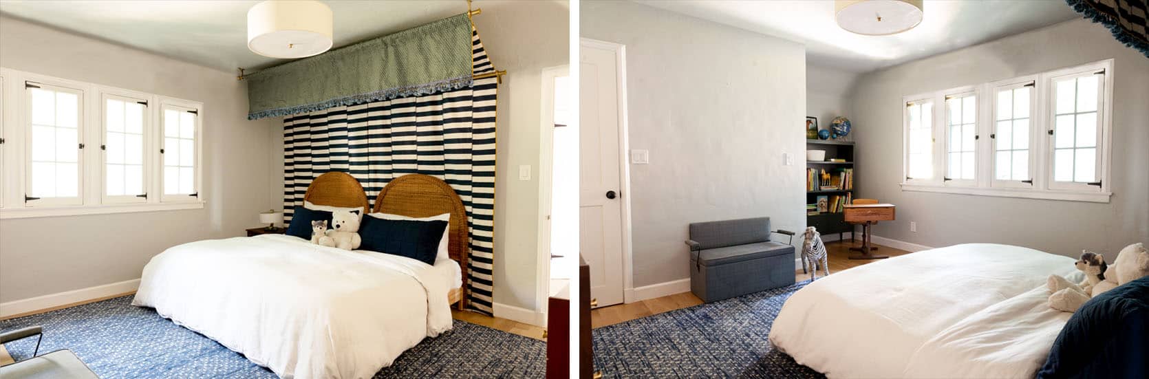
So since Julie is staying at our house I had her take out the red quilt and rug. and take down the curtains (since those are changing anyway and were just so distracting) and snap a few photos. It’s definitely pulled back and maybe it “works” better but, meh, not sure. 🤔I think not having any side tables or lamps and just a big white bed isn’t helping. It really looks like we moved into a room that already had a canopy leftover from the previous owners so we are trying to make it work.

So here’s where we “PLAY”. Since Julie has fantastic skills, I asked her to photoshop some scallops on to the wall. She took most of the suggestions from the “Scallop Trend” post comments and spent some time playing around.
First up, let’s look at the scallop inspiration. I loved two different inspiration shots – one that was more uniform and one that was more handpainted.


Dark Blue & Gray in Uniform Scallops

First up – she pulled the navy blue from the canopy fabric and threw it up on the wall, but left the light gray that is above it. I THINK I like it, but honestly, I’m kinda confused about this whole room right now, full of a lot of self doubt (not in a negative way, more in a “have I actually lost it?” kind of way, which is OK because MAYBE I HAVE. Maybe we all have.

I think for this one we’d switch out the rug as it’s a lot of blue and I do miss that vintage red rug in here. The red is just so playful so I like having the mirror but it does feel rather red/white/blue which AGAIN goes very ’80s. I think it would be fun to paint the window and the door to match the scallops, but I get so nervous to paint those, and I have no idea why. But here’s what it would look like:

Dark Blue & White in Uniform Scallops

Here we have the same blue, but with WHITE on top. Remember that there will be woven organic shades on the windows, too. I’m still interested and think that the biggest problem here is the big white bed that looks weird. A few of you suggested it would be EITHER the canopy OR the headboards but not both. I don’t agree, but I am rethinking it all. I KNOW that the headboards would be cute, so maybe the canopy is the real problem, but I want to try to make it work before I give up and there is something here that IS working. I’d be interested in seeing the dark blue, white combo with the red vintage rug and see how that works.
One of you also mentioned that I should lower the lowest bar of the canopy to make it more sweeping and maybe you are right.

Dark Blue & White with Irregular Scallops

For each color, Julie was going to do one normal scallop and one that looked more handpainted or irregular. The irregular one looks more like bubbles and with the blue and white canopy there is something very nautical about it, which is not the intention but as some of you pointed out, maybe that’s the point – I don’t know my own intention.

So here is where we go through a variety of colors that you suggested with quick commentary on my initial thoughts. LET’S GO.
Dark Green & Gray with Uniform Scallops

This could work if the bed wasn’t so stark white, and if there were punches of black and maybe brass. I could lean into the “mood” but worried it’s not playful enough. I have NO idea what kind of bedding we’d want honestly but having a huge white bed is bumming me out. Maybe I find another vintage quilt in the green/blue tones instead OR we dye a quilt indigo.

There is something pretty “no no no” here. Is it the red mirror with the green? The blue rug with the green? Again the huge white bed? Or maybe we need white on top instead of the current gray?
Dark Green & White with Uniform Scallops

This reads more playful and fun, for sure. But a lot more contrast and less moody. And maybe we have darker tonal bedding with a big red velvet lumbar and red Persian rug? GUYS, SANTA CLAUS IS COMING TO TOWN!

I keep taking my fingers and covering things to help visualize it. As much as I love that red mirror when I put my finger over it on the screen I like the space so much more (I’d love for you to picture that – me, an internet-famous designer literally holding up two fingers, and closing an eye to obscure a prop on my laptop in order to make design decisions). My secret methods are out there now. But seriously, try it! It looks better without the red mirror, right? Again I think we could use some black, brass, and wood to help edge it up. I kinda like how the bookshelf disappears. Nothing is a “hell yes” right now, but I’m seriously trying to figure out what I don’t like and why.
Update! After I wrote about my secret finger method, Julie did is all a favor and out the mirror. See SO much better…right??

Dark Green & White with Irregular Scallops

You know, I still think when done right, the irregularity of the scallops could look good. I think this is too “big, little, big, little” thus looking like a bubble pattern, but if it were more subtle it could really look sweet and playful.

What about a green and blue Persian rug instead? Oh, you know what you’ll never find in your life that I’ve been meaning to tell you? A vintage GREEN AND BLUE PERSIAN RUG. I would know as I’ve been looking for the right one for years for the living room. There are some newer options, sure, and maybe in a smaller size I could find what I wanted, but I searched for one for the living room in a 10×14 and never found one under like $15k.
Medium Blue & White in Uniform Scallops

Man, this takes a lot of “envisioning”. Now picture this blue but NOT the blue rug, maybe a blue/green Persian (see above) or just something light and neutral. Another pattern? Do you know what rug we WON’T use in here? The Stockholm rug from Ikea. Some of you are PISSED that people still like that black and white broken stripe (I just reread all the comments from the first post). SO, DON’T WORRY. I won’t use that, guys, as you said it’s not 2014 anymore. (But honestly, we think it’s a new classic).

I like the medium blue and the red. We’d change the bed, bench, and rug but that’s a playful happy blue, and with the white it feels youthful and still modern.
Medium Blue & White in Irregular Scallops

When I first saw the irregular scallops I was like “no” but maybe I’m starting to like the playfulness? Or is it the glass of wine talking that I had to pour myself in order to look at the same photo in different colors over and over and over and have insightful things to say about each one??? MAYBE.

Bright Red & White with Uniform Scallops

Charlie asked for a bright red version and Julie obliged. I do love red so much so I get it, Charlie. I think with the nautical canopy and the scallops all Julie and I could think of is an ocean of red blood. Risky! Daring! Whimsical?

It was a hard “no” until both Charlie and Elliot squealed in delight when I showed it to them on my laptop. When I asked “why?” they said, “because it matches the mirror,” which isn’t quite enough of a reason for me. BUT I just like that they were so passionate about the process.
Muted Red & White with Uniform Scallops

Maybe a darker red? NOPE.

Muted Pink & White in Uniform Scallops

Birdie asked for pink, OK FINE I ASKED FOR PINK. The problem with renderings is that the lighter the paint on the wall the more shadows you lose (as Julie pointed out) and it looks fake. So while I actually really like this pink (not with all the elements) it just doesn’t look good. Elliot screamed YES YES YES!!!! and Charlie screamed “NO”, so I think it’s a “no”, but hilarious how predictable those two are.

As I was writing this I asked Julie for a couple more options. She humored me, most likely because I’m her boss, but I appreciate the time spent regardless.
White & Gray with Uniform Scallops

Do we keep the gray on the top and do white on the bottom? Nope.
Gray & White with Uniform Scallops

How about white on the top and gray on the bottom? Nope.
Light Blue & White with Uniform Scallops

Oh no. Just no. Now before we get into the comments I wanted to show you two new options. 1. All white and 2. All navy. Maybe Suz was right. Maybe scallops are stupid and wrong? So much can happen with accessories that I hate to paint anything until I see it and spend some time in the room. Maybe we can divide up the headboards, add some side tables, lamp/s, different rug and try other things before we repaint this room for the FOURTH TIME.
All White with No Scallops

Well that looks dead and reminds me how it looked in person when it was white – DEAD. Lastly – all blue.
All Navy with No Scallops

Strangely the room looks the most balanced painted dark, which makes me realize that balance is the real problem. So I think it’s mostly the other elements that are lacking. I’ve got to get my hands on accessorizing in there. The shades go in soon. I have some cute accordion sconces to put in, and I’m not done with that red faded rug. The light fixture is changing, in fact, it’s been sitting there for months and it’s more modern. Lastly, in case you haven’t fully checked yourself into an insane asylum, I asked for one last tweak. The window frames felt so WHITE (which could still work – it ties in with the headboard obviously). So I asked Julie to “paint” the moldings and the baseboard.
Ok, Actually All Navy

Admittedly this looks a little nuts, but what if the bedding were darker and moodier? Painting that room dark is a BOLD move, there is nothing safe in doing that and there is something a little dark and depressing about a kid’s room being such a dark color. I just showed this to Brian and he was speechless until he laughed and walked away. Apparently he’s not my blog demographic that likes to see a room mocked up 19 different ways.
So that’s where we are – kinda nowhere. With no real conclusion or “YES THAT’S IT”. I suppose if I had to choose right now, without seeing it in person I’d choose… nothing. There is no way I could choose. I think I like the navy scallop the most, with the medium blue coming in second but maybe Suz is right. Maybe scallops are wrong, maybe the canopy is wrong.
The good news is that we are going to LA to get Birdie’s cast off on Monday so I’ll be able to see it in person, play around and make an actual informed decision. I can’t wait. This “designing without being in a room” is not how I like to do it and I really don’t think it gives the best results ever. It’s actually making me feel NUTS. Before we leave I think it’s only appropriate to round all of these options up, to give a visual to the inner madness.

WHAT SAY YOU?


number 7, NAVY!!
I don’t know if it seems a little too grown up this way, but it’s definetely the most balanced!!
regarding the canopy, I would change the fringe (sorry) and make the scallops there, i know it’s less original but I do believe THAT is the odd part of the room (sorry again)
I agree with this entirely! The fringe is throwing a lot off. Re the dark color, my 6 year old son’s room is a dark navy (Westcott Navy) but we kept the trim white, his bed has a citron yellow quilt and he has a black and white teepee in there, vintage metal yellow plane on the wall, bookshelves with a globe, pretty toys and books etc…..lots of playfulness to build on the foundation of the dark color. It feels cozy when he’s going to sleep and I love that he can grow with the color without having to repaint for each stage as he develops.
I agree with you on the canopy. My eye is immediately drawn to it in all of the photos and not in a good way. I’m sure the material is beautiful in person but it looks dingy in photos. Also, the stripes and fringe fight each other and make the canopy look heavy.
I agree with the kids on the color! Red is invigorating and promotes creativity – I say if they love it, let them have it. Growing up, I insisted on a green apple bedroom. My mother didn’t like it but she knew it made me happy and gave in. 😊
Ok, now I won’t sound so mean. Don’t mean to be mean, but…in no way shape or form does this room look inviting to any age group–let alone kids. The back stripey thing? In feng shui, stripes, most especially dramatic dark and light stripes, and most of all, stripes that are uneven say your kids are going to fight like crazy. And with you. But most of all, yes, an eyesore. Not saying a kids room has to be all sugar and spice but this looks like a before, before with no after in sight?
With a nod to above posting, where is the playfulness for a kids room???
With the kindest of thoughts to you, start over. Fresh.
Yes to the feng shui of stripes! Those are stripes that are broken as well-it gives it too much drama, too much forboding…it doesn’t feel “safe” to our subconscious.
YESSSSSSSSS!!!!! All navy with white windows. Bring the color and pattern in on the art, bedding, floor. Those dark walls are amazing!!!!
I agree on the canopy – I really like the stripes but the fringing and green make it look a bit dull and drab. It doesn’t feel like it belongs in a child’s room. If you changed that the rest of the room might feel more playful. The all navy colour options look great too. You always design lovely rooms so am sure you’ll get it right.
I agree, too! Love the navy scallops, but the fringe and that dull green . . .
I completely agree: #7. All navy with white trim looks so well balanced (but not as cave-like as navy with navy trim). It also makes a perfect foundation for some fun pops of mustard to liven it up and tie in with the trim on the canopy.
I agree: number seven and change out the fringe on the canopy! The navy balances out the canopy nicely.
I’m onboard with the feeling that the wrinkly green fabric and frayed-looking fringe are the first thing that draws my eye (in a not-good way) in all the photos. Maybe it’s fab in person, so who cares about the pics, but that is the way it looks, to me, IN PHOTOS. It makes every other paint combo look wrong.
Not for nothing, I vote for regular, not bubble, scallops, don’t paint the window trim and not pink : )
I think the shade of green on canopy is just very off for the room. Kinda grandmas weird faded couch. Which maybe fits the theme. But the undertones in the green are dissonant with the yellow undertones in the headboard. If it was a punchy mustard or a brighter green, maybe that would jive better. But I think the fringe/green side is what is totally throwing me off too.
I like the darker blue paint, it does feel more balanced.
Change the headboard out maybe? Have Julie photoshop a different shape in? I feel overwhelmed by this room and can’t figure out where to rest my eyes.
Clever idea to add the scallops on the canopy. I would love to see a rendering that replaces that green part of the canopy with another pattern that incorporates some red. Maybe even a floral to go full eccentric granny? I think whats not working on the canopy is that you have the intense and crisp offset stripes which aren’t balanced by the subtle green pattern.
Couldn’t agree more with this. The green part of the canopy is the first thing I look at every time, and it’s just meh – like the split pea soup your mom forced you to take 3 big bites of before you could leave the table in 4th grade. Take that out of the equation, make your design decisions and then update that part of the canopy. Then, I think you’ll have us all ooh-ing and ahh-ing (like we do over the chocolate chip banana bread we just stress-baked and ate half of straight out of the pan while re-watching Tiger King).
Yah i think thats a good strategy – move forward knowing that the green might change. I’m dying to see in person, too.
Yes to the idea of the scallops on the canopy! I love the playfulness of scallops, but they’re not working for me on the wall.
Completely agree about the fringe! Now with the “pared back” photos I can see that the biggest issue with the room is that front section of the canopy. Frankly, it is an eyesore. The green fabric and fringe come off as dreary and dowdy. Not young, fun or whimsical. I love the idea of adding scallops to the front of the canopy instead, though, I don’t mind the uniform navy scallops on the wall either.
OK. The “irregular scallops” are too regular. They aren’t as random and frivolous as the example you showed in the original post. They were better, because the randomness makes it less fussy and girly.
I’d go for dark green TRULY RANDOM scallops; OR
Gray random scallops with white.
The green plays really nicely with the bookshelf and desk nook…kinda like a secret captain’s office.
I love the red mirror! LOVE IT! Please keep it in there. It’s so fun.
Much better without the red throw. Didn’t mind the red rug overlay.
Still interested as, to see where this one lands. 😉
I agree about the ‘more random the better’ re the scallops. Its hard to do those in a rendering!
All navy, no scallops! Sorry, as I really appreciate all the time that went into this post (and Julie’s photoshopping!) but I think the scallops are one of those things that are just better in theory than execution. The navy walls with white trim (I find the all navy version too dark/serious for a kid’s bedroom) looks the most balanced and beautiful, to me.
I would, however, add the red rug/elements back in. I know the red/white/navy combo does look a bit 80s, but… is that really a problem? It’s 2020, can’t we look back with a bit of fondness by now? I dunno, maybe not, but I like the red! (This is shocking to me because I actually hate red in interior design, I have zero red in my home and to the best of my recollection have never used it for a client either.)
I agree with all of these things– the solid navy with white trim looks great, and I think the red mirror is amazing and needs to stay. Maybe if you add something in the mustard color of the canopy it would read less patriotic?
I would get rid of the bench though, it just looks uncomfortable and sad. It looks like something I would have found on the side of the road in college and dragged home with grand plans to do something inspired by Trading Spaces (by Genevieve, or maybe Hilde, definitely not Frank).
yes! get rid of the bench!
Yep, no bench. Maybe a cool trunk or big wicker storage basket to pull in the texture of the headboard?
One vote for cool trunk!
I have such sentimental attachment to that bench, but maybe i can use it somewhere else or up at the nountain house?
Ha. that’s why i added in the green in the first place – less patriotic! why do i love red, white and blue so much!!!!????
You should do the red, white, and blue. It doesn’t look patriotic because it’s navy, and if you use a couple of different shades of blue, it will add interest and not look like a flag. It also doesn’t look 1980s … that was more of a wine color, like the muted red that was a hell no. 😉 Red, white, varied shades of blue, those headboards, and warm woods and natural materials = beautiful! Also, lose the whole canopy and start over. The stripes don’t work, the green doesn’t work, the fringe doesn’t work. Also, 100% add the red vintage rug back. It will look even less patriotic. Check out Erin Gates’s new big boy room for Henry … it is perfection! http://www.elementsofstyleblog.com/2019/10/henrys-big-boy-room-reveal.html
Totally 100% agree. If I was choosing scallops i’d be all in for the irregular, but scallops paired with the canopy is a no for me dawg. I think something that has thrown me for a loop with the canopy every time (because I really WANT to like it in a big way) is seeing the bottom of it on the sides of the bed. I’m really eager to see it with sidetables because I think it’ll break things up a bit better and make it seem intentional. I LOVE the red accents and totally think you should totally lean into it. With the pops of that green throughout I think it’ll pull away from a fourth of july bonanza. Also, I’m not going to lie, I love the red and white quilt, it makes me smile every time I see it. On the end of the bed paired with a duvet cover that it’s just white… i think it could be amazing!
I’m also a fan of the quilt
yasss quilt!
Oh YES! Fold the quilt up so its just smaller, rather than covering so much of the bed. That might make a huge difference in balancing it with the canopy!
I know. I miss the quilt, too 🙂 I’m not giving up on it yet. Oh i’m going to play so hard next week in the kids room … separate the beds, maybe i should bring down some bedding …
This is where I’m leaning too. All navy, white trim… Keep the red mirror (PLEASE! It’s awesome) and maybe have a couple other red accents. The depth of the navy calms the crazy down a bit which lets you go weird with the canopy and some pattern.
The version in the last post had too many colors and too much pattern. If you are going nutso with the pattern, then pull back on the color palette. If you are going extreme with colors, then pull back on pattern. Then it will stay balanced.
I firmly believe that the red/white/navy combo is a classic for a kids room (even if it is reminiscent of the 80s).
ok. I still hate the headboards messing up the canopy..( which I love.), and I want to turn the mirror sideways. I love the free-flowing scallop but not the two tone wall. how about a double edged scallop stripe mid way down a solid wall? or navy and neutral wall, in red to befriend the mirror. and why does it have to be on all walls? have you thought about a pale blue ceiling with triangular “scallop”? don’t paint the trim on window.. door could have inner panels painted?
remember it’s only paint. My son at 6 wanted a black and purple room.. “mostly black Mama.”” Will, it would be really dark and hard to change”… the compromise was medium purple with black polka dots, paper plate size and smaller and we both loved it. Go for it!
Yes, the headboards are distracting.
Great progress and wonderful post.
1 or 5. I like the scallops. Green looks too grown up to me, and red is just too intense. I think for me the main problem atm is the bed, which is a big blob of white in the pics. Too big.
This. 1 and 5 are my favorites too – but I really liked the “all in version” with the door and window frames painted with the scallops.
I also like the canopy, pattern and the headboard. I’m sure once you accessorize everything will look more balanced.
I also thought the first version was very much a room that a fun eccentric English grandma would have.
None of the above. While seven would be a maybe, it’s not a fun kids room. It’s weird that I liked the red mirror with the stripes reflected in it but not the room itself. Maybe with artwork it will pull together? Looking forward to seeing more.
same! I think it’s the green of the canopy that’s out of place.
I think the red scallops are really fun! I like the other colors but they all look a little too grown up and sophisticated, which would look normal except this is a circus kids room! (Nautical circus? Is that a thing? I am imagining the color palette from the movie “The Boat That Rocked” which is like slightly muted 60s psychedelic + nautical…look it up!)
The blue scallops over the doors and windows immediately made me feel like we were sinking/drowning into the ocean…
The red scallops made my heart sing – I actually clicked through to read more when the red came up in the animate GIF preview.
That being said, I also liked the pink and the dark red – I think there’s something about how the warm tones in the red play with the wood of the headboard, and also balance the green in the canopy. I’m not too sure about the red mirror with red walls (I have a gold-framed vintage mirror I would love to throw into that room), but yeah. The red scallops, for me, were such a moment of happy wow. AND I HATE RED, but in a fun, kids space, I FELT it when I saw the red, and also felt like some of the funkier elements started to Make Sense…
#TeamRed
I love red, too, but just worried it feels like, you know, drowning in a sea of blood which is not the kids theme that we were going for, but it is edgy 🙂
Quite the conundrum, Emily Henderson.
Gut tells me navy or medium blue. I love a dark green but I also love the red mirror and they don’t seem to be friends.
I honestly thought there was zero chance of me ever liking this room after the initial post but the more pulled back versions have me on team eclectic English granny! Number 1 FOR SURE! And it isn’t vintage but the ONLY blue and green vintage looking rug I have ever been able to locate is the Heriz rug from room and board. I ordered a sample and it is FANTASTIC but unfortunately was a little out of my price range and my very large dogs who have a personal vendetta out for every rug in my home made me hesitate. Good luck!
I had to look up the rug and wow! I didn’t realize neon blue could be a thing 😀
“…my very large dogs who have a personal vendetta out for every rug in my home …”
The best, funniest, and most “playful” (word getting a lot of use in this ongoing post) thing about this entire room in whatever iteration!
Thank you, Jeff, for my belly laugh of the day!
I really, really love number 6- the red! The contrast is wonderful; it gives the room a playful touch and your kids loved it. Some people might say it’s dated; others might say it’s classic and timeless. I think with the green, pattern and possible scalloping, it’s quite modern yet still fun and classic. Good luck with your choice. I’m sure the final product will look awesome and original.
Even after several posts I don’t think I understand this style (English grandma) but my $0.02 is medium blue, (regular) scallops with white on top. It’s not too bold of a statement so that you can really play with everything else. The canopy is so fun but I think the part I struggle with is the green. Is that up for swapping with a different fabric?
Yes!! Your comments are my thoughts exactly. Great minds 😁
Can I just say how much I LOVE that you are taking risks, trying something different and being so open and transparent about it. I agree fully that perfect and polished is so boring and its so nice to see you explore your craft, and let us all watch and be fascinated by the results. I am so glad that you haven’t succumbed to the pressure of demonstrating perfection (which we all know is a fallacy). Thanks for your playfulness, humor and honesty.
I LOVE seeing the work in process, all the possibilities, and seeing the creative process in action. We all know the super slick finished insta-worthy rooms all went through this too, thank you for giving us a sneak peek behind the curtain, or canopy in this case 😉
I agree! I love the process pictures and more “real” updates. I have less and less patience for spreads where it’s unclear how people (specifically people with children) actually use the space. I love these posts and still enjoy the reveals. Thank you for bringing us along for the ride!
I think the navy and white is the culprit of what is not working. It is too nautical and, I’ve said it before and hopefully won’t say it again, Pottery Barn 2005. To me, it doesn’t feel like English grandma, but rather preppy and basic.
I wonder if you could take us along for a re-Pinterest adventure. I’d love to see more of what makes your and Brian and Elliot and Charlie’s hearts sing. Maybe even an adventure into the mind of Julie—WWJD with this space?
I think any of the uniform scallops is fine (I agree that the non-uniform ones don’t feel kooky enough if it’s just an alternating pattern); don’t paint the window casings! But for me, the biggest problem is still that canopy; I think the black-and-white color scheme and scale of the patterns on both sides is all wrong, and until you fix that, you’re just rearranging the proverbial deck chairs. I love the idea of a canopy and the idea of print mixing–just not that canopy or those prints.
Yes!! The canopy is all wrong for this space.
I totally agree. How about a crazy wallpaper on the ceiling instead? Like a dreamland mural you see when you’re going to sleep?
I also think maybe a bench at the end of the bed to break up the way too low way too uniform king sized jumping zone.
I agree. The canopy is all wrong, especially for a kids room. Even as an element that a kid could ‘grow’ into. The pattern is just too jarring and not at all restful. I love the idea of the canopy but perhaps in a different fabric?
Agree!
No scallops and no canopy—really, no canopy. Those bars are just too loud and jarring against that great headboard and every other element in the room, and the tiny flap (?) up top works in a smaller room but feels wishy-washy here.
Agree!
I don’t mind the scallops on the headboard and window wall, but something about them on the closet/nook wall doesn’t sit right with me (I think it just feels too broken up on that wall). Is it possible to not do scallops on that wall and just paint it solid the color of the scallops? If not, maybe more art/etc hung on that wall to bring the eye up and soften the hard line created by the scallops. Also, I feel like the mirror should be hung horizontally. Otherwise, I love the canopy/headboard and didn’t mind the red rug, but think the bedding should be about color and not pattern. I think once you add the new window treatments and ceiling light, it’ll start to take off the edge of your design. Go for it!
I would put a red scallop fabric down the edges of the canopy-very marimekko-esq. The canopy just feels unfinished and thats why nothing works. Then I’d like the room grey beliw white above, but I suspect lots of things would work if the canopy felt more finished.
I was so excited when I saw the topic this morning!
This process is SO MUCH FUN.
Here’s what I’d do (based on my personal taste):
– Dark green organic scallops on bottom, soft white on top, maybe BM white dove?
– Paint the mirror to match the dark green. I agree with the kids – the mirror matching the bottom part of the wall looked so good – Playful and interesting! I just personally can’t stand red.
– Add lighter woods and all the kid stuff – art, books, accessories – That will provide all the “child whimsy” people are so concerned about. (I have three littles and their stuff absolutely creates the adorable “a kid lives here and has a full happy childhood” vibe.)
I also have been wondering if the ceiling architecture is a factor. The inspo canopy (from earlier post) did not have a slanted ceiling. Not sure what to do with this, just an observation I haven’t seen anyone mention.
I prefer the medium blue scallops – I think they are fun and add a bit of whimsy. While I fully get the eccentricity concept and love the idea of the navy with white trim, it does feel a little too grown up and less fun. The red mirror is a nice reminder that minimal pops of red seem to suit this room nicely.
Definitely number THREE!
#2 or #7, but add some pink for birdie so it feels like her room too.
omg. the ocean of blood. blech! that’s exactly what i thought when i first saw it too. the gray must go. over gray forever. and it’s not a fun kid color.
also, love this idea for picking colors. send julie over to my house please and thank you. i need her skills!
Possibly 7, if not 7 then 8.
None of the above! I am solidly team No Canopy. Love the headboards (which completely disappear in front of that canopy) and would love to see a room where they are the star. Even a full wallpapered wall wouldn’t hide the headboards as much. Have you considered wallpaper?
So the blue scallops look ominous to me–like water that is too high, and that’s from an adult’s standing eye-view. For a child it would be even more intense, especially while in bed. I agree with the kids on the red! At least bring some red back, whether it’s the walls or something else.
I hope people can understand your last paragraph. I agree that you have to lean in rather than pull back–it’s never going to look right half-way. Once the windows and light are no longer big white blocks, maybe people will start to see it. The headboards and canopy are for sure the best parts of the room! So excited to see more!
Oops, I meant to reference the paragraph between the navy option pics, not the last paragraph of the post. What you said about balance and adding all of the things.
I am a little concerned that the window shades will not be enough to keep windows from shouting. Would love to see some subdued patterned curtains in the mix.
#7!
Sorry, but this is all wrong. You just keep digging deeper into the abyss of overstyling… trying too hard. This room gives me a seizure.
2. The uniform navy blue scallops feels so classic cape cod
2 of all the options above. The canopy still needs to go.
1) Of these, I like the dark green even scallops best.
2) I would resist the urge to do blush or navy in here… Navy is a very sophisticated, somewhat serious color, and if what you’re going for is playful/fun kids’ room, then I think navy blue is entirely the wrong path to go down.
3) Is changing the canopy an option? Maybe something with more of a mural feel? Or less dark? Or maybe with some bright red in it even?
#7 or #1 without the canopy. Keep the red mirror it’s a fun element in the room. I know you adore the canopy but it’s not working in this space with those headboards. Perhaps you can put in another play room for the kids? The idea is fun, the execution is lacking.
Can we paint the headboard, maybe white? I think it would make the room look less serious (more fresh), less busy (more calm), and less dark.
Irregular scallops? Hell to the no, sister. I actually quite love the muted pink with white. All navy is stressing me the f out. Navy anything is stressing me the f out in that space. The dark green is interesting…would it be insane to do it on the top?? UGH work through it you beautiful brain. Love all your work, always have!! 🖤🖤🖤
#8 It doesnt feel like a kid’s room. Feels stuffy
Agree!
get rid of the sage green color on the canopy! i think thats what is messing everything up!
I’m with your MIL on this one. First off, do you remember the closing scene in Real Genius when the house fills up with popcorn? This is what I see when I look at the hand painted scallops except that the house is filling up with bubbles, but not in a good way. It’s like a scary fun house at the local parking lot carnival. Nooooo.
I have boy/girl twins that are a year older than Charlie. My daughter would love the uniform scallops, but my son would not, and I feel like they would both grow out of them fairly quickly. If it was a nursery for a baby, maybe, but not for older kids. My favorite is the dark blue, but the painted windows and trim were a bit much. You’re right though – might look better with darker bedding.
Such a fun post – I love watching the whole process unfold.
I think the canopy is wrong for this room. On the wall behind the bed it just seems to shout “look at me” no matter what color is on the wall. (Although it looked best with the walls painted up to the ceiling in navy.) But who wants that dark of a room for young children? It also seems to compete with the headboards too.
What about trying the canopy as a bedspread? Maybe seeing it on a horizontal plane would help as you play
with the colors and the scallops.
As always, thanks for playing design with your friends in blogland!
I like that idea…canopy as the bedspread!
I like the navy versions best! Though I have to admit, none of these feel particularly kid-like to me? I definitely get the English grandma vibe, just not sure otherwise… But thanks for letting us see the process!
I like it all navy with white windows. Definitely felt the most balanced. My second pick would be navy scallops.
I really like the scallops, but I think the scale of each individual scallop is too small. Maybe Julie could do a few more mockups for us? 😋 When I saw the room painted entirely in navy, I gasped! I’m torn. Either way, this is REALLY fun!
I hate to say it but I’m in the “none of the above” camp. I think I don’t like the canopy either, although I really want to like it. It’s so fun to see this process though and I love the risk taking!
If it was for MY room, I’d probably choose #7 and add more wood and brass to warm it up (which it sounds like you’re planning to do). And the thought about bringing the bar down is probably on point.
I did like how the medium blue brought out the blue fringe, and am wondering if a lighter green might be an interesting option to try, to play with the green on the canopy.
After #7, I had the biggest positive gut response to the medium blue with irregular (truly irregular, like you said) scallops – I was like “oh yeah maybe this can be good.” I was already Team Lean In but the colors up to that point weren’t doing it for me.
I really want to like the pink, because it adds warmth, but yeah that specific version definitely is not great.
It would have been nice to see some of the options with that red rug, because the room seems to be leaning predominantly cool toned.
<3 you, keep it up!
I also noticed that the medium blue tied into the fringe, which I liked. And the medium blue looks good with red without feeling as nautical.
7 jumped at me the most (but with trim still white)! Otherwise 2/4/5 I like! Need something to ground the canopy!
Number 2: Navy scallop with white ceiling. I would continue the scallops onto the window casings, it’s whimsical, the color contrast is crisp, and the wall treatment, bed canopy, and the rug all come together.
I like the forest green on the bottom, light gray on top. Take your green velvet quilt from Target and put it on the bed. No red at all, too jarring. Paint the mirror navy blue and hang it horizontally over bench. Keep molding/window trim white. Add bedside tables in natural wood. Get playful in the artwork!
One: Your entire approach to design is so joyful, inspiring, and grounded (let’s experiment and make magic! … and sometimes some wonky mistakes! … but who cares because design is play!). Two: Love the irregular scallop (that’s the kid’s room whimsy that was missing before!) and the navy or medium blue + white wall color. If it was an adult’s room, I’d go all in on the moody ceiling to floor navy (but I don’t think kid me would have dug it). Regardless, I love the experimentation and seeing the process! This messiness and funky “in-between” period is what so much of us non-designers live with, here and there, as our spaces evolve. But it’s the fun part, in a way, because design really can just be grown up play!
I think the dark blue works the best in the room in either the uniform scallop with the trim, door and window casing half painted to follow the color or the all dark blue with the trim, door and window casing still white. I still think a reg vintage rug could look awesome in here with the dark blue on the walls. It was the red mirror and the red quilt that were clashing. I also liked the idea to drop the canopy a bit so it sweeps over the bed a bit more. Love the quirkiness you’re going for in here!
Not the red! Oy it’s bad, I like the navy scallops or navy all over!
#5. LOVE the canopy and headboard and I think the medium blue sets both of them up to shine really really well! And in that color the scallops look great to me, too. Fun and young but still a tad subtle.
Navy blue either way all the way!!!
The entire room painted navy!!!
I love your style and designs but am reluctantly, very reluctantly, going to have to agree with your MIL.
OK – initial thoughts is this is a KIDS room? Kids…? Wheres the fun, the whimsy, the mischief? You want vintage? Design something around hot air balloons. Mischievous and crazy. Kids will grow out it in a year or so. Then you can go stylish and sensible and Instagram worthy.
Yes to this comment. The red mirror is wonderful! The red walls are too much but the color really works. Add a pattern to the wall that is predominantly red, please! I think it would really help to pull the room together. Get rid of the fringe and the green wrinkled fabric. Maybe the room needs to look tented, including the edge on the canopy. Miles Redd did a fun room with hot a hot air balloon wallpaper that may be interesting to reference. Can’t wait to see how this turns out.
The Miles Redd hot air balloon wallpaper room is a great inspiration photo! It totally feels like what she’s trying for.