


Like children, no room is perfect but some are just so much easier. There are rooms I can envision instantly and generally their pieces fall into place and look good. Then there are the other ones. I’ve found myself so frustrated with the “problem room” while designing the kid’s room in LA as well as our living room (see only three versions above). But as I reflect on all the rooms I’ve ever done, I can now easily identify a few things that have made some rooms harder to design and make beautiful than others. These are more than “problem rooms”, they are taunting little pricks wanting to publicly embarrass you, provoke fights in your marriage due to your endless rearranging, and make you doubt your own abilities. Or so I’ve heard. So let’s identify WHY a room is hard to design so we can potentially get closer to solving these problems (if possible).
Let’s walk you through a couple of NON-problem rooms, first.

My Master Bedroom: Even though we had to put the bed in front of a window it was still an easy room to design (HOT TIP – Bedrooms are so much easier to design than living rooms mostly because there is less furniture – bed, nightstands, dresser – boom, done – and less functional needs).

Birdie’s First Bedroom: Big source of light, pretty big mural, and a big wall to either put a daybed or a bed on (see full room here). Here it was as a guest bedroom when we staged it to sell – still worked:

So why are some rooms SO hard to design? First, off I’d like to place the blame on old dead architects who built houses before the 1950s for not considering the not yet invented TV or king-sized beds, or the need for big closets and open concept kitchen/family rooms. Most modern/contemporary houses do not have the same challenges as say, a 1920s English Tudor, but they also don’t have the architectural charm (most likely). So you get one or the other. Our LA house, dripping with natural light and architectural charm was harder to figure out than the Portland project that was essentially a new build. We were able to place every window and wire for every TV. So let’s talk about the major problems and how to solve them.
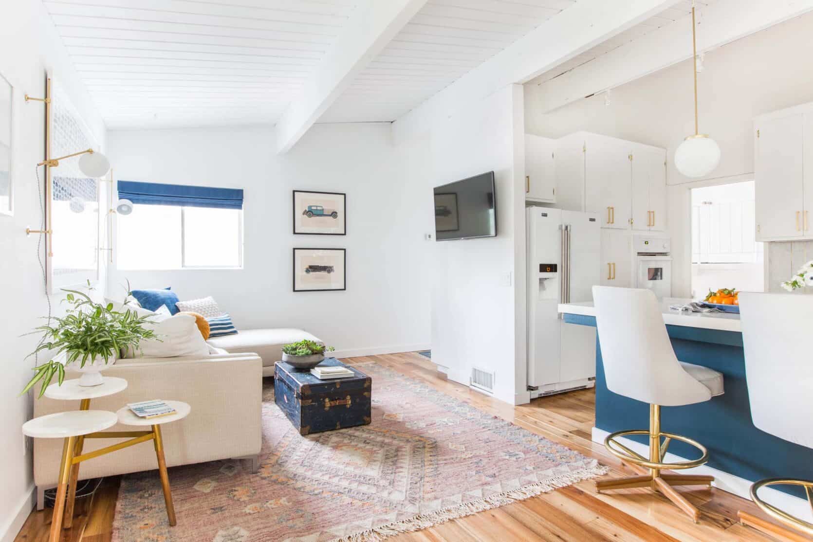
Problem #1: MULTIPLE FOCAL POINTS

When you have a singular focal point it’s so easy to orient a room, but with multiple focal points and no solid walls you have more options and you have to choose what to showcase. In this living room, we have the fireplace, bay window, large french windows – it’s an embarrassment of riches in the architectural focal point arena. We’ve tried it so many different ways and this is the way the room feels the best and is the most functional for our family, but often it feels like we should be facing the fireplace and opening up those bay windows for a table and chairs. In case you never saw this layout option post when we first moved in check it out.

We recently took our reader suggestions and rearranged it even more here.
Solution: Go with function and flow (and keep all focal points visually open)
Let function and flow guide you. Like in our case, it feels like the sofa should face the fireplace. But in order for it to be close enough to feel like it was even in a “conversation” with the fireplace, it cut the room in half. While we’ve had the sofa on the other side of the room (where the french doors are) for Christmas, this is the way that works the best for our family since we do use those doors so much and I love staring into the patio from the sofa instead of facing the street.

And then just make sure that you have no furniture visually blocking a focal point – like chairs in front of your fireplace (instead try a low bench or pouf) and that is one of the reasons we are switching out our sofa – for one that has a much lower back to get those bay windows shine.
I’m so excited to show you our new sofa and the chaise lounge finally reupholstered in the most amazing floral. I haven’t seen it yet besides photos, but boy are we excited.
But the point is, I think this room is starting to really WORK, and I’m so excited to show you.
PROBLEM #2: LONG AND NARROW ROOMS

I’ll say this publicly, square rooms are easier to design. I can lay a square room in a second. Long, narrow rooms are just hard, especially if you add in doors and windows and fireplaces. Sara’s living room is such a great example of “long and narrow” done right, but it wasn’t easy.

SOLUTION: BREAK IT UP WITH ZONES
Velinda (Sara’s designer and EHD alum) broke it up into zones and used low back chairs between the zones to not visually stop the eye and yet keep it open. But this was a conundrum too and she showed up a bunch of layout options that you all voted on in this post.

To give you all a little blast from the past, here are a bunch of layouts that were put together for a “how to design a long and narrow living room” post that we did on the blog in 2016. Guys, it’s still hard four years later!

PROBLEM #3: NO CLEAR “FOCAL WALL”


Oh what I wouldn’t give for a big blank wall, maybe with two windows near each edge leaving enough room for a bed in the kid’s room (think Portland bedroom). So easy. Granted if I needed to fit one twin or even a queen bed, this wouldn’t be so hard. But since I need a king bed now and soon two twin beds it makes the layout super hard (and no, they don’t like bunk beds).
SOLUTION: CREATE A FOCAL WALL
I think maybe the I mean the word is FORCE. That’s right, force a focal wall like say, with a large visually impactful canopy. BY THE WAY, when I went down to check on the house I separated the beds and raised them and it’s starting to look good, I promise. Should I do an update post? It’s still not there, but you’ll be able to see that it is getting there. My iPhone shots just suck. Anyway, I think it’s going to work, guys. Maybe I should not have done such a loud focal wall, but she wants A LOT OF ATTENTION. You have our focus, lady.
Exhibit #2: The Downstairs Den Now Playroom

Such a good example of what NOT to do – if a room is too open with the rest of the house like our playroom/den (making it parenting a dream), don’t stop your eye by making it dark (like an “accent room”). When we realized that we needed a playroom more than a TV room, we painted it the same tone as the rest of the entry and added that ship mural which I actually LOVE. The window is still where your eye goes, but the mural helps create that “art zone”. So we GAVE it a focal point, and the windows become a beautiful source of light but you want to stay in the first 1/2 of the room because there is something exciting (yet calm) happening on that wall.

It actually really works right now functionally and makes parenting in this house easy because the playroom is so close to the kitchen. I think that if I could forego how we actually live here (aka having a kid-focused space) I’d put a pretty floating desk, with a chair and ottoman in the bay window and enclose the room with french doors, but for our life, this works so well.


PROBLEM #4: IT’S A PASS-THROUGH SPACE

What do you do when you also have to walk through one room to get to another? It’s hard. Arlyn had this problem with her dining room – she couldn’t float the table in the middle of her dining room so she came up with a genius solution – she shoved the dining room towards one wall, with a banquet instead of chairs that would need to float. SMART.

SOLUTION: Open Up and Shove Against Walls

Obviously this solution will depend on whether this room is a living room or dining, but with both of these examples, we shifted the furniture to allow the room to be more open, allowing for flow. For the family room above, by shoving the sofa against the wall, having an oval coffee table, and then choosing visually open chairs we were able to make this work. See the whole post about other ways we made it work.
PROBLEM #5: MULTIPLE FUNCTIONS
Let’s face it – unless you have a “tv room” often the location of the TV causes PROBLEMS. Maybe you have one of those perfectly laid out living rooms where it’s not a problem, most new houses, built in the last 50 years were designed for a clear “tv wall”. In our Glendale house, there was no clear TV wall in that big bright living room, so we shoved it into the family room right off the kitchen, which was awkward but totally functional.
I just realized that this room was ALSO a pass-through room – no wonder it was so hard to make it work (I didn’t like it until the DAY we staged it to sell and then I loved it – ugh).

As you can see above, that TV was awkward just on that random wall, but it totally worked functionally for our family (it looks high but it was fine because sofa was deep and against the wall).
SOLUTION: Create Zones (Yep, Again)


This is sometimes easier said than done depending on your space, but just remember that everything looks better when it has a specific place. It will feel more organized and less chaotic.
OK, those have been my biggest struggles, but here are some other ways that a room becomes “hard” to design –
- A guest room that has to also be a TV room or an office is also hard unless it’s really big.
- Lack of natural light – A bright room with lots of windows is easier to work with. But there are ways to help, which we wrote about here.
- Long blank walls with nothing to break it up. We had that problem at the Atlanta show house, which we broke up with a big dynamic gallery wall and plug-in sconces.
- Lastly, KIDS AND PETS – There is a “price of admission” when you have either kids or pets. They’ll ruin your pretty house and furniture and they’ll create messes in every room that will then need a ton of easy access storage. It’s possible, but if you are struggling to make your living rooms look beautiful with kids and pets you are not alone. We have written about kid-friendly tips here, and pets here and both here and if you are looking for good looking storage (our favorite) check out this post here.
If you guys have any other “problem child/rooms” let us know what they are and we can try to tackle them.
Opener Images Credits: From Left to Right: Photo by Tessa Neustadt | Photo by Ryan Liebe | Photo by Sara Ligorria-Tramp


Oh Emily! I would love it if you tackled my problem room. It’s a LARGE (approx 19’ x 20’) space just off our carport (everyone enters here). It has: a spiral staircase in the middle of one wall, a laundry closet, a pass through fireplace with traffic flow on each side to the rest of the house (splitting the room into thirds), a doorway to a bedroom, a large bright window, and 10 foot ceilings. It has all the problems! I need it to be a mudroom, entry, library/sitting room, and hallway. Help!!
I suggest using Modsy, or a similar service. I struggled with my living room, and based on how I wanted it to function, Modsy gave me several floor plan ideas. Their aesthetic didn’t jive with me, but all I was after was the floor plan/furniture arrangement. I thought for the price, it was well worth it as I would have never thought of what they suggested. It’s how we’re using the space, and it works perfectly.
Also, in our family room, my husband and I were uncertain how to place the furniture based on its function and flow (all open concept), and my mom’s friend – a professional interior designer – walked in our door and told me within 20 seconds how/where to place the furniture. She nailed it right off the bat.
Sometimes, calling in help from a resource with professional training makes all the difference.
I’ve been thinking about Modsy. Thanks for that suggestion!
The challenge I’ve had both in my current smaller London rental and in my former bigger Seattle home I owned is not having an obvious place to put a TV (even before modern scale ones showed up!).
Btw I’ve heard from multiple sources that “call a spade a spade” is an expression with some racist connotations, even though that’s not the original meaning, so it might be worth an edit given current events and goals!
Cmon… Donald Duck is racist because of his white feathers???? Dont be silly! Thats tooo much…
Fyi: https://www.npr.org/sections/codeswitch/2013/09/19/224183763/is-it-racist-to-call-a-spade-a-spade
Ohhh…sorry…. thanks…. one can NOT be cautious enough…
Hi Virginia! Thank you so much for letting us all know. It has been edited. Words are important and we really appreciate it when we unknowingly understand that background. xx
You’re so welcome! I had no idea until recently. I’m now examining SO MANY turns of phrase, old and new, that I never thought about before!
Emily I was so excited to read this since I thought for SURE you would tackle the awkward office/guest room dilemma. Please do, and thanks for this article!
Hi Emily, i would love to know how to deal with curved walls. We have them in the entry to the kitchen, the family room and the master bedroom. It’s keeping me from being able to have a bedside table.
My challenge is a 66 x 14 ft long living room. The last 6 ft of one end has lovely, large windows on three sides, so a definite plus, and we are putting up two very cool, large midcentury hanging lights so hopefully plenty of light in the whole room. The end zone (literally!) can act as a sunroom area, so lop off about 10 feet of my concern there.
It’s the 56′ I worry about. Since it is so narrow, don’t want it to look like a hallway. Have a really nice, curvy caramel sofa that will go on one side, will arrange seating groups of two nice sized chairs and little round tables on each end of sofa. Ditto on other side, with chairs and cute little tables, and garden stools for drinks, deco stuff. All dialed up as kind of separate conversation groups. Not enough room for a coffee table in front of sofa.
Suggestions on how to not make it look like a “high school hallway” as my husband calls it?
You definitely need zones, but maybe not all seating zones. When you look at old films or books on English country house design you see large or long rooms broken into multiple types of spaces, for example, one seating area focused around the fireplace; another area focused around a desk, perhaps with chairs in front of it, too; another area focused on a games table (think Billy Haines sexy low klismos chairs and matching round table), which can be used for drinks, meals, and buffet service, as well as games. If you don’t have a fireplace, consider putting in a mantle in exactly the right place in the room to have two matching sofa’s on either side of it and maybe a third sofa (or chairs) on the opposite call. I might put the games table near the sunroom end zone. The FP and seating group in the middle of the room, and the desk and chairs at the opposite end of the room from the sunroom. Another seating area on the wall opposite where the desk is located (and I envision the desk on the same side of the room as the FP seating zone), or bookcases. Lots of… Read more »
You mentioned creating a focal wall where there isn’t one, like in the kids’ room. I think that if you don’t want your fireplace wall to be a focal point, you might need to do the opposite. The simplified designs take it in that direction, but maybe instead of asking what would look pretty or stylish, it’s what would read as neutral, what would not draw the eye, etc, for that wall only.
omg. this post sent me on an hours-long rabbit hole of all your linked posts, ha! i love everything, that’s why i get sucked in. i have a question, not about hard to design rooms, but, can you please provide a source for your bedside lamps in your master bedroom? the ones with the round black bottoms? i think those are exactly what i’m looking for for our room. thanks!
Rejuvenation.com
thank you!
Any tips on how to hide TV components? Like in the Glendale family room… where is the DVD player, router, sound bar my husband insists on having…. I could much more easily design my living room if I didn’t need to have a console under the TV. Thanks!
Emily, will you please answer a question that I (and I’m guessing many of your readers) have? With all that you have been doing to help correct for systemic racism, your only African American staff member, Veronica, is no longer showing on your team page. This is a pretty recent change. Will you speak to this? Thank you!
Hey Roberta, A few months ago (pre-corona) Veronica let us know that she felt ready to look for the next step in her career as a full time photographer as we just didn’t have enough fashion or home shoots. She was doing a lot of blog admin, which wasn’t exactly her passion. She stayed on through quarantine for a while because it wasn’t the best time to go freelance, obviously. We are hiring her as much as possible for our future shoots (but she’s already having her schedule fill up:)). We are in frequent communication with her, we miss her a lot and know that she is doing well. We have her booked on two big jobs this summer and we are very excited to continue working with her. Now that things are picking up production-wise in LA we’ll be promoting her here and on social to help her get more work like we do for most of our former EHD alum. So, if anyone in LA needs a photographer Veronica is so talented, so fun and one of the kindest people we know. Here is her site: https://www.veronicacrawfordphoto.com/
Thank you! Glad to hear Veronica is doing well! You have launched so many careers, Emily!
I know you’re always in favor of natural light, but one of our living room problems is the spacing of all the windows — there’s never enough space between windows for something like a credenza or bar. Our solution is a credenza to use as a bar that goes up against the back of the sofa, but that still leaves us with a couple of weird corners that look lonely but are a little too small to make zones out of.
This post has validated and put into clear words why I’ve been struggling with some rooms! We recently bought our first home and beautiful under 800 sqf 1950s gem that has bay views.
Our living room is amazing but clearly has too many focal points – it’s where you enter the house, has a wall of windows for the view, has a mid century fireplace and built ins on one end, and is long and narrow. Then our guest room/office is small and needs to function as both. To make things extra spicy it has 5 walls including french doors that lead to nowhere (literally) and now serve as windows and a backdoor.
Definitely taking a few layout ideas to play with from this post.
I know. its like YAY for all the windows and good ‘flow’ but it makes the rooms harder to design. xx
Emily, I have an expensive but brilliant idea for your living room. I think that you should replace the built-in bookshelves next to the fireplacewith built in benches and put in windows above them. Then, on your left side window wall (when facing the fireplace), you could either wall it off completely (but still get light on two sides from the other windows) or do smaller windows with a partial wall. I think this would feel soothing and cozy and less busy.
Just a thought – I love where you are headed with the room.
I actually love the idea of putting windows flanking the fireplace. Although I think its pretty close to our neighbors fence … But that does sound indeed expensive – I do love the ideas. Last time i was at the house I actually really liked where it was headed and my vintage chaise is done being upholstered in this awesome floral. stay tuned 🙂
I focuses on the idea of benches, which in my mind look like the L-shaped banquettes David Easton used on either side of fireplaces quite often. It would create symmetry, which I think your house needs at that end of the room. And it would give you a secondary seating area, perhaps with matching small tables for drinks or games. I would make the banquettes deep enough to be comfy for sitting for a while. Then your sofa/chairs would be their own seating area. And the piano and bench would be a third zone.
This post was so reassuring that I simply don’t stink at decorating my space! I love all things interior design/styling but have struggled in my last two homes. My next home will NOT have a tiny rectangle living room/dining room. Haha
Thank you for the ideas! I’ve got a super tricky small, rectangular, walk though, multiple focal points, multi-functional room. Plus kids! Haha
Hi all! Had a thought about redoing your fireplace – clad it in stone on the part that sticks out from the bookcases, or stucco it -to make it be the focal point of the room – give some weight to that side of the room….
The long narrow room! Oh my gosh! I have a long narrow master bedroom that also functions as an office. I’ve never been happy with it despite trying to create “zones.” I’m thinking about a new arrangement, but yes, this room is HARD!
Can you help w a multi function room?
– long space with kids rooms at one end
– spiral staircase comes down midway along one wall
– large storage closet built in
– minimal natural light
It’s been kid-zone for years which meant couches and places to drop stuff. Now I’d love it to be library/office/craft/game room, but am stuck on layout.
Ah, that 2016 post was my old living room! Can’t believe I’ve been reading this blog every day for so many years. We’ve since moved and I still miss that house, weird narrow living room and all. It’s funny how the things that drive you crazy don’t bother you at all in your memories. We’re now in a soulless, 2004-era beige builder house, with fewer layout issues and zero character. I miss my silly old house with all its quirks. Emily, I miss Design Agony!
Ooh I have one. I live in an old (1917) “center hall” style house – it has a tiny front vestibule then you step into the middle of the living room, with the doorway splitting it into 2 zones – one side is seating area with fireplace and built in bookshelves – and the other side quite difficult to design because it is a pass through to a small sunroom porch. My issue is that (in non-Covid times) when we have any more people than 1 other couple over, even though the 2 spaces together are large enough to hold everyone its not possible to seat everyone in the same zone – the side by the fireplace really only holds a small sofa and 2 chairs. Is there way to have more portable furniture to push together when I have book club over? Is there something to be done with “pass through” zone? Happy to send photos to illustrate.
OK, I’ve got a question: why does playroom did not work with dark blue walls and Arlyn’s living room dies? I am puzzled, both are open rooms with adjacent white walls areas…
Emily – Off topic, but could you tell me the name/brand/color of your roofing shingles on your LA house, please? My bungalow will be 100 next year and she needs a new roof. I really like yours, so I’m asking. Many thanks.
I know it’s not fun, but a post on how to choose the right roof for the house style, color, etc. would be so helpful.
When I first saw the ships wallpaper in a post a while back, my mind went to: wow, those ships powerfully represent colonialism, exploitation of resources, the bringing of devastating disease and contagion, exploitation of and genocide of native peoples, slavery, cultural destruction. At the time I didn’t say anything, but seeing them again, now, I would prefer to see that wallpaper with just the crashing waves and maybe the flukes of whales and the spray from their blow holes. I do find the ships images bring to mind a lot of unresolved historical realities and a lot of uncomfortable feelings, something I can’t unsee.